
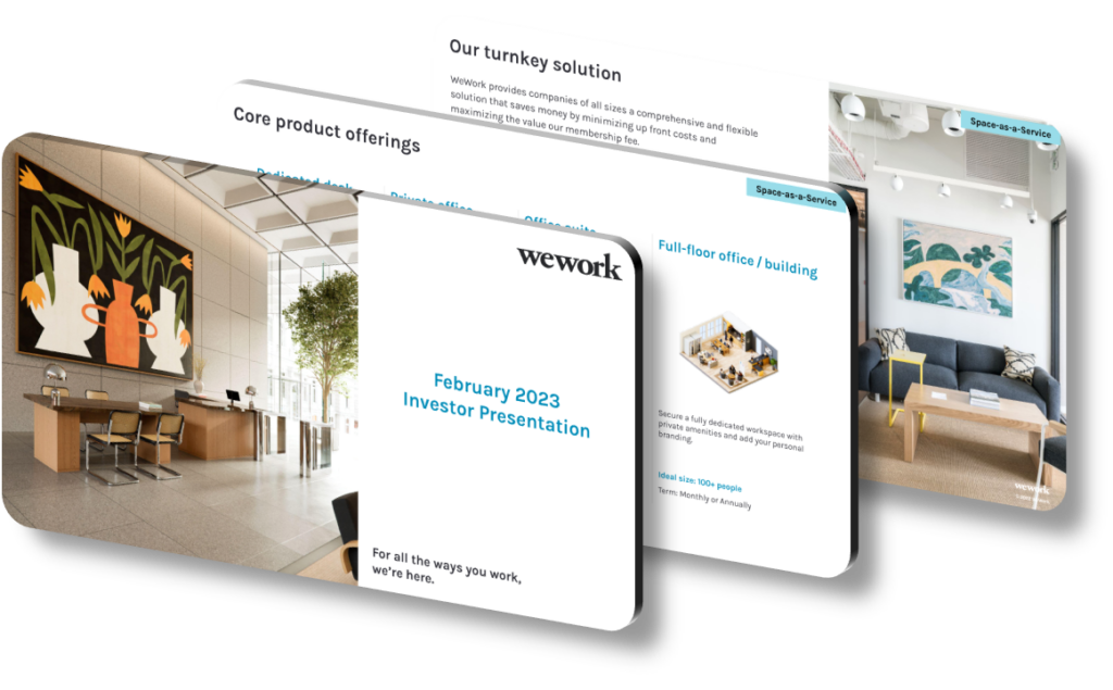
A presentation design highlights strategic growth and flexibility by using a cohesive visual system that communicates expansion potential through progressive layouts, scalable data visualizations, and adaptive slide structures. Rather than static snapshots, effective designs incorporate timeline-based frameworks, modular content blocks, and color-coded growth stages that allow viewers to mentally project the trajectory of a strategy. When done well, the design itself becomes an argument — demonstrating that the organization thinks in phases, adapts to change, and has a plan for multiple future scenarios. This is especially critical in investor decks, board presentations, and strategic planning documents where credibility depends on clarity and vision.
Strategic growth in presentation design is typically communicated through visual progression — the deliberate use of before-and-after comparisons, milestone roadmaps, and annotated charts that show compound improvement over time. A common mistake is using generic stock chart styles without contextual callouts; viewers see numbers but don’t absorb the story behind the growth. Instead, layered bar charts that build slide-by-slide or animated funnel diagrams that reveal new stages guide the audience through a logical sequence. Flexibility, on the other hand, is conveyed through modular slide architecture — presenting multiple scenarios (conservative, base, and optimistic) using the same visual template signals that the strategy isn’t rigid, but rather stress-tested and adaptive to real-world variables.
Color strategy plays a surprisingly powerful role in signaling both growth and flexibility. Using a warm-to-cool gradient palette across sequential slides (for example, moving from amber tones in the ‘current state’ section to blue-green tones in the ‘future state’ section) creates a subconscious narrative arc that audiences feel before they consciously analyze it. Typography hierarchy matters equally — a consistent scale where slide headers are set at roughly 2.5× the body size ensures that the core message is always scannable during live delivery. Flexible design systems also rely on a defined grid, typically a 12-column layout, which allows content blocks to be rearranged across different slide formats (16:9 widescreen, 4:3 print, or mobile-first PDF) without losing visual coherence or requiring a full redesign.
Concrete framing elements used in high-performing strategic presentations include phase gates, scenario matrices, and growth levers — each requiring specific design treatments to function clearly under pressure.
- Use a three-horizon roadmap layout where Horizon 1 (core business), Horizon 2 (emerging growth), and Horizon 3 (transformational bets) are color-differentiated and placed on a single panoramic timeline slide for immediate strategic context.
- Apply a consistent icon system across your slides, using the same 24px-grid icon set throughout, so visual metaphors like ‘expansion,’ ‘partnership,’ and ‘efficiency’ are instantly recognizable without requiring explanatory text.
- Design a scenario comparison table with three clearly labeled columns — conservative, base, and optimistic — using subtle background shading to help audiences quickly locate their reference point during Q&A discussions.
- Incorporate a ‘growth levers’ slide that uses a horizontal Likert-scale visualization to rank each initiative by effort versus impact, giving stakeholders a decision-making framework rather than a raw list of priorities.
- Use progressive disclosure across three to five slide builds for complex financial projections, revealing each data series individually so the audience absorbs each layer before the full picture is shown, reducing cognitive overload.
- Create a modular ‘appendix architecture’ where backup detail slides share the same header and footer template as main slides, ensuring the presentation scales gracefully from a 12-slide executive summary to a 40-slide deep-dive without inconsistency.
- Anchor every major section with a one-sentence ‘so what’ callout box styled in a contrasting accent color, so key strategic insights are never buried inside dense body text or complex charts.
The practical takeaway is that design and strategy must be developed in parallel, not sequentially. If you’re building a strategic deck, start by mapping the narrative arc first — identify your three to five core arguments, then select design treatments that reinforce each argument visually. As a concrete next step, audit your existing slides for a ‘flexibility signal’: does every major claim include at least one alternative scenario or contingency path? If not, add a simple two-column ‘Plan A / Plan B’ layout to key decision slides. Note that this approach is less suited to operational status updates or weekly reporting, where simplicity and speed of consumption outweigh the need for strategic framing.
Need a presentation that wins the room? SlideGenius designs custom, high-impact decks for brands like Red Bull, Amazon, and Adidas. Browse our presentation design portfolio, explore our PowerPoint design services, or contact us for a free quote.










