
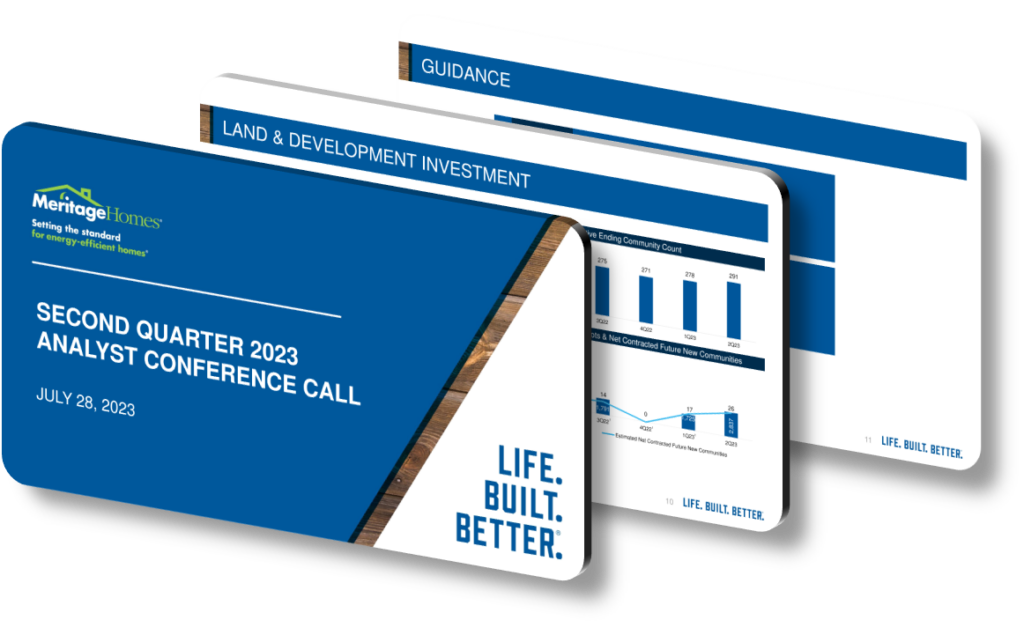
A well-crafted 2023 annual presentation design highlights key achievements and strategy by combining clear data visualization, a logical narrative arc, and visual hierarchy that guides the audience from results to roadmap. Rather than listing accomplishments randomly, effective presentations open with a headline metric — such as revenue growth percentage or units delivered — and immediately anchor it to a strategic decision made earlier in the year. This approach signals to investors, partners, and employees that every number has a story, and every story connects to a deliberate plan rather than favorable market conditions alone.
The structural backbone of a strong achievement-and-strategy presentation typically follows a three-act format: where we were, where we arrived, and where we are heading. The first act establishes baseline context — market conditions in early 2023, headwinds such as rising interest rates, and the constraints the organization was working within. The second act presents achievements with specificity: not just ‘we delivered strong margins’ but ‘gross margin expanded by 320 basis points year-over-year due to disciplined spec inventory management.’ This level of specificity separates high-credibility presentations from vague executive summaries. The third act then uses those achievements as proof points to validate the forward strategy, making the strategic roadmap feel earned rather than aspirational.
Visual design choices carry enormous weight in separating memorable presentations from forgettable ones. Color-coding achievement categories — operational, financial, customer experience, land acquisition — helps audiences quickly orient themselves across dense slide content. A common mistake is placing too many callout statistics on a single slide, which dilutes the impact of each metric. Best practice is the ‘one hero number per slide’ rule: if gross margin improvement is the headline, it should appear in a large typeface at 48pt or above, with supporting context in 18-20pt body text. Heat maps, timeline ribbons showing community openings, and waterfall charts breaking down margin movement are all formats that perform well when explaining layered strategic outcomes to a mixed audience of financial and operational stakeholders.
- Open with a single-page executive summary slide that lists three to five milestone achievements in bold text alongside the fiscal year framing, giving audiences an immediate orientation before detailed content begins.
- Use a waterfall or bridge chart to show how specific operational decisions — such as reducing cycle time by 15 days — translated directly into improved return on invested capital over the year.
- Dedicate one full slide to macro context, such as the 2023 interest rate environment hovering above 7%, to acknowledge headwinds and make achievements feel more significant and credible to skeptical audiences.
- Create a visual ‘strategy scorecard’ section with color-coded status indicators — green, yellow, red — tied to each pillar announced in the prior year’s presentation, demonstrating accountability and honest self-assessment.
- Include a geographic map or community count visualization to show physical market presence growth, which grounds abstract financial metrics in tangible operational reality for non-financial stakeholders.
- Pair each forward-looking strategic initiative with a specific, measurable commitment — for example, ‘targeting X new communities in entry-level price points by Q3 2024’ — so the strategy section feels binding rather than decorative.
- Reserve the final two slides for a clean, uncluttered closing that repeats the top three achievements alongside the top three strategic priorities, reinforcing memory retention through deliberate repetition and whitespace.
The practical takeaway is that presentation design should always serve narrative clarity, not aesthetic novelty. If you are building or auditing a 2023 strategy presentation, start by identifying your five strongest quantifiable outcomes and trace each one back to a decision made at least six months prior — that causal chain is your story. Note that this approach works best when data is auditable and consistent; if your achievement metrics vary between slides due to different calculation methodologies, the entire credibility of the strategic narrative collapses. For early-stage organizations without a full year of comparable data, a milestone-based format rather than a percentage-growth format is the more honest and effective structural choice.
Need a presentation that wins the room? SlideGenius designs custom, high-impact decks for brands like Red Bull, Amazon, and Adidas. Browse our presentation design portfolio, explore our PowerPoint design services, or contact us for a free quote.










