
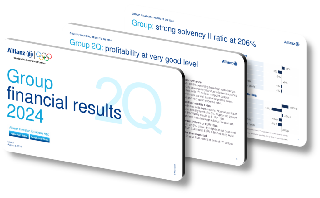
A well-crafted 2024 financial presentation design highlights key insights by combining visual hierarchy, data visualization best practices, and intentional narrative flow so that decision-makers can absorb complex numbers at a glance. Rather than dumping raw figures onto a slide, effective designs use contrast, color coding, whitespace, and typographic emphasis to draw the eye toward the most critical metrics first — whether that is year-over-year revenue growth, margin compression, or liquidity ratios. The goal is to reduce cognitive load while increasing retention, ensuring that every design choice serves the underlying financial story rather than decorating it.
One of the most common mistakes in financial presentation design is treating every number as equally important. In reality, a 2024 annual or strategic review typically has three to five headline figures — for example, a 12% combined ratio improvement or a €4.2 billion net profit milestone — that must be visually dominant. Supporting data like segment breakdowns or regional comparisons should appear at a secondary visual weight, using smaller type, muted palette tones, or subordinate chart types such as small-multiple bar charts. When everything looks equally prominent, audiences struggle to identify what actually changed or what decision is being recommended, which defeats the purpose of the presentation entirely.
Modern financial presentations also benefit from a deliberate slide architecture that mirrors the structure of a financial analyst’s thought process: context first, then performance summary, then segment deep-dives, then forward guidance or outlook. This mirrors how frameworks like the Minto Pyramid Principle organize information — leading with the answer or key finding and then supporting it with evidence. For a 2024 investor or board-level presentation, this means opening with a one-slide executive summary using a waterfall or bridge chart to show how individual business units contributed to the overall result, before drilling into individual performance areas. Waterfall charts, in particular, are exceptionally effective for showing net change drivers in premium income, claims costs, or investment returns.
- Use a consistent color system where one accent color (for example, a deep teal or amber) exclusively marks positive performance indicators, so audiences build instant visual literacy across all slides.
- Apply a maximum of three typeface weights per slide — regular for body data, semibold for sub-headers, and bold exclusively for the single most important figure on each page to create unambiguous hierarchy.
- Replace generic pie charts with 100% stacked bar charts when showing portfolio or segment mix, because they allow year-over-year comparison on the same axis rather than requiring the viewer to flip between slides.
- Use data callout boxes positioned at 2 o’clock relative to the chart to annotate the single most important insight, such as ‘Investment income up 18% driven by rising fixed-income yields in H2 2024.’
- Apply a five-second test to every slide — if the core takeaway cannot be identified within five seconds, the slide needs redesign through stronger visual hierarchy or a clearer headline statement.
- Incorporate subtle grid lines set at 10-15% opacity rather than heavy borders in financial tables, which reduces visual noise while still allowing the eye to track across rows accurately.
- For forward-looking slides such as outlook or guidance, use a visually distinct slide template — for instance, a lighter background tone — to signal a shift from reported facts to projected or estimated figures, reducing interpretation errors.
The practical takeaway is that effective financial presentation design in 2024 is less about aesthetics and more about information architecture and guided attention. Start by identifying your three to five headline numbers before opening any design tool, then build the visual system around making those numbers undeniable. A useful next step is to run your draft deck past someone unfamiliar with the data and ask them to name the top three findings — if their answer matches yours, the design is working. Note that these principles apply less effectively in highly technical appendix slides intended for specialist analysts, where density and completeness outweigh simplicity and speed of comprehension.
Need a presentation that wins the room? SlideGenius designs custom, high-impact decks for brands like Red Bull, Amazon, and Adidas. Browse our presentation design portfolio, explore our PowerPoint design services, or contact us for a free quote.
Presenting complex numbers? Explore our financial presentation design.










