How to Make a Simple Infographic Using PowerPoint SmartArt

infographics

PowerPoint Design

powerpoint tutorial

Infographics are a powerful way to present complex information visually. While you might think you need advanced graphic design software to create infographics, PowerPoint’s SmartArt feature allows you to design simple, effective infographics quickly and easily. Here’s how to create an infographic using SmartArt in PowerPoint.


1. Choose the Right SmartArt Graphic

The first step in creating an infographic is selecting a SmartArt layout that best fits your data. PowerPoint offers a wide range of layouts for different types of information, such as lists, processes, or hierarchies.Why It’s Important:

  • Matches Your Data: Choosing the right layout ensures that your data is presented clearly and logically.
  • Simplifies Design: SmartArt offers pre-designed templates that make the process fast and easy.

How to Do It:

  • Go to the Insert tab and select SmartArt.
  • Choose from the categories such as List, Process, Cycle, or Hierarchy based on the type of data you’re presenting.

2. Input Your Data

Once you’ve selected your SmartArt layout, the next step is to input your data. You can enter text directly into the SmartArt or use the text pane for a more structured input.Why It’s Important:

  • Organizes Information: Entering data into the SmartArt ensures that your information is structured and visually balanced.
  • Clarifies Your Message: Well-organized data helps convey your message more effectively.

How to Do It:

  • Click on the SmartArt graphic to open the text pane.
  • Input your data in the provided fields, using concise text to avoid clutter.

3. Customize the Design

PowerPoint allows you to customize your SmartArt by changing colors, shapes, and fonts to match your presentation’s theme or your company’s branding.Why It’s Important:

  • Enhances Visual Appeal: Customizing the design makes your infographic more visually engaging.
  • Reinforces Branding: Using your brand’s colors and fonts ensures consistency across all marketing materials.

How to Do It:

  • Click on the SmartArt Tools tab and use the Change Colors and SmartArt Styles options to customize your design.
  • Adjust fonts and sizes to make your infographic more readable and visually appealing.

4. Add Visual Elements

To make your infographic more engaging, consider adding icons or images that complement your data. Visual elements help break up text and make your infographic more dynamic.Why It’s Important:

  • Increases Engagement: Adding visuals makes your infographic more interesting and easier to understand.
  • Supports the Message: Icons and images help illustrate points and reinforce key messages.

How to Do It:

  • Go to the Insert tab, select Icons or Pictures, and choose relevant visuals to enhance your infographic.
  • Place icons or images near the corresponding text to maintain a clear and organized design.

5. Adjust the Layout

Once you’ve input your data and customized the design, you may need to adjust the layout to ensure that everything is properly aligned and visually balanced.Why It’s Important:

  • Improves Readability: A well-organized layout ensures that your infographic is easy to follow.
  • Enhances Aesthetics: A balanced design makes your infographic more visually appealing.

How to Do It:

  • Drag and resize the SmartArt elements to create more space between sections or adjust the proportions.
  • Use PowerPoint’s alignment tools to ensure that your infographic elements are evenly spaced and aligned.

Final Thoughts

Creating a simple infographic in PowerPoint using SmartArt is an easy and efficient way to visually represent data. By choosing the right layout, inputting clear and concise information, and customizing the design with visuals and colors, you can create an engaging infographic that enhances your presentation. With PowerPoint’s intuitive tools, even non-designers can create professional-looking infographics in just a few clicks.

3 Quick Ways to Turn Information into Visuals

infographics

information

PowerPoint Design

powerpoint ideas

visualization

As we know, it’s easier for our brains to process visual information. As Dr. John Medina writes on his website, “vision trumps all other senses.”

Within seconds of exposure, pictures beat sentences and words for recall. And in memory tests where people are shown hundreds of photos, they can remember 90% three days later – and 63% after a year.

So if you want to make your presentations memorable, you need to learn how to turn all your data and information into visuals that your audience can easily digest and understand. We’re living in the multimedia age. Today, there’s much more emphasis on images and graphics than there is on the written word. According to MarketingProfs, these are 3 quick methods that you can try to make your information more memorable:

Videos

What can be more engaging than watching something play out before your very eyes? Showcase product demos or customer testimonials through short video clips. You can even try your own hand with a short informative skit through animation. Get started by making use of free tools like Masher, Animoto, and Adobe Voice. If you’d rather just share a video you found through YouTube, you can check this tutorial to learn how you can add one directly to your PowerPoint slides.

Infographics

Another great way to visualize information is through the use of infographics. As we mentioned in the past, they’re an effective way to condense data in a way that’s easy to understand. Infographics are a fun combination of quirky illustrations and hard-hitting facts. To make one yourself, keep these pointers in mind and explore online tools like Visme and Piktochart. With a bit of creativity and customization, you can also make use of PowerPoint SmartArt.

Heat Maps

You’ve probably seen heat maps used in the weather report, where color intensity is used to pinpoint the temperature all over the country. For a presentation, you can also make use of a heat map to visualize data about your website. If, for example, you’re presenting about your online marketing methods, you can make use of Crazy Egg and Clicktale to make your own heat map. These sites will pull information from your websites and pages to show which areas have the most activity.

What other methods do you use to turn the information you have into eye-catching and interesting visuals? Share your thoughts through our social media channels linked below.

READ MORE: Three Ways to Visually Present Information (Without Spending a Fortune) – MarketingProfsFeatured Image: Armando Maynez via Flickr

PowerPoint Design Ideas: Visual Storytelling

content marketing

infographics

PowerPoint Design

visual storytelling

Visual storytelling is gaining more and more traction in social media platforms. Users these days are more inclined towards infographics, photos, and videos than purely text-based content, especially during the advent of social media and fast information.[sg-blog-modules module=one]Brands are wise to take advantage of this trend in their marketing strategies. And you would be too, if you learn to apply visual storytelling in your PowerPoint design.

The importance of visual storytelling

Humans are highly visual creatures. We’re naturally attracted to beautiful colors and interesting patterns. In fact, our brain is able to process images 60,000 times faster than information presented in text. It’s also easier for us to retain visual information. According to Dr. John Medina, after three days, we’re able to recall 65% of information if it was presented with images or illustrations.So if you’re presenting information that’s bulky with data, the audience will thank you if you can integrate comprehensible illustrations. Take the usual charts and graphs a step further by weaving stories through imagery.

Integrating visuals to enhance core message

There’s more to visual storytelling than sticking random pictures to your slides. Your statistics won’t make much sense if the visuals you add only serve an aesthetic purpose. Visual storytelling is about using different media that contribute to the message you’re presenting.As an example, here’s a small part of an interactive infographic by Collaborative Fund, Hyperakt and Start Up American Partnership:Visual storytelling - car sharing infographicThe infographic, which you can view in full here, showcases the positive effects of car sharing to the environment. It offers a lot of statistics that are perfectly illustrated to create more impact. It’s hard to imagine the difference a vague number makes but through this illustration, you can perfectly see how much carbon dioxide emissions have diminished.Here’s another example, this time, from a Facebook post by Intel:

Visual storytelling by Intel-Facebook
Screen cap by Social Media Examiner
Intel showcases their brand identity while adding a bit of humor at the same time. For your PowerPoint design, make sure you choose pictures with interesting narratives. There’s always a rare gem in the sea of cheesy stock photos. Especially if you know where to look.–Your text-based, bullet point-ridden PowerPoint design isn’t helping anyone. It’s not engaging your audience, and it’s not helping you get your message across. Instead, you should consider taking inspiration from visual storytelling. Showcase and illustrate your key points with visual elements, and your PowerPoint design will have more impact.If you need help, contact us to schedule a free consultation. Our professional PowerPoint designers will be happy to take your ideas and turn them into reality.[sg-blog-modules module=two]Featured Image: Håkan Dahlström via Flickr

From Numbers to Narratives: Mastering the Art of Infographics

infographics

We previously featured several infographics to celebrate the Fourth of July. Have you noticed how infographics have been gaining momentum in recent years?With the wealth of data now available to them, Internet users prefer how infographics can effectively break down the information they need in easy-to-comprehend illustrations. According to Kissmetrics40% of people are more likely to respond to visuals than plain text, making it clear why infographics can be a great tool to enhance your presentations.However, there’s more to infographics than just slapping together numbers, pie charts, and quirky visuals. Aside from great design, an infographic needs to have significant and accurate content. It can do a lot to engage your audience. Marketing guru Jeff Bullas explains that if you’re posting infographics online, it can quickly gain you a new set of readers.With so many eyes on your infographic, you need to make sure that you’re doing it correctly. Here are a few pointers to keep in mind:

Research Your Content

This is perhaps the most crucial part of making infographics. You won’t have anything to put in your infographic if you don’t do some research.You don’t need to hit the library and read through scientific journals, but don’t just do a quick Google search either. Look for reliable sources and be critical of anything you find on the Internet. Cross reference any data you want to use with a different source.

Condense Information into an Interesting Story

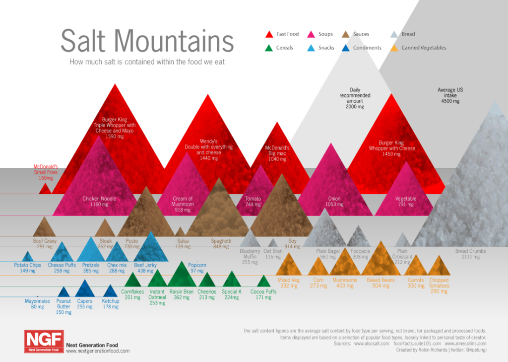
Your infographics should also focus on telling a specific story. Tackling too many topics in one infographic will be confusing, especially if you plan to use it for a presentation. Instead, focus on answering just one question.This infographic answers the question, “How much salt is in the food we eat?”

'Salt Mountains' infographic by GDS Infographics for Next Generation Food
by GDS Infographics for Next Generation Food
Aside from answering the question it poses, this infographic is also advocating a change in diet. A good story ends with a call of action. The same is true for an effective infographic.

Use Images that are Related to the Topic at hand

This might seem obvious, but it is truly important the images you use are related to the question you’re trying to answer with your infographic.Think of how illustrations work in a children’s book. The same should be true for your infographic.This is an infographic we made on public speaking anxiety:infographic design: public speaking

The Takeaway: Give it One Last Look

Before you place it on your PowerPoint presentation or post it online, give your infographic one last look. Ask yourself if the information you presented are sufficient enough to finish the story you’ve set out to tell.More importantly, check to see if it feels too cluttered or awkward on the eyes. Trim some design details and even some unnecessary data if you have to.

References

9 Awesome Reasons to Use Infographics in Your Content Marketing.” Jeff Bullas Blog. March 07, 2012. Accessed July 07, 2014.Video Infographic – Your Brain on VisualizationKissmetrics. Accessed July 07, 2014.Featured Image: GDS Infographics for Meet the Boss TV

Sparkling Insights: Unveiling Fourth of July Infographics for an Unforgettable Holiday Weekend

fourth of july

infographics

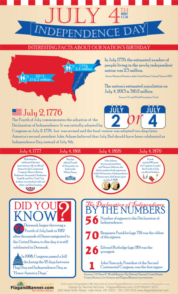
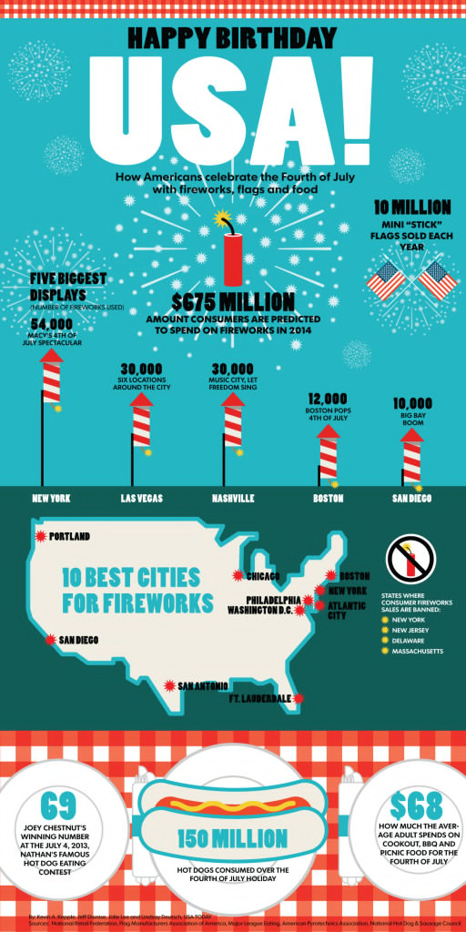
Fourth of July means fireworks, barbecues and family gatherings. We’re going to join in on your celebrations. For America’s 238th birthday, we scoured the Internet to find the best Fourth of July infographics.

Did you know that two presidents died just a few hours apart on Fourth of July? Learn fun facts about the holiday, as well as a few tips to help keep your celebrations safe and orderly.

Have a happy weekend, everyone!

(Click on pictures to enlarge)

Interesting Fourth of July Facts

Independence Day Infographic by FlagandBanner.com
FlagandBanner.com

Happy Birthday, USA! 

Happy Birthday USA by USA Today
USA Today

Food Safety Tips from the Founding Fathers

Food Safety Infographic by USDA
US Department of Agriculture / Flickr

Have a Pet-Friendly Fourth of July

Keep your pet safe on the Fourth of July by Tagg.com
tagg.com / Dakotasden.com

Fireworks Facts and Safety Tips

fireworks-101-4th-of-july-safety_51c9e7049cb42
InstantCheckmate / DailyInfographic.com


Featured Image: Jeff Kubina via Flickr