How can incorporating emulsifiers enhance the visual appeal and effectiveness of business infographics?
Incorporating emulsifiers in business infographics can significantly enhance their visual appeal and effectiveness by improving the overall flow and coherence of design elements. Emulsifiers, in a design context, refer to visual techniques or elements that blend different components harmoniously, making the information easier to digest for viewers. By strategically using emulsifiers such as color schemes, shapes, and layouts, designers can create a unified look that draws attention and communicates messages more clearly. For instance, using consistent color palettes helps establish brand identity while guiding the viewer’s eye through the infographic’s narrative. Additionally, effective use of whitespace can act as an emulsifier by preventing clutter and allowing key points to stand out. This not only makes infographics more attractive but also aids in retention of information as viewers are less likely to feel overwhelmed by dense data presentations.
View Our Presentation Portfolio

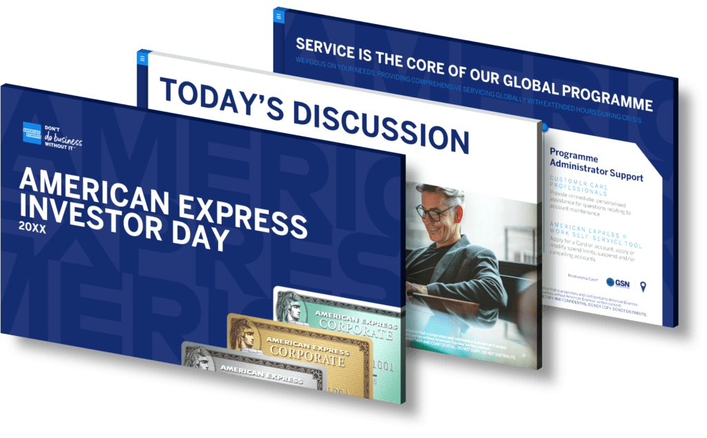
How can visual design in presentations enhance investor understanding during capital raising efforts?
Visual design plays a crucial role in enhancing investor understanding during capital raising efforts. By leveraging effective design principles, presentations can convey complex information in a more digestible format. Key elements such as color schemes, typography, and imagery help to create a coherent narrative that captures attention and facilitates comprehension. For instance, infographics can simplify data-heavy slides by presenting statistics and trends visually, making it easier for investors to grasp key points quickly.
Furthermore, well-structured layouts guide the audience’s eye through the presentation flow, emphasizing critical messages while minimizing distractions. Utilizing charts and graphs not only illustrates financial data but also highlights growth potential and market opportunities concisely. The strategic use of whitespace enhances readability and focuses attention on essential content rather than overwhelming viewers with cluttered slides.
In summary, an aesthetically pleasing and thoughtfully designed presentation not only engages investors but also fosters trust by conveying professionalism. When done right, visual design transforms ordinary presentations into compelling storytelling tools that drive investor confidence during capital raising initiatives.
View Our Presentation Portfolio

How can visual design enhance the clarity of financial results in business presentations?
Visual design plays a crucial role in enhancing the clarity of financial results in business presentations. By effectively integrating graphics, charts, and infographics, complex data can be transformed into easily digestible visual formats. This approach not only captures attention but also aids in retention and comprehension. Using color coding to differentiate between various types of data or performance metrics allows audiences to quickly grasp essential information without sifting through dense text. Additionally, utilizing consistent layouts and typography helps maintain a coherent flow throughout the presentation, ensuring that key messages are communicated clearly.
The strategic use of visuals can lead to more impactful storytelling by linking financial figures with real-world implications—helping stakeholders understand trends over time or compare performance against benchmarks. Moreover, incorporating interactive elements such as animated graphs can engage viewers further and make the presentation more dynamic.
Ultimately, investing in high-quality visual design is vital for conveying financial results effectively; it not only enhances understanding but also fosters informed decision-making among stakeholders.
View Our Presentation Portfolio

How can an infographic visually enhance the presentation of a smart gym equipment conversion kit’s benefits and team expertise?
Infographics are powerful tools that can significantly enhance the presentation of a smart gym equipment conversion kit’s benefits and team expertise. By utilizing visual elements, infographics can simplify complex information, making it easier for your audience to digest and retain key messages. Here’s how an infographic can be effectively used:
- Visual Representation of Benefits: Infographics allow you to present the advantages of your smart gym equipment in a visually appealing manner. Use icons, charts, and illustrations to highlight features such as improved efficiency, enhanced user experience, or cost savings. This not only captures attention but also facilitates quick understanding.
- Data Visualization: Present statistics or data related to performance improvements or user satisfaction through graphs and pie charts. This visual format makes it easier for viewers to grasp important metrics at a glance.
- Cohesive Storytelling: Infographics help in creating a narrative around your product’s journey—from conception through development—showcasing the expertise of your team along the way. You can include timelines or flowcharts that outline each phase of the conversion kit’s evolution while emphasizing team achievements.
- Aesthetic Appeal: The use of color schemes and branding elements in infographics not only beautifies your presentation but also reinforces brand identity. A well-designed infographic reflects professionalism and creativity, which can enhance credibility with potential clients.
- Simplifying Technical Jargon: If your conversion kit involves technical aspects that may confuse some audiences, infographics provide an opportunity to break down this jargon into digestible parts using visuals instead of text-heavy slides.
The combination of these elements creates an engaging experience for viewers while effectively communicating both the benefits of the product and showcasing team expertise—all crucial factors when presenting innovative solutions like a smart gym equipment conversion kit.
View Our Presentation Portfolio
Category: business-communicationWhat are the top visual design tips for engaging driver education presentations?
Creating engaging driver education presentations requires a strategic approach to visual design that captures attention and enhances comprehension. Here are some top tips to ensure your visuals are effective:
- Use High-Quality Images: Select relevant, high-resolution images that resonate with the content of your presentation. Visuals should be clear and support the message you wish to convey, whether it’s demonstrating safe driving techniques or showcasing road signs.
- Consistent Color Scheme: Choose a cohesive color palette that reflects the theme of driver education. Use colors that evoke trust and safety, such as blues and greens, while ensuring there is sufficient contrast for readability.
- Limit Text on Slides: Aim for concise bullet points rather than lengthy paragraphs. This keeps the audience’s focus on key messages without overwhelming them with information.
- Create Infographics: Utilize infographics to simplify complex data or processes related to driving regulations or statistics about road safety. This can help in conveying information quickly and effectively.
- Add Interactive Elements: Incorporate interactive elements like polls or quizzes within your presentation to engage participants actively. This not only makes learning fun but also reinforces knowledge retention.
- Diverse Visual Formats: Mix various visual formats such as videos, diagrams, charts, and animations throughout your presentation. This variety maintains interest and caters to different learning styles among participants.
- Avoid Cluttered Layouts: Maintain a clean layout by using ample white space around text and images. A clutter-free design helps viewers focus on essential components without distraction.
- Edit Ruthlessly: Review each slide critically; remove any unnecessary elements that do not add value to the core message of your presentation.
The combination of these design strategies will not only enhance engagement during driver education sessions but also improve understanding and retention of critical information regarding road safety practices.
View Our Presentation Portfolio

How can visual design enhance understanding in Medicare program presentations?
Visual design plays a crucial role in enhancing understanding during Medicare program presentations by simplifying complex information and making it more accessible to the audience. Effective use of visuals such as charts, graphs, icons, and infographics can break down intricate data into digestible formats. For instance, presenting statistics on enrollment trends through a visually appealing graph allows viewers to grasp key insights quickly. Additionally, color schemes can guide the audience’s focus to important points while maintaining engagement throughout the presentation. By incorporating relevant images and straightforward layouts, presenters are better equipped to convey their messages clearly and maintain the attention of diverse audiences who may have varying levels of familiarity with Medicare topics.
View Our Presentation Portfolio

How can clear visual design in slides enhance understanding of forward-looking statements?
Clear visual design in slides plays a pivotal role in enhancing the understanding of forward-looking statements. By utilizing effective visual elements such as graphs, charts, and infographics, complex data can be transformed into easily digestible formats that highlight trends and projections. The use of consistent color schemes, typography, and layouts not only captures the audience’s attention but also guides them through the information logically and intuitively.
Moreover, incorporating visuals helps to break down dense text into bite-sized pieces that facilitate retention and comprehension. For instance, a well-designed bar graph can succinctly illustrate projected growth over time compared to lengthy written descriptions. Additionally, using icons or imagery that relates directly to your statements can create mental associations that aid memory recall.
Furthermore, utilizing white space effectively allows for better focus on critical elements without overwhelming the viewer with information overload. This is particularly crucial when presenting forward-looking statements which often involve intricate financial forecasts or strategic plans; clarity is essential for ensuring stakeholders grasp both risks and opportunities involved.
In summary, clear visual design not only makes presentations more engaging but also significantly enhances comprehension by simplifying complex ideas related to forward-looking statements. By prioritizing clarity through thoughtful design choices, presenters can foster a deeper understanding among their audience.
View Our Presentation Portfolio

What are the top visual design tips for presenting Swiss Re’s Q1 2024 financial results in a compelling infographic?
Creating a compelling infographic to present Swiss Re’s Q1 2024 financial results requires careful consideration of visual design elements that enhance clarity and engagement. Here are some top tips to ensure your infographic stands out:
- Define Key Messages: Start by identifying the core messages you want to convey about Swiss Re’s financial performance. Focus on critical metrics such as revenue, profit margins, and growth rates.
- Choose an Appropriate Layout: Select a layout that guides the viewer’s eye through the information logically. Consider using a vertical flow for sequential data or segmented sections for comparative analysis.
- Utilize Brand Colors and Fonts: Incorporate Swiss Re’s brand colors and typography consistently throughout the infographic. This reinforces brand identity while maintaining visual harmony.
- Simplify Data Representation: Utilize charts, graphs, and icons instead of dense text blocks. Bar charts or line graphs can effectively illustrate trends over time, while pie charts can show composition percentages.
- Add Visual Hierarchy: Use varying font sizes, bolding techniques, and contrasting colors to emphasize key figures or facts. This helps draw attention where it matters most.
- Avoid Clutter: Keep your design clean by limiting the number of visuals on each section of the infographic. White space is essential as it allows viewers to digest information without feeling overwhelmed.
- Create Engaging Narratives with Icons & Imagery: Integrate relevant icons or images that relate directly to financial concepts—like dollar signs for revenue—but ensure they don’t distract from the data itself.
- Select Readable Text Sizes:The text should be legible from a distance; use at least 12-14 points for body text with larger headings so viewers can easily read them in presentations or printed formats.
A well-designed infographic not only presents data but also tells a story that captures attention while providing insights into performance metrics clearly and effectively. By applying these visual design tips thoughtfully tailored for Swiss Re’s Q1 2024 results presentation, you will create an engaging tool that resonates with stakeholders.
View Our Presentation Portfolio
Category: slide-designHow can effective visual design in slides enhance financial presentations for stakeholders?
Effective visual design plays a crucial role in enhancing financial presentations for stakeholders by improving clarity, engagement, and retention of information. Well-designed slides utilize various elements such as color schemes, fonts, graphics, and layout to create a cohesive narrative that captures the audience’s attention. When presenting financial data, it is essential to highlight key metrics and trends using visuals like charts and infographics instead of relying solely on text-heavy slides. This approach not only makes complex data more digestible but also facilitates quicker comprehension among diverse audiences.
Moreover, effective visual design aids in storytelling; it transforms dry statistics into compelling narratives that resonate with stakeholders’ interests and concerns. By strategically using whitespace to avoid cluttered slides, presenters can emphasize critical points without overwhelming their audience. Additionally, incorporating branding elements ensures consistency across all materials while reinforcing the company’s identity.
In summary, leveraging effective visual design within financial presentations not only enhances understanding but also fosters connection with stakeholders by making the content more visually appealing and engaging.
View Our Presentation Portfolio

How can advanced metallization technologies enhance the visual impact of business infographics and presentations?
Advanced metallization technologies can significantly elevate the visual impact of business infographics and presentations by introducing innovative finishes that capture attention and convey professionalism. These techniques involve applying metallic elements—such as gold, silver, or holographic foils—to printed materials, creating striking contrasts and enhancing textural depth. The reflective qualities of metallic surfaces can draw the viewer’s eye to key information, making it stand out against traditional matte backgrounds.
Moreover, incorporating advanced metallization in your designs not only enhances aesthetics but also communicates a brand’s commitment to quality and innovation. This is particularly effective for high-stakes presentations or marketing materials aimed at investors or clients who expect a polished look. By integrating these technologies into your infographics and slideshows, you create memorable visuals that resonate with audiences on both emotional and intellectual levels.
The use of metallized elements can also be strategically applied to emphasize specific data points or branding elements within your presentation design. For example, using metallic accents on graphs or charts can highlight performance metrics while maintaining an overall cohesive design theme.
View Our Presentation Portfolio

How can effective infographic design visually represent the correlation between daily steps and calories burned in business reports?
Effective infographic design can play a pivotal role in visually representing the correlation between daily steps and calories burned, particularly in business reports where clarity and engagement are paramount. To achieve this, designers should utilize a combination of visual elements such as graphs, icons, and color schemes that make complex data easy to digest. For instance, employing a line graph can effectively showcase the trend of calories burned relative to the number of steps taken throughout different periods—daily or weekly. Incorporating icons like foot prints for steps alongside calorie symbols adds an intuitive layer that helps viewers quickly understand key points.
Using contrasting colors for different data sets enhances visibility; for example, blue could represent daily step counts while red signifies calorie expenditure. Additionally, integrating percentage markers or averages directly within the infographic allows stakeholders to grasp significant insights at a glance without sifting through extensive textual explanations.
Moreover, incorporating engaging visuals such as images depicting active lifestyles not only makes your report aesthetically pleasing but also resonates with your audience’s aspirations towards health improvement through increased physical activity.
View Our Presentation Portfolio

How can visualizing America’s speech patterns enhance your infographic design for business presentations?
Visualizing America’s speech patterns can significantly enhance your infographic design for business presentations by providing a clear and engaging representation of complex data. By incorporating elements such as charts, graphs, and icons that represent various speech patterns, you can create an informative narrative that resonates with your audience. This approach not only makes the information more digestible but also highlights trends and insights that might otherwise go unnoticed.
When designing infographics, understanding the nuances of American speech—such as regional dialects or common phrases—can help tailor your message to specific demographics. Utilizing visual metaphors related to these speech patterns allows you to connect with viewers on a cultural level, making your presentation more relatable and impactful.
Moreover, employing data visualization techniques enhances retention rates among audiences who may struggle with traditional text-heavy slides. By transforming spoken language into visual formats like word clouds or flowcharts depicting dialogue dynamics in different contexts (business meetings versus casual conversations), you engage multiple senses which aids comprehension.
This strategic use of visualization fosters deeper engagement during presentations by encouraging discussion around the presented material while illustrating key points effectively. Ultimately, leveraging America’s diverse communication styles through thoughtful infographic designs will not only clarify your message but also amplify its effectiveness in conveying essential business concepts.
View Our Presentation Portfolio

How can a standardized color system in presentations enhance information retention and visual search efficiency?
Implementing a standardized color system in presentations can significantly enhance information retention and visual search efficiency. By using consistent colors across slides, you create a cohesive visual flow that helps audiences quickly identify key themes and concepts. This uniformity minimizes cognitive load, allowing viewers to focus on absorbing the content rather than deciphering varying color schemes or layouts. Additionally, specific colors can evoke emotions or highlight important points, making it easier for the audience to remember critical information. In terms of visual search efficiency, a predictable color palette enables quicker navigation through your presentation materials since viewers learn to associate certain colors with particular types of data or categories. Overall, this strategic use of color not only improves clarity but also boosts engagement and recall during discussions.
View Our Presentation Portfolio

How can I create an engaging and visually appealing presentation using Pinterest?
Creating an engaging and visually appealing presentation using Pinterest is a process that involves several steps. Pinterest is a treasure-trove of ideas and inspiration that can significantly enhance your presentation. Here’s a step-by-step guide on how to do it:
1. Start with Research
Begin by doing a keyword search on Pinterest that’s relevant to your presentation topic. Look for infographics, images, or pins that catch your eye and relate to your topic. These can serve as inspiration for your presentation’s design and layout.
2. Create a Board
Create a new Pinterest board specifically for your presentation. As you find pins that inspire you, save them to this board. This board will serve as your mood board, which will help guide your presentation’s visual aesthetic.
3. Look for Design Inspiration
Pinterest is filled with design inspiration, from color schemes to typography, to layout ideas. Look for pins that stand out and fit the mood you’re trying to create in your presentation. Remember, consistency is key in design, so try to stick to a specific color palette and font style.
4. Create Your Slides
Once you’ve gathered enough inspiration, start creating your slides. Use your Pinterest board as a guide, but don’t be afraid to put your own spin on things. Remember, your presentation should be a reflection of your brand and message.
5. Use High-Quality Images
One of the benefits of using Pinterest for presentation inspiration is access to high-quality images. Use these images in your slides to create a visually appealing presentation. Just ensure you have the rights to use these images, or they are under a creative commons license.
6. Incorporate Infographics
Pinterest is an excellent source for infographics that can make complex data easier to understand. If there are infographics that are pertinent to your presentation, consider incorporating them into your slides.
7. Finalize and Review
Once you’ve created your slides, review them for consistency in design and message. It’s also a good idea to get feedback from others to ensure your presentation is effective and visually appealing.
At SlideGenius, we specialize in creating visually stunning presentations that capture your audience’s attention. Our team of expert designers uses tools like Pinterest to find the latest design trends and inspiration, ensuring that your presentation is not only visually appealing but also effective in conveying your message.
View Our Presentation Portfolio

How can I enhance the visual appeal of my slides when editing a presentation in Google Slides?
Enhancing the visual appeal of your slides in Google Slides can significantly impact audience engagement and the overall effectiveness of your presentation. Here are some tips:
1. Use High-Quality Images
High-resolution images can create a visual impact and keep your audience engaged. However, ensure that the images are relevant to your content. You could use stock photos, but original images that reflect your particular situation or context can be more effective.
2. Utilize Effective Color Schemes
Colors set the mood of your presentation. A well-thought-out color scheme can make your slides visually appealing. Try to limit your choice to 2-3 primary colors, and ensure they align with your brand’s color palette if you’re representing a business or organization.
3. Make Use of Shapes and Icons
Shapes and icons can be used to signify different sections, highlight key points, or simply break up text-heavy slides. These elements can make your slides more interactive and easier to understand.
4. Apply the Right Fonts
Fonts can make or break the readability of your slides. Use clean, easy-to-read fonts, and ensure the font size is large enough to be read even from the back of the room. Stick to one or two types of fonts throughout your presentation for consistency.
5. Use Graphs and Charts
Graphs and charts can turn complex data into understandable visuals. Google Slides has built-in tools to create these, which can significantly improve your presentation’s effectiveness.
6. Incorporate Videos
Videos can break up the monotony of a presentation and provide a rich, engaging experience for your audience. Google Slides allows you to insert videos directly from YouTube or from your Google Drive.
7. Consistency is Key
Ensure that all your slides follow the same design theme, including color scheme, font type, and layout. This consistency gives your presentation a professional look and feel.
If you find this process overwhelming, SlideGenius offers a range of services to help. Our team of expert designers can create visually stunning, custom-made slides to help you deliver a powerful presentation.
View Our Presentation Portfolio
