How can businesses effectively use infographics to showcase complex healthcare partnerships?
Infographics serve as a powerful tool for businesses to simplify and visually communicate the intricacies of complex healthcare partnerships. By leveraging compelling visuals, organizations can break down dense information into easily digestible formats that resonate with diverse audiences. The use of clear icons, charts, and diagrams allows stakeholders to quickly grasp essential data without wading through lengthy text. Additionally, incorporating brand colors and logos reinforces identity while maintaining engagement. To maximize effectiveness, businesses should focus on storytelling within their infographics—highlighting key benefits, outcomes, and collaborative efforts in an organized manner. This not only enhances comprehension but also fosters trust among partners and clients alike by showcasing transparency in healthcare initiatives.
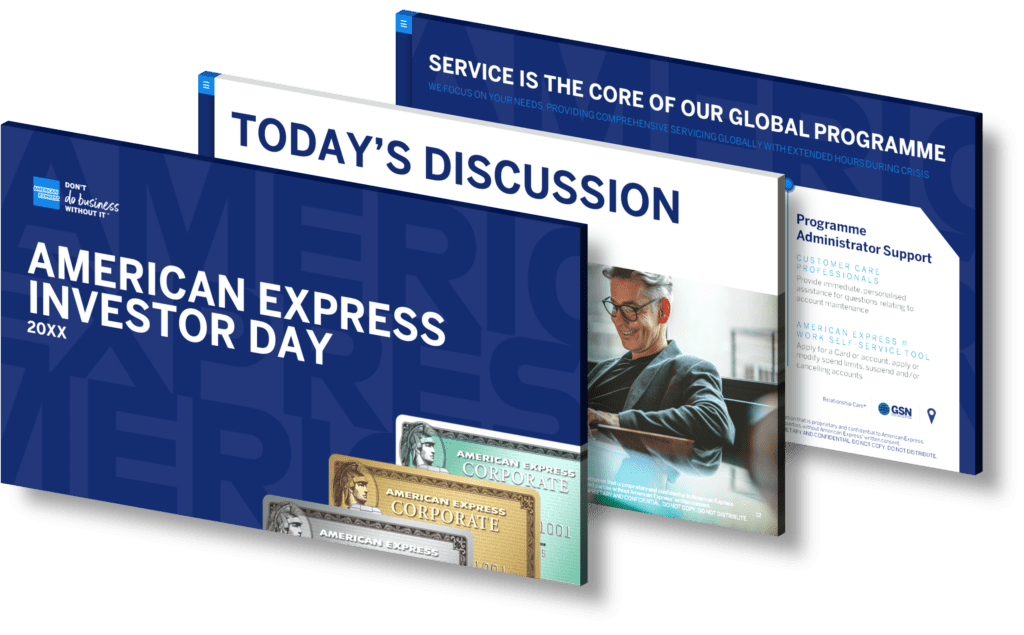
View Our Presentation Portfolio
How can businesses use infographic design to simplify decision-making and reduce consumer overwhelm in the purchasing process?
Infographic design serves as a powerful tool for businesses aiming to simplify decision-making and alleviate consumer overwhelm during the purchasing process. By transforming complex data into visually appealing graphics, infographics can distill essential information into easily digestible formats. This approach allows consumers to quickly grasp key points, compare options, and understand the benefits of products or services without wading through dense text or overwhelming statistics. Furthermore, effective use of color coding and visual hierarchy can guide viewers through the information systematically, making it easier for them to identify what is most relevant to their needs.
Moreover, infographics can highlight customer testimonials or case studies in a concise manner that builds trust and credibility with potential buyers. When designed thoughtfully, these visuals not only enhance engagement but also facilitate quicker decision-making by presenting clear calls-to-action (CTAs) that encourage users to take the next step—be it making a purchase or seeking additional information.
Incorporating infographic design into marketing strategies ultimately helps brands communicate effectively with their audience while reducing cognitive overload. This seamless flow of information empowers consumers to make informed choices confidently.
View Our Presentation Portfolio
How can businesses leverage forward-looking statements in infographics for effective earnings presentations?
Businesses can effectively leverage forward-looking statements in infographics for earnings presentations by employing a strategic approach that enhances clarity, engagement, and impact. Forward-looking statements are crucial for setting expectations about future performance and outlining potential growth opportunities. To incorporate these statements effectively into infographics, companies should follow these steps:
- Clear Visual Representation: Use graphs and charts to visually depict projections alongside historical data. This allows stakeholders to easily compare past performance with future expectations.
- Key Messaging: Highlight essential forward-looking statements using bold typography or contrasting colors within the infographic. This draws attention to critical insights that may influence investment decisions.
- Contextual Information: Provide context around the projections by including market trends or economic indicators that support your forward-looking claims. This adds credibility and helps stakeholders understand the basis of your forecasts.
- Simplicity is Key: Avoid cluttering the infographic with excessive text or complex jargon. Use concise language and focus on high-level takeaways that resonate with your audience.
- User Engagement: Incorporate interactive elements if possible, such as clickable sections or embedded videos explaining key points in more detail. Engaging formats can enhance retention of information among viewers.
The combined use of compelling visuals and clear messaging ensures that forward-looking statements are not only informative but also persuasive, fostering confidence among investors regarding the company’s strategic direction.
View Our Presentation Portfolio
How can businesses effectively use infographics for presenting forward-looking financial projections?
Businesses can effectively utilize infographics to present forward-looking financial projections by employing several key strategies. First, they should simplify complex data into visually appealing graphics that highlight essential trends and figures. This can be achieved through the use of charts, graphs, and icons that make the information easily digestible for stakeholders.
Moreover, incorporating a narrative element helps contextualize the data; businesses should explain what the numbers mean in terms of future growth or potential challenges. Color coding can also enhance understanding by categorizing different aspects of financial projections—such as revenue streams or expenditure forecasts—allowing viewers to quickly grasp critical insights.
Additionally, using interactive elements in digital presentations can engage audiences more deeply than static images alone. Tools like clickable timelines or animated graphs allow users to explore scenarios and outcomes based on varying assumptions about market conditions and business performance.
Finally, ensuring that all infographics align with brand guidelines reinforces corporate identity while maintaining professionalism throughout communications. By blending clarity with creativity in their presentations, businesses can significantly improve stakeholder understanding and buy-in regarding their financial outlooks.
View Our Presentation Portfolio
How can businesses effectively visualize DRG implementation strategies in a presentation to engage diverse stakeholders?
To effectively visualize Diagnosis-Related Group (DRG) implementation strategies in a presentation, businesses should focus on several key elements that cater to the diverse interests and backgrounds of stakeholders. Firstly, it’s crucial to utilize clear and concise visuals such as charts, graphs, and infographics that can simplify complex data into easily digestible formats. Infographics are particularly effective for summarizing information while maintaining engagement.
Incorporating storytelling techniques into the presentation can also play a vital role in engaging stakeholders. By framing the DRG strategies within real-world scenarios or case studies, you can illustrate their practical implications. This approach not only makes the content relatable but also helps stakeholders understand how these strategies directly impact their roles or departments.
Utilizing color coding and icons can further enhance understanding; different colors can represent various components of DRG systems (e.g., cost-saving measures vs quality improvement initiatives), while icons help to visually categorize information quickly.
Moreover, interactive elements such as polls or Q&A sessions during the presentation encourage participation from all attendees. This not only fosters a collaborative atmosphere but also allows you to address specific concerns or questions from different stakeholder groups immediately.
Finally, ensuring that your data is backed by credible sources will increase trust among stakeholders. Incorporate citations within your slides where applicable to reinforce authenticity and reliability.
View Our Presentation Portfolio
How can businesses effectively use infographic design to present complex clinical trial data?
Infographic design is an invaluable tool for businesses looking to present complex clinical trial data in a clear and engaging manner. By transforming intricate information into visually appealing graphics, companies can enhance understanding and retention among their audience. Here are several strategies to effectively utilize infographic design for this purpose:
- Simplify Data: Break down complex data sets into manageable chunks. Use infographics to highlight key findings, trends, and comparisons that matter most to your audience.
- Visual Hierarchy: Establish a clear visual hierarchy by using size, color, and layout strategically. This helps guide the viewer’s eye through the information in a logical flow.
- Use Icons and Illustrations: Incorporate relevant icons or illustrations that represent data points visually. This approach not only makes the content more relatable but also aids in quicker comprehension.
- Cohesive Color Palette: Select a cohesive color palette that aligns with your brand guidelines while ensuring readability and accessibility of the infographic content.
- Annotations and Callouts: Use annotations or callouts to provide additional context or explanations for specific data points without overcrowding the overall design.
- User-Centric Design: Keep your target audience in mind when designing infographics. Tailor the content style—whether technical or layman—to fit their level of expertise regarding clinical trials.
The effective use of infographic design not only simplifies communication but also enhances engagement with your stakeholders by making complex clinical trial data accessible and understandable at a glance. Consider partnering with professional designers who specialize in creating impactful visuals tailored specifically for scientific communication.
View Our Presentation Portfolio
How can businesses enhance earnings presentations with innovative infographic designs?
Businesses can significantly enhance their earnings presentations by integrating innovative infographic designs that not only capture attention but also convey complex financial data in an easily digestible format. Infographics leverage visual elements like charts, graphs, icons, and color schemes to illustrate trends and performance metrics effectively. By simplifying intricate information into visually appealing graphics, businesses can facilitate better understanding among stakeholders and investors.
To create impactful infographics for earnings presentations, consider the following strategies:
- Data Visualization: Utilize bar charts, pie charts, and line graphs to represent quantitative data clearly. This allows your audience to quickly grasp key figures without wading through dense text.
- Thematic Colors: Choose a color palette that aligns with your brand identity while ensuring contrast for readability. Consistency in colors helps anchor visual elements together.
- Simplified Messaging: Focus on concise messaging within each infographic element. Use bullet points or short phrases instead of lengthy paragraphs to keep your audience engaged.
- Storytelling Elements: Craft a narrative around the data presented. Incorporate sequential infographics that guide viewers through the story of your company’s performance over time.
- A/B Testing Designs: Experiment with different layouts and styles before finalizing your presentation design. Gather feedback from colleagues or test audiences to determine which visuals resonate best.
The integration of these innovative design principles not only enhances the aesthetic appeal of earnings presentations but also improves information retention and audience engagement during critical discussions with stakeholders.
View Our Presentation Portfolio
How can businesses use infographics to highlight the economic impact of healthcare challenges like chronic wound management?
Businesses can leverage infographics as a powerful visual communication tool to effectively convey the economic impact of healthcare challenges, such as chronic wound management. By distilling complex data into visually appealing graphics, businesses can highlight critical information at a glance, making it easier for stakeholders to understand the scope and implications of these issues. Infographics can showcase statistics on treatment costs, patient demographics, recovery rates, and the broader economic burden on healthcare systems. They also serve to illustrate comparisons between conventional methods and innovative solutions that may improve outcomes while reducing costs.
Furthermore, incorporating case studies or testimonials within infographics can humanize the data by illustrating real-world implications of chronic wounds on patients and healthcare professionals alike. This storytelling aspect enhances engagement and fosters empathy among audiences. Utilizing vibrant colors, icons, charts, and diagrams not only captures attention but also facilitates information retention.
By presenting this vital information in an accessible format through infographics—whether for presentations at conferences or as part of marketing materials—businesses can drive awareness about chronic wound management challenges while advocating for necessary changes in policy or practice.
View Our Presentation Portfolio
How can businesses use infographics to highlight efficiency and sustainability in their presentation designs?
Businesses can effectively use infographics to highlight efficiency and sustainability in their presentation designs by incorporating visually engaging elements that convey complex data in an easily digestible format. Infographics allow companies to showcase statistics, processes, and case studies related to their sustainable practices while maintaining audience interest. By using a combination of charts, icons, and illustrations, businesses can illustrate the impact of their sustainable initiatives on operational efficiency. For instance, depicting energy savings through visual comparisons or outlining a timeline for implementing green practices can help audiences quickly grasp the benefits without overwhelming them with text. Additionally, integrating color schemes aligned with environmental themes reinforces the message of sustainability while enhancing overall brand aesthetics. To maximize engagement and retention of information presented through infographics, it is important for businesses to ensure that the design is not only informative but also aligns with their branding strategy.
View Our Presentation Portfolio
How can businesses enhance decision-making with infographics in financial presentations?
Businesses can significantly enhance decision-making during financial presentations by incorporating infographics as a key visual tool. Infographics allow complex data to be distilled into clear, engaging visuals that facilitate understanding and retention. By using charts, graphs, and visual narratives, companies can present intricate financial information in a way that highlights trends and insights effectively.
One of the primary advantages of infographics is their ability to convey large amounts of information succinctly. For instance, instead of presenting pages of numbers in spreadsheets, a well-designed infographic can summarize key metrics such as revenue growth or expense ratios in an easily digestible format. This clarity not only aids comprehension but also supports quicker decision-making by enabling stakeholders to grasp essential insights at a glance.
Moreover, integrating infographics fosters greater engagement among audience members. Visuals are more likely to capture attention than text-heavy slides; this engagement encourages dialogue and collaboration during presentations. When team members or investors can visualize the data being discussed—such as through comparison charts or timelines—they are better equipped to contribute valuable perspectives based on the presented information.
Additionally, using consistent branding elements within infographics reinforces corporate identity while ensuring that all visuals align with strategic messaging. This consistency builds trust with the audience as they recognize familiar branding associated with reliable data presentation.
In summary, businesses looking to enhance decision-making in financial presentations should leverage the power of infographics to simplify complex data sets, engage their audience effectively, and maintain brand consistency throughout their communications.
View Our Presentation Portfolio
How can businesses effectively use forward-looking statements in infographic designs?
Forward-looking statements play a crucial role in infographic design by providing audiences with insights into a business’s future plans, projections, and strategies. To effectively incorporate these statements into your infographics, businesses should ensure clarity and conciseness. Start by summarizing key projections or goals in straightforward language that can be easily understood at a glance. Utilize engaging visuals like charts and graphs to represent data trends, making it visually appealing while conveying important information.
In addition, consider the context of these statements—align them with current market conditions or company initiatives to enhance relevance. Utilizing color coding can also help differentiate between various categories of information (e.g., optimistic vs pessimistic forecasts). Lastly, always include appropriate disclaimers to inform viewers that forward-looking statements are subject to risks and uncertainties.
By following these strategies, businesses can create compelling infographics that not only capture attention but also foster trust through transparent communication regarding future directions.
View Our Presentation Portfolio
How can businesses leverage infographics to simplify complex data for insurance presentations?
Businesses can leverage infographics as powerful tools to simplify complex data for insurance presentations by transforming dense information into visually engaging formats. Infographics allow companies to break down intricate statistics, policy details, and market trends into digestible visuals that enhance understanding and retention. By utilizing charts, graphs, icons, and other visual elements, presenters can highlight key points effectively while maintaining audience interest.
To maximize the impact of infographics in insurance presentations, businesses should focus on clarity and brevity. This involves selecting only the most relevant data points that support their narrative while avoiding overwhelming viewers with excessive information. Additionally, incorporating a consistent color scheme that aligns with the company’s branding can create a cohesive look that reinforces brand identity.
Moreover, interactive infographics can further engage audiences by allowing them to explore data at their own pace. Tools like clickable charts or animated transitions keep viewers involved and facilitate a deeper understanding of complicated concepts such as risk assessments or claims processes.
Finally, consider tailoring your infographic style to suit your target audience—whether they are clients seeking assurance in policy offerings or stakeholders interested in market performance metrics. This tailored approach not only clarifies complex information but also fosters trust through transparency.
View Our Presentation Portfolio
How can businesses effectively utilize infographics to enhance parent and family engagement strategies in educational settings?
Infographics serve as a powerful tool for businesses aiming to enhance parent and family engagement strategies in educational settings. By visually conveying complex information, infographics can simplify communication between schools and families, making data more accessible and engaging. Here are several ways businesses can effectively utilize infographics for this purpose:
- Highlight Key Information: Infographics allow you to present essential statistics related to student performance, attendance rates, or program benefits in a visually compelling manner. This helps parents quickly grasp the most critical information without sifting through lengthy reports.
- Showcase Events and Activities: Design engaging infographics that outline upcoming school events, family engagement activities, or important deadlines. Using colorful visuals and clear timelines can increase participation from parents by making the information more appealing.
- Create Educational Resources: Businesses can produce infographics that provide tips on supporting children’s learning at home or explain educational initiatives in simple terms. This not only informs but also empowers parents with actionable insights.
- Facilitate Feedback Mechanisms: Utilize infographics to summarize feedback from parents regarding school programs or initiatives. Presenting this feedback visually can encourage further dialogue and collaboration between families and educators.
- Cultivate Community Awareness: Infographic campaigns highlighting community resources available for families (such as workshops or counseling services) foster a sense of belonging and support among parents.
The key to success lies in ensuring these graphics are not only informative but also resonate with the target audience’s preferences—considering factors like cultural relevance, language accessibility, and visual appeal will maximize engagement rates significantly.
View Our Presentation Portfolio
How can businesses use infographics to visualize the 2024 global economic outlook effectively?
Businesses can leverage infographics to effectively visualize the 2024 global economic outlook by transforming complex data into engaging and easily digestible visual content. Infographics allow companies to present key statistics, trends, and forecasts in a manner that is both informative and visually appealing. By utilizing charts, graphs, icons, and color coding, businesses can highlight critical information such as GDP growth rates, unemployment statistics, trade balances, and sector performance across different regions.
To maximize impact, it’s essential to focus on clarity and simplicity. Start by identifying the most relevant data points for your audience—whether they are investors, stakeholders or customers—and organize this information logically within the infographic. A well-structured narrative helps guide viewers through the data story you want to tell.
Incorporating branding elements such as logos or company colors within your infographics enhances brand recognition while maintaining a professional appearance. Additionally, consider sharing these visuals across various platforms including social media channels and newsletters to reach a broader audience.
Using interactive elements such as clickable links or animations can also increase engagement levels where feasible. Ultimately, an effective infographic not only communicates vital economic insights but also encourages informed decision-making among its viewers.
View Our Presentation Portfolio
How can businesses enhance investor presentations with compelling infographic design?
Businesses can significantly enhance their investor presentations by incorporating compelling infographic design, which effectively communicates complex data in a visually engaging manner. Infographics allow for the simplification of intricate information, making it easier for investors to grasp key insights quickly. Here are several strategies to achieve this:
- Data Visualization: Use charts, graphs, and diagrams to present financial metrics and performance indicators clearly. Visual representations facilitate quicker comprehension compared to text-heavy slides.
- Consistent Branding: Maintain a cohesive design that aligns with your brand’s identity. Utilizing consistent colors, fonts, and styles strengthens recognition and fosters trust among investors.
- Simplification of Content: Focus on essential points by breaking down information into digestible segments. Avoid cluttering slides with excessive text; instead, use bullet points or concise statements paired with visuals.
- Narrative Flow: Craft a compelling story through your presentation that guides investors from one point to another seamlessly. Infographics can highlight critical milestones and future projections effectively.
- A/B Testing Designs: Experiment with different infographic layouts or designs before finalizing your presentation. Gathering feedback can reveal which formats resonate best with audiences.
The integration of these elements not only captivates the audience but also elevates the overall professionalism of the presentation, leading to better engagement from potential investors.
View Our Presentation Portfolio
How can businesses leverage infographics to showcase smart city solutions like Signify’s BrightSites?
Businesses can effectively leverage infographics to showcase smart city solutions, such as Signify’s BrightSites, by visually communicating complex data and ideas in a clear and engaging manner. Infographics can distill intricate information about smart lighting systems, energy efficiency, urban planning, and sustainability into easily digestible graphics that attract attention. By using vibrant colors, compelling icons, and concise text, businesses can highlight the benefits of their solutions—such as enhanced safety through improved visibility or reduced energy consumption through intelligent lighting systems.
Additionally, these visual tools allow businesses to tell a story about how their innovations integrate with existing urban infrastructures while addressing community needs. Infographics can illustrate case studies demonstrating successful implementations of BrightSites in real-world scenarios or show comparative statistics on performance improvements before and after adoption. This not only aids in educating stakeholders but also enhances brand credibility by showcasing thought leadership within the smart city domain.
Furthermore, sharing these infographics across various platforms—like social media channels or industry reports—can significantly broaden reach and engagement with target audiences. By optimizing infographics for SEO purposes (using relevant keywords related to smart cities), businesses can improve online visibility and drive more traffic to their websites.
View Our Presentation Portfolio
How can businesses use infographics to effectively explain complex energy transition data?
Businesses can leverage infographics as a powerful tool to simplify and communicate complex energy transition data effectively. Infographics combine visual elements with concise information, making it easier for audiences to grasp intricate concepts. By utilizing clear graphics, charts, and icons, businesses can break down significant data points related to energy consumption, carbon emissions, renewable resources, and policy changes into digestible segments.
One effective approach is to use narrative storytelling within the infographic format. By guiding viewers through a visual journey that highlights key statistics and trends in the energy sector, companies can create a more engaging experience that fosters understanding and retention. Incorporating color-coded sections or thematic visuals can also help categorize information clearly—distinguishing between traditional versus renewable energies or illustrating progress over time.
Moreover, interactive infographics allow users to engage directly with the data by clicking on different elements for more detailed insights or additional context. This interactivity not only makes learning about complex transitions more enjoyable but also provides tailored experiences for diverse audience segments based on their interests or prior knowledge.
Ultimately, by employing infographics strategically in presentations or reports about energy transition data, businesses not only enhance clarity but also drive home the importance of sustainability initiatives in a visually compelling manner that resonates with stakeholders.
View Our Presentation Portfolio
How can businesses leverage infographics to showcase the versatility of Ford Transit configurations?
Businesses can effectively leverage infographics to showcase the versatility of Ford Transit configurations by employing a visually engaging and informative approach that highlights key features and options. Infographics allow for the presentation of complex information in a simplified manner, making it easier for potential customers to understand the various configurations available. For instance, businesses can use color-coded sections to differentiate between cargo, passenger, and custom configurations. Incorporating icons or images representing different uses—like transportation for goods or shuttle services—can further illustrate how versatile these vehicles are.
Additionally, including statistics such as payload capacity, seating arrangements, and customization options within the infographic can provide valuable insights at a glance. This not only enhances user engagement but also aids in decision-making processes for clients considering different Ford Transit models.
To maximize visibility online, optimizing infographics with relevant keywords related to Ford Transit configurations will improve search engine rankings. Sharing these infographics across social media platforms and embedding them in blog posts can significantly increase reach while educating your audience about product benefits.
View Our Presentation Portfolio
How can businesses effectively use infographics to present complex financial forecasts and strategies?
Infographics serve as a powerful tool for businesses aiming to present complex financial forecasts and strategies in a clear and engaging manner. By leveraging visual elements such as charts, graphs, and icons, organizations can distill intricate data into digestible formats that enhance understanding among diverse audiences. To effectively use infographics for financial presentations, consider the following strategies:
- Select Key Data: Focus on the most relevant data points that directly support your financial forecasts. This ensures that your infographic is not overloaded with information but instead highlights critical insights.
- Use Visual Hierarchy: Organize information in a way that emphasizes important trends and relationships. Utilize larger fonts for key figures or bold colors to draw attention to significant changes over time.
- Create Comparisons: Employ side-by-side comparisons through bar charts or line graphs to illustrate growth patterns or shifts in strategy. This helps stakeholders quickly grasp where the business stands versus previous periods or competitors.
- Simplify Language: Use straightforward language alongside visuals to explain complex concepts succinctly. Avoid jargon unless it’s well-defined within the infographic context.
- Add Context: Provide brief descriptions or annotations that contextualize the data you’re presenting, ensuring viewers understand its implications for future strategies.
The ultimate goal of using infographics is not just aesthetic appeal but also enhancing comprehension of complex financial narratives. By applying these techniques thoughtfully, businesses can foster greater engagement and facilitate informed decision-making among their audiences.
View Our Presentation Portfolio
How can businesses use infographics to effectively present health tips during the COVID-19 pandemic?
Businesses can leverage infographics as a powerful tool to communicate health tips effectively during the COVID-19 pandemic by utilizing visually engaging elements that simplify complex information. Infographics can distill essential health guidelines, such as social distancing protocols, hand hygiene practices, and vaccination information into easy-to-understand graphics. By incorporating vibrant colors and clear icons, businesses can draw attention to critical points while enhancing retention of the information presented. Furthermore, distributing these infographics through various channels—such as social media, email newsletters, and company websites—ensures wider reach and engagement with diverse audiences. Incorporating statistics or data visualizations also adds credibility to the messages being conveyed. Ultimately, using infographics not only aids in disseminating vital health tips but also fosters a sense of community responsibility during these challenging times.
View Our Presentation Portfolio
How can integrating forward-looking statements into infographics improve business presentation strategies?
Integrating forward-looking statements into infographics significantly enhances business presentation strategies by providing clarity and context for your audience. Forward-looking statements, which include projections, forecasts, or expectations regarding future events or results, help set a roadmap for your business vision. When these statements are visually represented through infographics, they become more engaging and easier to comprehend. This visual representation allows key data points and trends to stand out, making it simpler for stakeholders to grasp complex information quickly.
Moreover, the use of infographics can highlight potential growth areas or strategic initiatives that may not be immediately obvious in traditional text-heavy presentations. By employing visuals such as charts, timelines, and icons alongside forward-looking statements, you create a narrative that captivates your audience’s attention while reinforcing the message of progress and future opportunities.
Additionally, integrating these elements fosters transparency and builds trust with your audience by demonstrating a proactive approach to planning and forecasting. Overall, leveraging forward-looking statements within infographics not only improves understanding but also strengthens the impact of your business presentations.
View Our Presentation Portfolio
How can businesses use infographics to enhance internal campaigns like Hitachi’s Kiva partnership?
Businesses can leverage infographics as a powerful tool to enhance internal campaigns by simplifying complex information and improving engagement among employees. Infographics allow companies like Hitachi, involved in initiatives such as the Kiva partnership, to visually represent data related to their social impact and community involvement. By presenting key statistics, goals, and success stories in a visually appealing format, businesses can capture the attention of their workforce more effectively than traditional text-based communications.
To maximize the effectiveness of infographics in internal campaigns, companies should focus on clarity and relevance. This involves using graphics that clearly illustrate the benefits of partnerships like Kiva’s microfinance efforts while highlighting how these initiatives align with corporate values and objectives. Infographics can also serve as educational tools—helping employees understand their role in achieving campaign goals or participating in community outreach programs.
Moreover, sharing infographics through internal newsletters or presentations fosters a culture of transparency and collaboration within organizations. By making information easily digestible and engaging, businesses not only inform but also motivate employees to participate actively in campaigns that drive social change.
View Our Presentation Portfolio
How can businesses effectively use infographics to highlight LGBTQ visibility and community support in presentations?
Businesses can effectively utilize infographics to enhance LGBTQ visibility and demonstrate community support in their presentations by following several strategic approaches. First, it’s essential to incorporate data that reflects the current status of LGBTQ rights and representation within both the corporate sector and society at large. By presenting statistics on workplace diversity, inclusion initiatives, or survey results regarding public perception and acceptance of LGBTQ individuals, organizations can create a compelling narrative that reinforces their commitment to equality.
Next, visual storytelling plays a crucial role. Infographics should be designed with vibrant colors and symbols associated with the LGBTQ community—such as rainbow motifs—to resonate emotionally with the audience. This not only captures attention but also fosters a sense of belonging among attendees who identify with or support these communities.
Additionally, highlighting real-life stories through case studies or testimonials in infographic format can further humanize the data presented. Sharing success stories from diverse team members or detailing how specific policies have positively impacted employees’ lives makes the information relatable and impactful.
Moreover, integrating interactive elements such as clickable charts or animated graphics into digital presentations can engage audiences more deeply than static images alone. This interaction encourages participation and enhances retention of important messages about inclusivity.
Lastly, businesses should ensure that all infographics are accessible by using legible fonts, adequate contrast for color-blind viewers, and alternative text descriptions for images. Accessibility is key to ensuring that every member of your audience receives your message equally.
View Our Presentation Portfolio
How can forward-looking statements influence business presentation strategies?
Forward-looking statements play a crucial role in shaping business presentation strategies by providing insights into future expectations and potential outcomes. These statements help organizations convey their vision, strategic direction, and anticipated market performance to stakeholders. When preparing presentations, businesses can leverage forward-looking statements to emphasize growth opportunities, risk management strategies, and innovation initiatives. This proactive approach not only enhances credibility but also fosters investor confidence by illustrating a clear roadmap for the company’s future. Additionally, incorporating these statements into presentations allows businesses to align their narrative with market trends and stakeholder interests effectively. By doing so, they can create more engaging content that resonates with the audience while demonstrating a commitment to transparency and accountability.
View Our Presentation Portfolio
How can businesses use infographic design to simplify complex financial data for stakeholders?
Businesses can leverage infographic design to effectively simplify complex financial data for stakeholders by transforming raw numbers and intricate concepts into visually engaging formats. Infographics enable the distillation of detailed information into digestible visuals that highlight key metrics, trends, and insights. By using a combination of charts, graphs, icons, and concise text, companies can present financial data in a way that is both informative and appealing. This approach not only enhances comprehension but also facilitates quicker decision-making among stakeholders who may not possess extensive financial expertise.
Moreover, strategic use of color coding and layout helps to draw attention to critical points while maintaining clarity throughout the presentation. Infographics can also incorporate storytelling elements that contextualize data within broader business narratives or goals; this adds an emotional layer that resonates with viewers. For instance, instead of presenting figures in isolation, businesses might showcase how certain financial outcomes impact overall organizational performance or customer satisfaction.
Ultimately, successful infographic design empowers businesses to engage their audience more effectively while ensuring that complex data is perceived as accessible rather than overwhelming. Investing in professional infographic design services can further enhance this process by ensuring high-quality visuals aligned with brand identity.
View Our Presentation Portfolio
How can businesses effectively visualize forward-looking statements in investor presentations?
Effectively visualizing forward-looking statements in investor presentations is crucial for businesses aiming to communicate their vision and strategy clearly. Here are several key strategies to achieve this:
- Use Clear and Concise Graphics: Incorporate charts, graphs, and infographics that simplify complex data. For instance, line graphs can effectively show projected growth trends over time, while pie charts can illustrate market share distributions.
- Highlight Key Metrics: Focus on essential performance indicators (KPIs) that matter most to investors. Place these metrics prominently within your slides, using bold typography or contrasting colors to draw attention.
- Narrative Context: Provide a narrative that complements the visuals. Explain the rationale behind your projections through concise bullet points or brief annotations directly on the slides.
- Simplify Data Presentation: Avoid cluttered slides filled with excessive information. Aim for a clean layout where each slide conveys a single idea supported by relevant visuals.
- Diverse Visual Formats: Utilize various types of visuals—such as icons, images, and videos—to maintain engagement while conveying important messages about future strategies or market opportunities.
- A/B Testing of Visuals: Before finalizing your presentation, consider testing different visual formats with small focus groups of stakeholders to determine which designs resonate best with them.
This approach not only enhances understanding but also builds trust as investors feel more confident in comprehending the business’s strategic direction. By thoughtfully integrating these visualization techniques into your presentations, you can create compelling narratives that engage investors effectively.
View Our Presentation Portfolio
How can businesses effectively convey future-oriented strategies through engaging infographic design?
To effectively convey future-oriented strategies through engaging infographic design, businesses should start by clearly identifying their key messages. Ensuring that the information is relevant and directly aligned with the business’s strategic goals will help create a focused narrative. Utilize visually appealing elements such as icons, charts, and illustrations to break down complex data into digestible bits that are easy for the audience to understand. Color schemes should be consistent with brand identity while enhancing readability.
Incorporating storytelling techniques can significantly enhance engagement; consider using a logical flow that guides viewers through the content seamlessly. This might involve starting with a problem statement, followed by proposed strategies and concluding with actionable insights or predictions about future outcomes.
Interactive elements can also elevate an infographic’s impact—think clickable sections or animations that draw viewers in and encourage exploration of more detailed information. Lastly, always remember to optimize your infographics for different platforms (such as social media or presentations) so they reach your target audience effectively across various channels.
View Our Presentation Portfolio
How can businesses leverage infographics to effectively convey complex financial growth data?
Infographics serve as powerful tools for businesses aiming to communicate complex financial growth data effectively. By transforming intricate statistics into visually appealing graphics, companies can enhance comprehension and retention among their audience. Here are several strategies to leverage infographics for this purpose:
- Simplify Data Presentation: Break down complex data sets into digestible sections. Use charts, graphs, and icons to represent key figures clearly, allowing viewers to grasp essential trends at a glance.
- Utilize Color Coding: Implement color schemes that categorize different types of data or indicate performance levels (e.g., red for losses and green for gains). This visual differentiation helps audiences quickly identify critical information.
- Create a Narrative Flow: Structure the infographic in a way that tells a story about financial growth over time. Start with the initial figures, highlight significant milestones, and conclude with forecasts or actionable insights.
- Add Contextual Information: Include brief explanations alongside visuals to provide context. This helps audiences understand not just what the data shows but also why it matters in relation to market trends or company goals.
- Optimize for Sharing: Design infographics that are easily shareable across social media platforms and other digital channels. This can expand your reach while facilitating discussions around your financial performance.
The combination of these elements leads not only to more effective communication but also enhances engagement with stakeholders such as investors, clients, or team members who may find raw data overwhelming without visual aids.
View Our Presentation Portfolio
Category: marketing-strategiesHow can businesses use infographics to illustrate the impact of future mobility trends on insurance?
Businesses can leverage infographics to effectively illustrate the impact of future mobility trends on insurance by employing a combination of visual elements and data storytelling. Infographics enable companies to distill complex information into easily digestible formats, allowing stakeholders to grasp critical trends such as electric vehicles, autonomous driving, and shared mobility services. By utilizing charts, graphs, and icons, businesses can highlight key statistics—like accident reduction rates or changes in consumer behavior—that underscore the evolving landscape of insurance. Additionally, infographics can convey how these trends affect policy pricing models and risk assessments through a clear narrative structure that guides viewers from one point to another seamlessly.
Furthermore, integrating case studies or real-world examples within the infographic helps contextualize the data for audiences by demonstrating tangible outcomes resulting from these mobility shifts. By sharing this information on platforms like social media or corporate reports, businesses not only enhance engagement but also position themselves as thought leaders in adapting insurance solutions for future mobility challenges.
View Our Presentation Portfolio
How can businesses leverage infographic design to simplify complex data like semiconductor trends?
Infographic design serves as a powerful tool for businesses to simplify and effectively communicate complex data, such as semiconductor trends. By visually representing information, infographics break down intricate statistics and technical jargon into easily digestible visuals. This approach allows audiences to grasp key insights quickly, making it ideal for industries where data can be overwhelming. Businesses can leverage infographic design by focusing on the following strategies:
- Visual Hierarchy: Organize information in a way that guides the viewer’s eye through the content logically. Use size, color, and placement to emphasize critical data points.
- Simplification of Data: Convert detailed charts or lengthy reports into straightforward visuals that highlight only the most relevant metrics related to semiconductor trends.
- Storytelling Elements: Incorporate narrative techniques within infographics to create a compelling storyline around semiconductor developments, making it relatable and engaging for your audience.
- Use of Icons and Graphics: Utilize icons and graphics that represent concepts visually; this aids in reinforcing understanding without overwhelming viewers with text-heavy descriptions.
- Diverse Formats: Experiment with different formats such as timelines or comparison charts that suit specific aspects of semiconductor trends while keeping the audience’s engagement high.
This strategic use of infographic design not only enhances comprehension but also aids in retention of information among stakeholders who may lack deep technical expertise. By adopting these techniques, businesses can transform complex semiconductor data into clear narratives that resonate with their target audience.
View Our Presentation Portfolio
How can businesses use infographics to effectively showcase revenue growth and profit margins?
Businesses can leverage infographics as a powerful tool to visually represent revenue growth and profit margins, making complex data more digestible and engaging for stakeholders. Here are several strategies to effectively use infographics for this purpose:
- Data Visualization: Infographics allow companies to present financial data through charts, graphs, and visual elements that highlight key trends in revenue growth over time. For instance, line graphs can illustrate monthly or yearly performance metrics, while bar charts can compare profit margins across different periods.
- Storytelling Approach: By adopting a narrative style in their infographics, businesses can tell the story behind their numbers. This could include contextual information about market conditions or strategic decisions that influenced revenue changes. A well-structured infographic guides viewers through the financial journey of the company.
- Simplifying Complex Information: Financial jargon and complicated statistics can be overwhelming. Infographics simplify this information into bite-sized pieces with visuals that make it easier for audiences to grasp concepts like gross margin versus net margin at a glance.
- Highlighting Key Metrics: Focus on essential figures such as year-over-year growth percentages or EBITDA margins by using eye-catching design elements like icons and color coding. This draws attention to critical insights without overwhelming viewers with excessive data.
- Audience Engagement: Engaging visuals are not only appealing but also memorable. Infographics encourage sharing on social media platforms or within presentations, expanding reach and reinforcing brand messaging about financial success.
- Differentiating Data Points: Use contrasting colors or shapes to differentiate between various data points related to revenue streams—such as product lines or geographical regions—allowing stakeholders to quickly assess where growth is coming from.
The combination of these strategies enables businesses to effectively communicate their financial health while enhancing engagement with stakeholders across all levels of understanding.
View Our Presentation Portfolio
How can businesses leverage infographic design to explain complex economic trends effectively?
Businesses can leverage infographic design as a powerful tool to simplify and communicate complex economic trends effectively by employing several key strategies. First, infographics allow for the visual representation of data, which can condense large amounts of information into digestible formats. By using charts, graphs, and icons, businesses can highlight essential statistics and relationships within the data that might be overwhelming in textual form.
Moreover, effective use of color schemes and typography enhances readability while guiding viewers through the narrative of the infographic. This approach not only captures attention but also aids in retaining information as visuals are processed faster than text by our brains.
Additionally, integrating storytelling elements into infographics helps contextualize economic trends within relatable scenarios or case studies. This makes abstract concepts more tangible for audiences who may lack expertise in economics. Businesses should also ensure that their infographics maintain a logical flow; starting with an introduction to the trend followed by supporting data culminates in actionable insights or conclusions.
Furthermore, sharing these infographics across various platforms—such as social media channels or company websites—amplifies reach and engagement while establishing thought leadership within the industry. By focusing on clarity and relevance in design, businesses can transform intricate economic narratives into accessible information for stakeholders at all levels.
View Our Presentation Portfolio
How can businesses effectively visualize complex R&D strategies using infographics for investor presentations?
Effectively visualizing complex R&D strategies for investor presentations through infographics involves a strategic approach that balances clarity and engagement. Start by distilling your R&D data into key insights that resonate with investors. Use clear headings and subheadings to guide viewers through the information logically. Incorporate visuals such as charts, graphs, and icons to represent data points succinctly—this helps break down intricate concepts into digestible formats.
Utilize color schemes that align with your brand while also enhancing readability; contrasting colors can help highlight critical information. Infographics should tell a story; therefore, structure the content in a way that leads the audience through your research journey, emphasizing milestones, timelines, and outcomes of R&D efforts.
Additionally, consider including case studies or real-world applications of your findings to illustrate their impact vividly. Interactive elements can also elevate engagement during presentations—think about using animated infographics or digital tools that allow for dynamic storytelling.
Ultimately, the goal is to create an infographic that not only informs but captivates investors by presenting complex R&D strategies in an accessible manner. This approach fosters understanding and encourages dialogue about future opportunities.
View Our Presentation Portfolio
How can businesses use infographics to visualize political shifts and their impact on industry strategies?
Businesses can leverage infographics as a powerful tool to visualize political shifts and their subsequent impact on industry strategies by employing several key approaches. First, infographics allow for the simplification of complex data; they can distill intricate political developments into easily digestible visuals that highlight trends, timelines, and correlations. By using charts, graphs, and maps, companies can effectively illustrate how changes in government policies or political climates influence market conditions or consumer behavior.
Furthermore, infographics can serve as an engaging storytelling medium that captures the attention of stakeholders and decision-makers. By integrating compelling visuals with relevant statistics and narrative elements, businesses can present a cohesive picture of how political events shape operational landscapes. This not only aids in internal strategy discussions but also enhances external communication with clients and investors.
Additionally, utilizing infographics for scenario analysis enables organizations to forecast potential outcomes based on various political scenarios. By visually representing different paths—such as regulatory changes or trade agreements—businesses can better prepare for potential impacts on their industry strategies.
Ultimately, the strategic use of infographics empowers businesses to stay informed about geopolitical dynamics while facilitating informed decision-making processes that align with shifting industry landscapes.
View Our Presentation Portfolio
How can businesses use infographics to effectively convey sustainability goals and achievements in presentations?
Businesses can leverage infographics as powerful visual tools to effectively articulate their sustainability goals and achievements during presentations. By transforming complex data and concepts into visually appealing formats, infographics enhance comprehension and engagement among the audience. Here are several strategies businesses can adopt:
- Simplifying Data: Infographics allow companies to distill intricate information into digestible segments, making it easier for stakeholders to grasp sustainability metrics such as carbon footprint reductions, waste management improvements, or energy efficiency gains.
- Visual Storytelling: Incorporating narrative elements within infographics helps convey a compelling story of the company’s sustainability journey. This approach enables audiences to connect emotionally with the brand’s mission while understanding its environmental impact.
- Highlighting Achievements: Use infographics to showcase key milestones in your sustainability initiatives—such as certifications earned, partnerships formed, or projects completed—emphasizing positive outcomes through engaging visuals like charts and icons.
- Diverse Formats: Businesses can employ various infographic formats—such as timelines for project progress, pie charts for resource allocation, or flowcharts for processes—to cater to different aspects of their sustainability efforts effectively.
- Aiding Retention: Visuals significantly improve information retention rates. When presenting sustainability goals alongside graphical representations of accomplishments or future objectives, audiences are more likely to remember key messages long after the presentation concludes.
The integration of these strategies not only enhances clarity but also encourages dialogue around sustainable practices within organizations. By effectively utilizing infographics in presentations about sustainability goals and achievements, businesses can foster a culture that prioritizes environmental responsibility while engaging stakeholders meaningfully.
View Our Presentation Portfolio
How can businesses leverage infographics to illustrate trust-building strategies in 2024?
In 2024, businesses can leverage infographics as powerful tools to illustrate trust-building strategies by presenting complex data and information in a visually engaging and easily digestible format. Infographics allow companies to break down intricate concepts related to transparency, reliability, and customer engagement into clear visuals that resonate with their audience. By incorporating statistics about customer satisfaction, testimonials, or case studies within infographics, businesses can effectively showcase their commitment to quality service and ethical practices.
Furthermore, integrating design elements such as brand colors and logos helps reinforce brand identity while establishing a sense of familiarity and trust. Using storytelling techniques within infographics can guide viewers through the narrative of how a business builds trust over time—highlighting milestones like certifications or partnerships that enhance credibility. Social media platforms are ideal venues for sharing these visual narratives; they not only attract attention but also encourage sharing among users who value trustworthy brands.
Ultimately, when executed thoughtfully, infographics become instrumental in conveying messages of integrity and dependability while fostering an emotional connection with potential customers. This strategic approach not only enhances brand perception but also encourages loyalty among existing clients.
View Our Presentation Portfolio
Category: marketing-strategiesHow can businesses leverage generative AI to enhance infographic and presentation design for better consumer engagement?
Businesses can significantly enhance their infographic and presentation design through the use of generative AI, which offers innovative tools that streamline the creative process and improve consumer engagement. Generative AI can analyze vast amounts of data to identify trends, preferences, and effective visual styles unique to specific target audiences. By automating the creation of visually appealing graphics based on this analysis, companies are able to produce infographics that resonate more deeply with viewers.
Furthermore, generative AI enables personalization at scale. Businesses can create tailored presentations or infographics for different customer segments by adjusting visuals and messaging according to individual user behavior or demographics. This personal approach not only captivates audiences but also fosters a stronger connection between consumers and brands.
In addition, these AI-driven design solutions often incorporate best practices in visual storytelling—ensuring information is delivered clearly and engagingly. The result is content that not only captures attention but also retains it longer than traditional methods might allow.
Moreover, businesses leveraging generative AI benefit from speedier design processes as repetitive tasks are automated; this allows teams to focus on higher-level strategy rather than manual execution. Ultimately, embracing generative AI technology in infographic and presentation design leads to improved aesthetic quality while enhancing overall consumer interaction with brand content.
View Our Presentation Portfolio
How can businesses effectively use infographics to illustrate the advantages of 3D printing over CNC machining?
Businesses can effectively leverage infographics to illustrate the advantages of 3D printing over CNC machining by focusing on clarity, visual appeal, and data-driven storytelling. Infographics should begin with a clear title that encapsulates the main message, such as “Why 3D Printing Outshines CNC Machining.” This sets the stage for viewers to understand the comparison at a glance.
Using engaging visuals is crucial; businesses should incorporate icons and illustrations that represent each technology—like gears for CNC machining and layered materials for 3D printing. Color coding can help differentiate key benefits such as cost efficiency, design flexibility, material variety, speed of production, and sustainability factors between both processes.
Data visualization plays an essential role in making comparisons more digestible. Charts or graphs showcasing statistical advantages—such as reduced waste percentages or faster turnaround times—can powerfully convey information in an easily digestible format. It’s also effective to include case studies or real-world applications illustrating how companies have benefited from adopting 3D printing technologies over traditional methods like CNC machining.
Lastly, including a call-to-action at the end encourages viewer engagement: inviting them to learn more about your services or explore additional resources reinforces their interest in your business solutions related to these technologies.
View Our Presentation Portfolio
How can businesses effectively use infographics to promote their environmental sustainability initiatives?
Businesses can effectively use infographics to promote their environmental sustainability initiatives by leveraging visually engaging content that simplifies complex information, making it accessible and easy to understand for their audience. Infographics serve as powerful tools for storytelling, allowing companies to illustrate their sustainability goals, achievements, and practices in a compelling manner.
To create impactful infographics, businesses should focus on the following strategies:
- Data Visualization: Use charts and graphs to present data related to carbon emissions reduction, energy consumption savings, or waste management statistics. Visual representations can make these figures more relatable.
- Simplified Messaging: Break down intricate initiatives into digestible parts. Clear headlines and concise text help convey messages without overwhelming the viewer.
- Aesthetic Appeal: Employ consistent branding elements such as colors and fonts that align with your company’s identity while ensuring ecological themes are reflected through imagery of nature or sustainable practices.
- User Engagement: Incorporate interactive elements if possible—such as clickable sections—that lead viewers deeper into specific aspects of your sustainability efforts on your website.
- Diverse Distribution Channels: Share these infographics across various platforms like social media channels (Instagram stories or LinkedIn posts), newsletters, blogs, and presentations during corporate events or webinars for maximum reach.
This strategic approach not only informs stakeholders about business commitments but also enhances brand image by showcasing transparency in environmental responsibility.
View Our Presentation Portfolio
Category: marketing-strategiesHow can businesses effectively design infographics to highlight children’s fast-food advertising tactics?
To effectively design infographics that highlight children’s fast-food advertising tactics, businesses should focus on clarity, engagement, and data visualization. Start by identifying the key messages you want to convey about these tactics—such as targeting strategies, emotional appeals, or promotional techniques utilized in ads aimed at children. Use a clean layout with visually appealing elements like bright colors and playful fonts that resonate with your audience while remaining professional.
Incorporate relevant statistics and research findings to support your claims; visual representations of this data can significantly enhance understanding. Utilize charts or graphs to illustrate trends in spending on children’s advertising or shifts in consumer behavior over time. Additionally, include imagery from actual advertisements as case studies; this contextualizes your points and makes the information more relatable.
Ensure that the infographic flows logically—start with an introduction explaining why understanding these tactics is crucial for parents and educators alike. Follow up with sections dedicated to different aspects of advertising strategies before concluding with actionable insights on how families can navigate these marketing messages responsibly.
Lastly, optimize your infographic for sharing across social media platforms by creating versions suited for each platform’s specifications (e.g., aspect ratio), thereby widening its reach among intended audiences concerned about children’s health and well-being.
View Our Presentation Portfolio
How can businesses leverage Gigabit Class LTE speeds to enhance their presentation or infographic design strategies?
In today’s fast-paced digital landscape, businesses can significantly enhance their presentation and infographic design strategies by leveraging Gigabit Class LTE speeds. This advanced connectivity technology offers rapid data transfer rates, enabling teams to access large files and cloud-based applications almost instantaneously. With these speeds, design teams can effortlessly collaborate in real-time on presentations or infographics—regardless of their physical location. This means multiple team members can work on a single project simultaneously without experiencing lag or interruptions, fostering creativity and efficiency.
Furthermore, high-speed internet allows for seamless integration of advanced design tools that may require substantial bandwidth for optimal performance. Businesses can utilize sophisticated software solutions that incorporate AI-driven features to automate certain aspects of the design process, streamlining workflows and improving overall productivity.
Additionally, enhanced connectivity facilitates quick sharing of designs with stakeholders for immediate feedback through online platforms. This swift exchange ensures that projects remain agile and responsive to changes based on input from various parties involved in the decision-making process.
The ability to deliver high-quality visuals quickly is also paramount; Gigabit Class LTE enables designers to upload large files without delay when presenting directly from cloud storage during meetings or webinars. Ultimately, leveraging this technology empowers businesses not only to produce visually compelling content but also enhances collaboration efforts across diverse teams—all contributing towards achieving impactful communication goals.
View Our Presentation Portfolio
How can businesses leverage infographics to enhance messaging app engagement and improve customer interactions?
Businesses can leverage infographics to enhance messaging app engagement and improve customer interactions by creating visually appealing, easily digestible content that communicates key information effectively. Infographics integrate data visualization with compelling design elements, making complex information more accessible and engaging for users. By incorporating infographics into messaging apps, businesses can simplify product explanations, share important updates or statistics, and highlight user testimonials in a captivating manner.
For optimal results, businesses should ensure that their infographics are tailored to the audience’s preferences and the context of the conversation. This could mean using vibrant colors or playful designs for younger demographics while opting for sleek professional aesthetics when targeting corporate clients. Additionally, interactive elements like polls or quizzes integrated within the infographic can encourage further interaction from users.
Furthermore, sharing these visuals on social media platforms connected to messaging apps can amplify reach and drive traffic back to your business’s primary communication channels. The strategic use of SEO-optimized keywords within your infographic content also enhances discoverability online.
View Our Presentation Portfolio