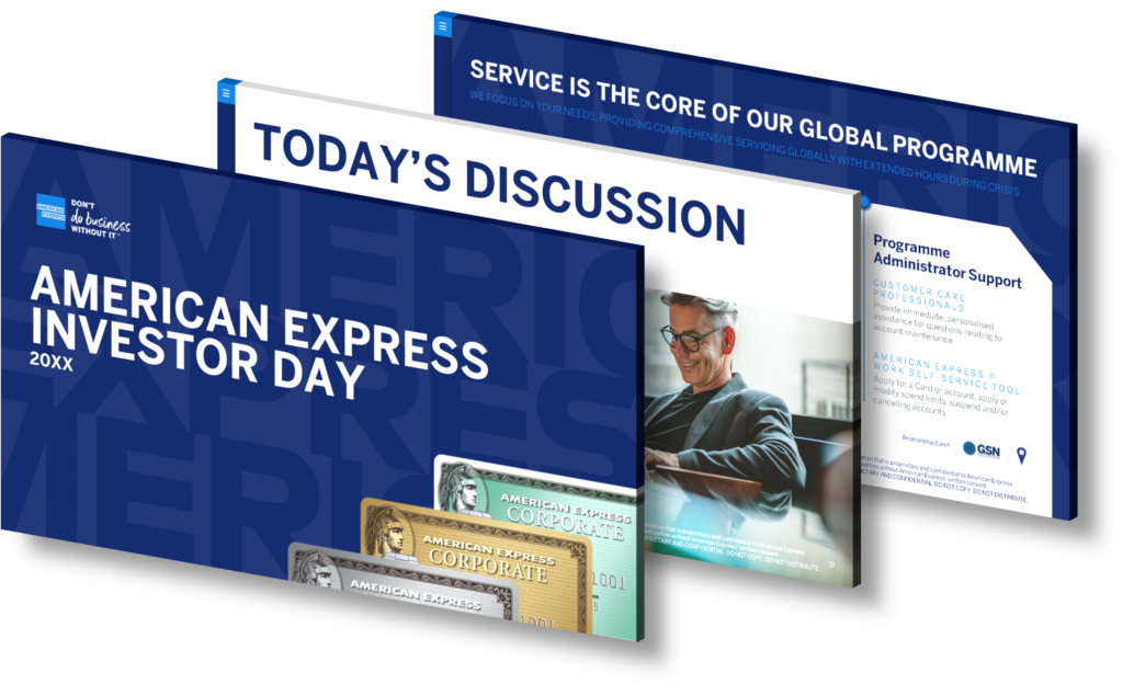
What are creative ways to visualize forward-looking statements in business presentations?
Visualizing forward-looking statements in business presentations can significantly enhance understanding and engagement. One creative approach is to utilize timelines that illustrate projected milestones and key metrics over time, making it easier for the audience to grasp the trajectory of growth or change. Incorporating infographics can also be highly effective; using charts, graphs, and icons helps distill complex data into digestible visuals. Another method is scenario modeling through interactive elements where viewers can explore different outcomes based on varying assumptions. Additionally, storytelling techniques can bring these statements to life by framing them within real-world contexts or hypothetical situations that resonate with your audience. Using color coding and contrasting design elements can further emphasize critical points while maintaining a cohesive aesthetic throughout your presentation.
View Our Presentation Portfolio

How can you effectively visualize forward-looking statements in business presentations?
Effectively visualizing forward-looking statements in business presentations requires a strategic approach to enhance clarity and impact. Start by selecting the right format for your data; consider using line graphs, bar charts, or infographics that can effectively depict trends and projections over time. Each visualization should be accompanied by concise labels and legends to ensure your audience understands the context without confusion.
Utilize color coding to differentiate between various scenarios such as best-case, worst-case, and likely outcomes. This not only makes the information more digestible but also highlights potential risks and opportunities. Incorporating icons or symbols can further aid in breaking down complex concepts into easily understandable visuals.
When presenting these statements, it’s essential to narrate a compelling story around the data you are displaying. Connect the visual elements with verbal explanations that outline key assumptions behind your projections, ensuring that stakeholders grasp both the numbers and their implications clearly.
Lastly, engage your audience with interactive elements if possible—like clickable charts or dynamic models—that allow them to explore different scenarios themselves. This not only maintains interest but also enhances understanding of forward-looking statements beyond mere numbers.
View Our Presentation Portfolio

What are innovative ways to visualize financial results and sustainability efforts in business presentations?
Visualizing financial results and sustainability efforts in business presentations requires creativity and a strategic approach to effectively communicate complex data. Here are several innovative techniques to consider:
- Infographics: Utilize infographics to present key financial metrics and sustainability initiatives. By combining visuals with concise text, you can make data more digestible and engaging for your audience.
- Data Visualization Tools: Leverage tools like Tableau or Microsoft Power BI to create interactive charts and graphs. These tools allow for real-time data manipulation, making it easier for stakeholders to explore different scenarios.
- Sustainability Dashboards: Create dashboards that visually represent your company’s sustainability metrics alongside financial performance indicators. Use color coding (e.g., green for positive impact, red for areas needing improvement) to highlight trends at a glance.
- Storytelling with Data: Frame your presentation around a narrative that connects financial success with sustainability achievements. This approach helps the audience understand the broader implications of the numbers presented.
- Circular Diagrams: Employ circular diagrams or pie charts to illustrate how various aspects of your business contribute to both profitability and environmental responsibility, emphasizing the interconnectivity between them.
- Simplified Charts & Graphs: Choose simple yet effective chart types—like bar graphs or line charts—to depict trends over time clearly. Avoid clutter; focus on one key message per visual element.
The goal is not just to show numbers but also to tell a compelling story about how financial outcomes align with your commitment towards sustainability. By presenting this information innovatively, you can foster greater understanding and engagement among stakeholders regarding both fiscal health and corporate responsibility.
How can businesses effectively visualize HPE SimpliVity’s HyperGuarantee benefits in infographics or presentation slides?
Effectively visualizing HPE SimpliVity’s HyperGuarantee benefits in infographics or presentation slides involves a strategic approach that combines clarity, engagement, and persuasive design elements. Start by identifying the key benefits of HyperGuarantee such as data efficiency, simplified management, and cost savings. Use concise bullet points to summarize these benefits clearly.
Incorporate relevant visuals like icons or diagrams that represent each benefit visually; for instance, use a dollar sign icon for cost savings or a clock to signify time efficiency. Employ contrasting colors and typography to differentiate sections while maintaining brand consistency with HPE’s color palette.
Utilize charts or graphs to present quantitative data related to performance improvements achieved through HyperGuarantee—this makes the information digestible at a glance. For instance, comparing traditional infrastructure costs versus those with SimpliVity can be impactful when shown in bar chart format.
Lastly, ensure your layout is clean and organized; whitespace can enhance readability and focus on key messages without overwhelming your audience. Engaging storytelling techniques can also help frame the information within real-world scenarios where businesses have successfully leveraged these benefits.
View Our Presentation Portfolio
