How do customizable PDF templates ensure brand consistency for mobile app firms during key investor presentations?
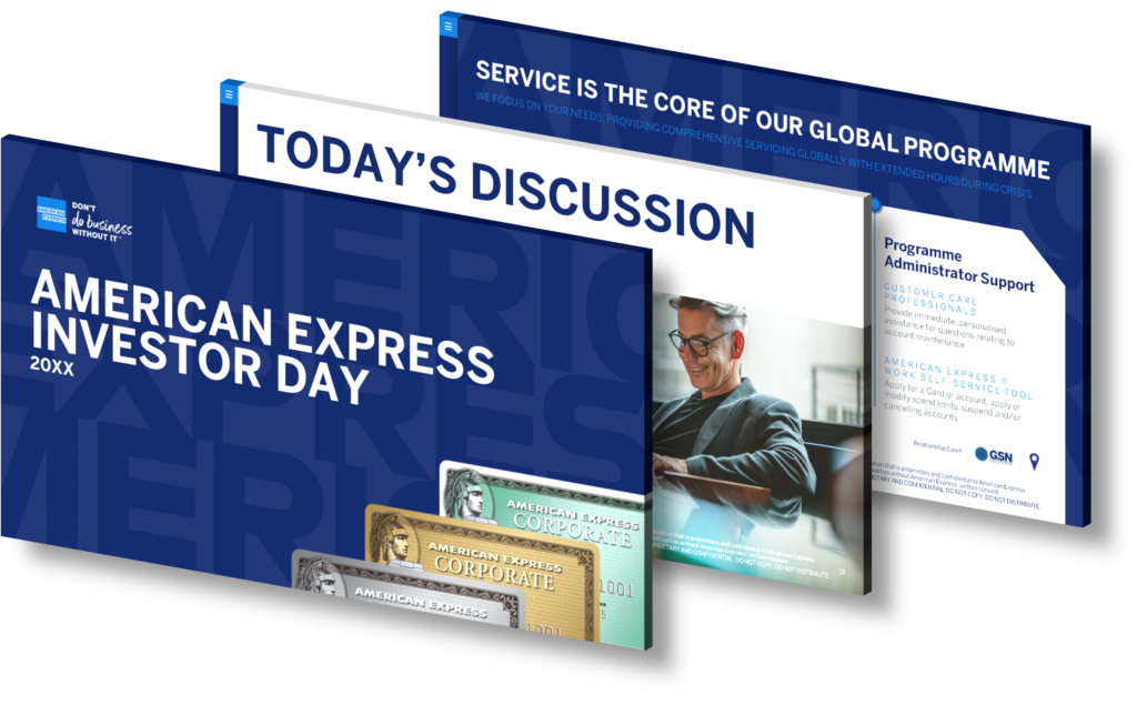
Customizable PDF templates play a crucial role in ensuring brand consistency for mobile app firms during key investor presentations. They serve as a powerful tool to maintain a uniform look and feel across all your presentation materials, which is essential in promoting a consistent and recognizable brand image.
Firstly, these templates allow you to incorporate your brand’s key visual elements such as your logo, color scheme, typography, and other design components. This consistent visual representation strengthens your brand identity and reinforces your brand message throughout the presentation.
Secondly, customizable PDF templates help in standardizing the format and structure of your presentations. They ensure that every slide follows a similar layout, style, and tone, making your presentations more professional and coherent.
Additionally, these templates save you time and resources. Instead of creating presentations from scratch, you can use the same template, modifying the content as per the requirements of each investor meeting. This not only maintains brand consistency but also ensures that your presentations are always ready and up-to-date.
Lastly, using customizable PDF templates reduces the chances of error and inconsistency. Since the design elements are pre-set, you don’t have to worry about misaligned logos, incorrect colors, or different fonts appearing in your presentation, thereby guaranteeing a consistent brand experience.
In conclusion, customizable PDF templates are an essential tool for mobile app firms to maintain brand consistency, enhance their professional image, and leave a lasting impression during key investor presentations.
View Our Presentation Portfolio

How can financial firms leverage collaboration tools to simplify complex data for impactful client presentations?
Financial firms can significantly benefit from the use of collaboration tools to simplify complex data and make their client presentations more impactful. These tools provide a platform for real-time information sharing, brainstorming, and co-creation of presentation materials, which are crucial in maintaining data accuracy and consistency.
One of the main advantages of using collaboration tools is the ability to break down complex financial data into understandable data visualizations. Through dynamic graphs, charts, and dashboards, these tools can transform complicated data sets into visually appealing and easy-to-understand information. This can greatly help in effectively communicating key insights and conclusions to clients.
Collaboration tools also offer various features that improve productivity and efficiency. For example, version control features allow team members to work on the same presentation simultaneously, reducing duplication of efforts. Furthermore, these tools often come with cloud-based storage, enabling easy access to presentation materials anytime, anywhere. This can be particularly useful for financial firms with multiple branches or those that often do remote presentations.
Moreover, collaboration tools can foster a more engaging and interactive presentation experience. Through features like real-time commenting and voting, clients can actively participate during the meeting, making them feel more involved in the process. This can lead to better client engagement, increased understanding, and ultimately a more successful presentation.
At SlideGenius, we understand the importance of effective data presentation in the financial industry. Our team of expert designers and consultants can help you leverage collaboration tools to deliver compelling and impactful presentations. We can guide you in choosing the right tool, creating visually stunning data visualizations, and crafting a clear and concise narrative that resonates with your clients.
View Our Presentation Portfolio

How do interactive visualizations boost clarity and engagement in financial presentations for C-suite in Healthcare Analytics?
Interactive visualizations significantly enhance clarity and engagement in financial presentations for the C-suite in Healthcare Analytics. They function as a powerful tool for communicating complex data and information in an easy-to-understand format. This is particularly critical in healthcare, where large sets of data are often analyzed and presented.
There are several reasons why interactive visualizations are beneficial:
1. Simplify Complex Data
Healthcare Analytics often involves complex data that can be challenging to understand. Interactive visualizations simplify such data, turning it into coherent and digestible information. These visual tools, such as charts, graphs, and infographics, can illustrate trends, patterns, and insights that might otherwise be difficult to perceive.
2. Enhance Engagement
Interactive visualizations encourage active participation from the audience. With elements that can be clicked, dragged, or hovered over, they offer a more engaging experience than static visuals. This interactivity can help maintain the attention of the C-suite, making them more likely to absorb and remember the information presented.
3. Enable Customization
One of the primary advantages of interactive visualizations is the ability to customize the view based on the viewer’s preferences or needs. This feature allows executives in the C-suite to focus on specific data points or aspects that are most relevant to them, enhancing the effectiveness of the presentation.
4. Foster Better Decision Making
By providing a clearer picture of complex data sets, interactive visualizations can aid in making informed decisions. They highlight important trends and patterns that can guide strategic planning and decision-making processes in Healthcare Analytics.
In conclusion, interactive visualizations serve as a bridge between complex financial data and the executives who need to understand this information to make strategic decisions. They turn abstract numbers into tangible visuals, making data more accessible, comprehensible, and engaging.
View Our Presentation Portfolio

What strategies ensure consistent brand identity in 30-60-90 day sales plans for mobile app pitches to new clients?
To ensure a consistent brand identity in 30-60-90 day sales plans for mobile app pitches to new clients, you should follow a number of strategic steps. These steps will help maintain your brand’s image, message, and identity throughout the entire sales plan.
Understanding Your Brand
Firstly, you need to have a clear understanding of what your brand is, what it stands for, and how it is perceived by your target audience. This involves defining your brand’s mission, vision, values, personality, and unique selling proposition. You should be able to articulate these aspects clearly and consistently in all your communications, including your sales pitches.
Consistency in Visual Identity
Consistency in your brand’s visual identity is crucial. This includes the logo, color scheme, fonts, and imagery. You should ensure that these elements are used consistently across all materials and touchpoints, including your sales plans and pitches. This will help your brand to be instantly recognizable and memorable.
Messaging Consistency
Your brand messaging should also be consistent. This means that the benefits and value that you are promising to your clients should remain the same throughout the 30-60-90 day sales plan. This messaging should be reinforced at every stage of the plan to build trust and credibility with your clients.
Align Sales Strategies with Brand Values
Next, ensure that your sales strategies align with your brand values. Your sales tactics should reflect what your brand stands for. For example, if your brand values transparency and honesty, your sales strategies should not involve aggressive or manipulative tactics.
Customer Experience
Finally, prioritize the customer experience. Every interaction that a client has with your brand should reinforce your brand identity. This means delivering on your brand promises, providing excellent service, and creating positive experiences that align with your brand’s image.
Measure and Adjust
Lastly, measure the effectiveness of your sales plan and adjust as necessary. Use analytics to understand how well your brand identity is being communicated and received. If something isn’t working, don’t be afraid to adjust your strategy.
By following these strategies, you can ensure that your brand identity remains consistent throughout your 30-60-90 day sales plans for mobile app pitches to new clients.
View Our Presentation Portfolio

How can digital marketing sales teams boost stakeholder engagement at virtual events using collaboration tools?
Digital marketing sales teams can enhance stakeholder engagement at virtual events using collaboration tools in many ways. These tools enable real-time interaction, encourage active participation, and facilitate seamless communication, which are all key to engaging stakeholders.
Firstly, live chats and Q&A sessions can be utilized to foster interaction. These features allow attendees to ask questions and provide feedback during the event. It not only makes them feel heard but also offers valuable insights to the team.
Breakout rooms can be used to split large groups into smaller ones for more focused discussions or brainstorming sessions. This can increase participation as attendees might feel more comfortable speaking up in a smaller group setting.
Moreover, polls and surveys can be leveraged to gauge attendees’ opinions and preferences. Immediate visibility of the results can spark further discussion and keep the audience engaged.
Screen sharing and whiteboarding can be employed for more interactive presentations. Screen sharing allows presenters to visually walk attendees through a concept or process, while whiteboarding can be used for collaborative brainstorming or problem-solving sessions.
Document collaboration tools allow multiple people to work on the same document simultaneously, making it easier to collaborate on projects or proposals during the event.
By using these features strategically, digital marketing sales teams can ensure the virtual event is not just informative, but also engaging and interactive, thus boosting stakeholder engagement.
At SlideGenius, we specialize in creating engaging and professional presentations that can be seamlessly incorporated into your virtual events. We understand the power of effective communication and can help you deliver your message in a compelling and memorable way.
View Our Presentation Portfolio

How can executives leverage interactive visuals to simplify financial data for impactful quarterly earnings presentations?
Executives can significantly leverage interactive visuals to simplify financial data for impactful quarterly earnings presentations. The key is to transform complex financial data into visually engaging, easily digestible content that effectively conveys the company’s performance and future strategies.
Use of Charts and Graphs
The first step is using charts and graphs. These visuals can represent large amounts of data cohesively, making it easier for the audience to understand trends, comparisons, and patterns. For instance, line graphs can be used to show changes over time, bar graphs can compare different groups, and pie charts can show parts of a whole. Remember, the choice of chart or graph should align with the type of data you’re presenting.
Interactive Dashboards
Interactive dashboards are another effective tool. They allow the audience to filter and drill down the data according to their interests. This can help engage your audience, as they can interact with the data and gain a deeper understanding of the information you’re presenting.
Data Visualization Tools
Utilizing data visualization tools can also be beneficial. These tools can transform raw data into engaging visuals, helping to highlight key points and insights. They can also provide real-time updates, ensuring the data is always current. These tools often come with customizable templates, making it easy for anyone to create professional and engaging visuals.
Infographics
Infographics are another great way to simplify complex data. They combine visuals with minimal text to provide a clear and concise overview of the data. Infographics can be used to highlight key points, show processes, or provide a summary of the data.
Animations and Videos
Animations and videos can also be used to simplify financial data. They can bring data to life and provide a dynamic and engaging presentation. They can be particularly effective when explaining complex concepts or processes.
Regardless of the tools and methods used, the goal should always be to present the data in a simplified, engaging, and interactive way. This can help to ensure your audience understands and retains the information, leading to more successful and impactful earnings presentations.
View Our Presentation Portfolio
