

We here at SlideGenius have witnessed far too many glaring mistakes on homemade PowerPoint presentations that make us want to pull our hair out. Unfortunately, what seems like common sense to us concerning what and what not to do with slide design is often lost on amateur PowerPoint creators.
When giving a corporate presentation (or a presentation of any importance, for that matter), we highly recommend going to the pros and employing the expertise of a PowerPoint specialist, but when you decide to do it yourself, here are some Do’s and Don’ts to pay attention to on your slides.

Text:
DO: Keep it simple and concise. Your audience should be listening, not reading.
DON’T: Avoid using your slides as your notes to read off of. Your slides are there for your audience, not you.
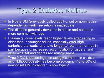
Color:
DO: Use color in the background of your slides to emphasize emotion. Be creative, but conservative. Check out our full post on color psychology for specifics.
DON’T: Be wary about making your background and text color too similar. There’s nothing more amateur than showing up with an illegible PowerPoint presentation.
Statistics:
DO: Simplify, break them up. Visually represent if possible. Avoid unless they’re a key part of your message.
DON’T: Tables, don’t use them to present information. Feather pillows are less conducive to sleep than a table full of figures to an audience.
Creativity:
DO: If you’ve had experience with graphic design, this can be utilized to make your presentation much more engaging. Presenting information in unique ways can keep your audience’s attention much more effectively.

DON’T: You won’t impress anyone with your knowledge of how to make the words zoom across the page at the beginning of each slide. Don’t go overboard with animations, because they’re often more distracting than anything else.
While it’s fun to be creative and experiment with new design methods, it’s important to remember that a PowerPoint presentation is not a work of art, it’s a tool used to convey information. High-end designing is best left to the professionals.


