
All the numbers, figures, facts and stats that you gathered for your professional presentation are all useless…let me tell you why.
Let me explain through this: “If a tree falls in a forest and no one is around to hear it, does it make a sound?” My answer to that philosophical question would be “who cares?” If the tree is not in my sight, my space, causing me any problem, or bringing me any benefit, why am I interested?
Much like that tree, and its sound or soundless noise, is of no direct interest to me, neither is your data, at least not yet. At the moment, your data is like that tree, it is a vague and irrelevant issue to the typical audience member. They don’t see, hear, feel, or need the sound or the tree, so to them, it is useless. The only way your complicated bar charts, pie graphs, numbers or percentages (your tree, if you will) will make me care is if they are relevant to me. The first step to relevance is making your data understandable.
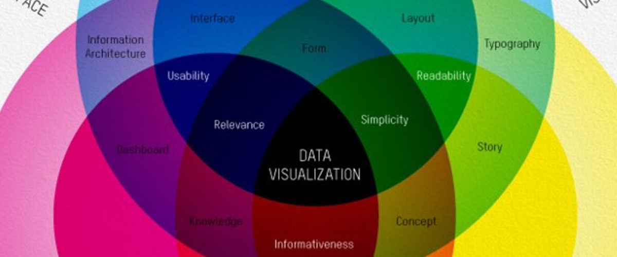
What is data visualization?
Data Visualization is the idea of visualizing data away from your computer and in so doing, making sense of your complex issues. Once your audience can make sense of your data, they can begin to see any personal relevance or interest in it. This is where data visualization comes in again.
Data visualization has the power to harness the relationships of meaning, cause and dependency. These three elements are what people use to judge personal relevance and interest on. If your audience understands the true meaning of what your showing, then sees what it can cause, or has caused to them personally, and finally understands that the next move is dependent on them, then you will have effectively made your data useful.
How to visualize your data
Extract the data from your current line graph, bar graph, pie chart, statistics or whatever medium you are displaying your data through. Then take a relevant photograph, or drawing, or design, and incorporate the data in it. For example:
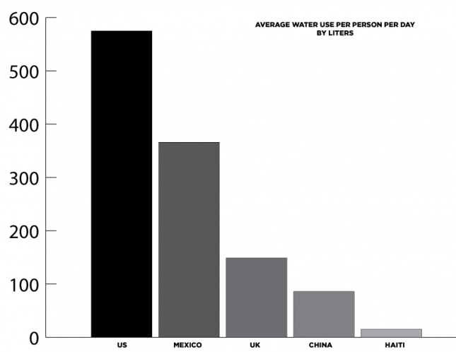
“… it’s another to see those bar charts shown as cups of water filled to different levels.”
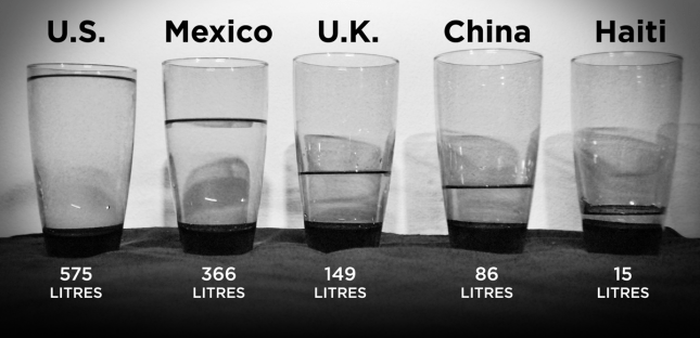
The key point to understand with this is that the design is meant to support and complement the data. For example:
- data on football fan attendance visualized by having fans hold up helmets to make a bar chart;
- data on declining education budgets visualized as a bar chart traced in the dusty rear window of a preschool;
- data on increasing dental costs can be visualized in a toothpaste line graph on a dollar bill
Additionally it is essential to focus on the central aspect of the visual. Whether it may be photography, hand drawn art, or a mix of the two, be sure it is good quality. Check the lighting, the picture quality, contrast, etc. Keep the photo free of extraneous elements; they will only confuse the audience. Take you base piece and add some descriptive text and a title in an image-editing program. Pretend it is your original chart or graph.
Science behind visualizations
These visualizations are effective interesting because as humans, we are not yet hardwired to understand and compute the things we see on screens and on paper. We are built to understand the real world, and we are very good at evaluating the things in it, and this lends an immediate grasp of the subject that rectangles on a screen sometimes can’t imitate.
Work Cited:


