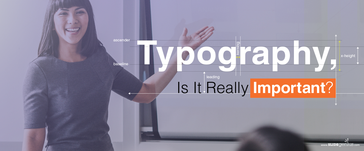
Typography is one of the most overlooked aspects of presentation design, yet it plays a critical role in how your message is received. The typefaces you choose, the spacing, and the overall presentation of your text can make a significant difference in readability, professionalism, and the effectiveness of your slides. Good typography ensures that your content is both legible and visually appealing, while poor typography can distract from your message.Here’s why typography is important in presentations and how to use it effectively:
1. Enhances Readability
The most fundamental role of typography is to make your text easy to read. If your audience can’t read your slides easily, they’ll miss out on key information. The right choice of font, size, and spacing ensures that your message is accessible and clear.How It Helps:
- Font Choice: Use fonts that are easy to read at a distance. Sans-serif fonts like Arial, Calibri, and Helvetica are generally more readable on screens than serif fonts.
- Font Size: Ensure your font size is large enough to be legible for everyone in the room. A minimum size of 24pt is recommended for most presentation text.
- Line Spacing: Adjust the spacing between lines to avoid overcrowded text. Proper spacing makes your slides easier to read and digest.
Example: A corporate presentation on a large screen should use a sans-serif font like Calibri, with text size at least 28pt for body text and 36pt for headings.
2. Conveys Tone and Personality
Typography can communicate more than just words—it can also convey the tone and personality of your presentation. Different fonts and styles evoke different emotions and set the tone for your message.How It Helps:
- Formal vs. Informal: Serif fonts like Times New Roman or Georgia convey a more traditional, formal tone, while sans-serif fonts like Arial or Helvetica feel more modern and casual.
- Consistency: Using consistent typography throughout your presentation creates a cohesive look, which enhances the professional feel of your presentation.
Example: If you’re giving a formal financial report, using a classic serif font for headings paired with a clean sans-serif font for body text can strike the right balance between professionalism and readability.
3. Draws Attention to Key Points
Typography can be used strategically to emphasize important points or guide the viewer’s attention to critical elements of your presentation. Bold fonts, contrasting colors, or larger text sizes can highlight key messages.How It Helps:
- Hierarchy: Use different font sizes and styles to create a hierarchy on your slides. Titles should be the largest, followed by subtitles, and then body text. This structure helps guide the audience’s eyes to the most important information.
- Contrast: Use contrasting font styles or weights (bold vs. regular) to differentiate between points and draw attention to critical information.
Example: In a marketing pitch, bold the key takeaway in a larger font size to make it stand out from the rest of the slide.
4. Improves Aesthetic Appeal
Well-chosen typography can make your presentation look polished and professional, while poor typography can make it look cluttered or amateurish. A clean, visually appealing layout helps engage your audience and makes your presentation more enjoyable to follow.How It Helps:
- Visual Harmony: Consistent fonts, spacing, and alignment create visual harmony in your slides. Avoid mixing too many font styles, which can make your presentation feel chaotic.
- White Space: Good typography often goes hand-in-hand with the effective use of white space. Plenty of space around text improves readability and gives your slides a cleaner, more modern look.
Example: Choose one or two fonts to use throughout your presentation—one for headings and another for body text—and make sure they complement each other for a unified look.
5. Supports Branding
Typography plays a crucial role in reinforcing your brand’s identity. Consistent use of brand fonts helps your presentation align with your company’s overall visual style, making it more memorable and professional.How It Helps:
- Brand Consistency: If your company has specific fonts for branding, use them in your presentations to maintain consistency with other marketing materials.
- Builds Recognition: Over time, using the same typography across all company presentations helps reinforce brand recognition and trust.
Example: If your company’s website and marketing materials use a specific font, ensure that same font is used in your presentations to create a consistent brand experience.
6. Reduces Cognitive Load
When typography is used effectively, it reduces cognitive load for your audience. Clear, well-structured text helps the brain process information more efficiently, allowing your audience to focus on the content rather than struggling to decipher the text.How It Helps:
- Minimizes Distraction: Poor typography, such as overly decorative fonts or inconsistent text alignment, distracts the audience. Well-chosen typography ensures the focus stays on the message.
- Enhances Focus: Clear, clean typography helps your audience process and retain the information more easily, enhancing the overall impact of your presentation.
Example: Avoid using overly decorative or script fonts for body text, as these can be hard to read and may distract from your core message.
Final Thoughts
Typography is a powerful yet often underestimated tool in presentations. It not only enhances readability but also sets the tone, emphasizes key points, and supports your brand. By using clean, consistent typography, you can improve the aesthetic appeal and effectiveness of your presentation, ensuring that your audience stays engaged and understands your message.