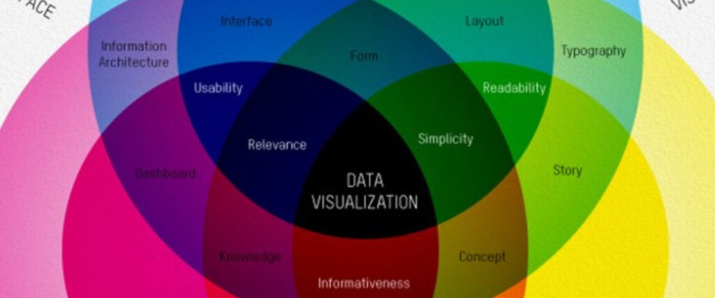
In today’s information-driven world, data plays a crucial role in decision-making. However, raw data alone can overwhelm or confuse an audience, especially during presentations. Data visualization is the solution. It transforms complex data sets into visual formats that are easier to understand, interpret, and act upon. Charts, graphs, infographics, and maps make large amounts of information digestible, enabling you to convey key insights quickly and effectively.Here’s why data visualization is essential in presentations:
1. Simplifies Complex Information
Raw data can be intimidating, especially in large quantities. Data visualization helps simplify complex information, allowing the audience to grasp key points without having to sift through numbers.Why It’s Important:
- Improves Understanding: Visual representations of data are easier to interpret, making complex information more accessible.
- Clarifies Patterns: Charts and graphs can reveal trends, correlations, and outliers that might be missed in raw data.
Example: Instead of showing a spreadsheet filled with sales data, a line graph can illustrate the upward trend in sales over the last year, making it easier for your audience to spot patterns.
2. Engages Your Audience
Presenting data in a visual format helps break up text-heavy slides and keeps your audience engaged. Visuals are more stimulating than rows of numbers and can capture attention more effectively.Why It’s Important:
- Enhances Engagement: Visuals are processed faster by the brain than text, keeping your audience more focused and attentive.
- Increases Retention: People are more likely to remember information presented visually than through text or spoken word alone.
Example: Using a pie chart to show market share distribution among competitors grabs attention more effectively than listing percentages in bullet points.
3. Highlights Key Insights
Data visualization helps presenters emphasize the most important data points and insights. By visually highlighting trends or critical metrics, you can guide your audience’s attention to the key takeaways.Why It’s Important:
- Focuses Attention: Visuals direct the audience to the most significant data points without requiring them to sift through irrelevant information.
- Increases Persuasiveness: Well-designed visuals can strengthen your argument by making data more compelling and easier to understand.
Example: A bar chart comparing the revenue growth of two products can make it obvious which product is performing better, allowing the audience to quickly grasp the comparison.
4. Makes Data More Persuasive
Numbers can be powerful, but they are even more impactful when presented visually. Data visualization allows you to build a more convincing narrative by backing up your points with clear, compelling data.Why It’s Important:
- Builds Credibility: Visualizing data makes your information look more professional and trustworthy.
- Increases Persuasion: Seeing data in a chart or graph format can make your argument more convincing to the audience.
Example: Showing a decline in customer complaints via a line graph over time reinforces the success of a customer service initiative.
5. Saves Time
Data visualization allows you to communicate more information in less time. Instead of explaining data point by point, a chart or graph can instantly convey key trends or comparisons, making your presentation more efficient.Why It’s Important:
- Increases Efficiency: Visuals convey a lot of information at a glance, saving time for both you and your audience.
- Improves Focus: You can present the core insights without overwhelming your audience with data overload.
Example: A heatmap showing regional sales performance allows the audience to instantly see which areas are underperforming without the need for lengthy explanations.
Final Thoughts
Data visualization is essential for making your presentation clear, engaging, and persuasive. It simplifies complex information, grabs attention, highlights key insights, and saves time for both presenters and audiences. Whether you’re presenting financial reports, marketing metrics, or operational data, using visual aids like graphs and charts will help you deliver your message effectively.
The Do’s and Don’ts of Slide Design
Slide design plays a critical role in the success of any presentation. Well-designed slides enhance your message, making your content more engaging and easier to understand. However, poor slide design can confuse or distract your audience, taking away from the effectiveness of your presentation. To ensure that your slides are helping, not hindering, your message, it’s important to follow a few key design principles.

