
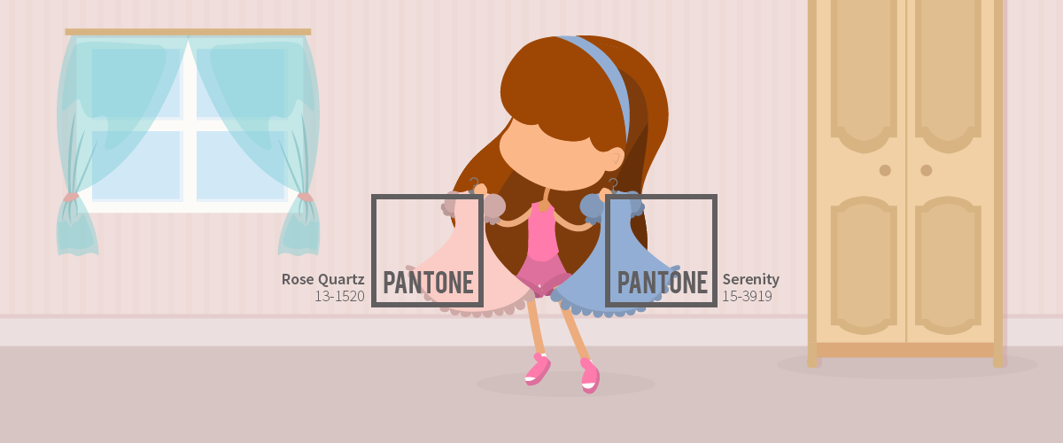
Pantone, the world’s leading authority on color and provider of color systems, surprised the world when it announced two colors for 2016’s Color of the Year.
Rose Quartz (Pantone 13-1520) and Serenity (Pantone 15-3919) made their way to the world of fashion and design for spring and summer. They create a secure and calm feeling when used both individually and together. These colors offer gentle color pairings. They also came with eight color templates you can use as a reference.
Play around with these colors’ contrast, balance, and harmony using the free color templates provided by Pantone on their Web site.
Peaceful and Inspirational: Rose Quartz and Serenity

Garr Reynolds, best-selling author and presentation consultant, explains in his article on TechRepublic how color can enhance your deck by calling up specific emotions. In this case, the pair of Rose Quartz and Serenity is reminiscent of dawn. This time of day is usually used as a metaphor for new beginnings and visually cues your audience to enter a more contemplative state.
According to Leatrice Eiseman, Executive Director of Pantone Color Institute:
“… Rose Quartz and Serenity demonstrate an inherent balance between a warmer embracing rose tone and the cooler tranquil blue, reflecting connection and wellness as well as a soothing sense of order and peace.”
Invoke the peaceful and relaxing imagery of dawn using Rose Quartz and Serenity for your pitch. Study your deck’s narrative carefully and decide if the theme fits the imagery these pastel colors evoke.
Rose Quartz and Serenity Color Templates
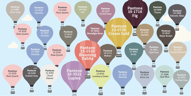
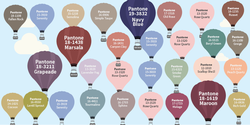
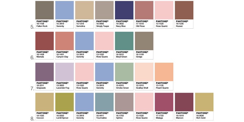
These color templates provided by Pantone suggest other possible color pairings that’ll work very well with the Color of the Year. Notice how shades of gray appear prominently in all of the swatches. Gray is a neutral color placed strategically to prevent other colors in the palette from overpowering Rose Quartz and Serenity.
Something else to take note of is that a color other than the two is allowed to stand out. In the first set of palettes, this is Fig; in the second set, it’s Cream Gold. Then Blooming Dahlia, Lupine, Navy Blue, Marsala, Grapeade, and Maroon. Most of these colors are variations of violet or purple, colors created by a mixture of red and blue. Secondary colors mixed with these colors don’t overpower Rose Quartz and Serenity but highlight them further.
Rose Quartz and Serenity can complement your brand color especially if it runs along the shades of purple or violet. Complement your brand color with some of the free Pantone palette suggestions. A cool color like Serenity or Rose Quartz in the background of your slide will make the color recede, bringing forward the foreground as the focus. Use a dark, warm color for your text in the foreground, like Fig (Pantone 19-1718), so that your text moves forward visually and contrasts with your background for better readability.
These color combinations should inspire you to look at your brand from a different perspective. Achieve balance and mindfulness with the help of Rose Quartz and Serenity.
Attain Balance and Harmony
These colors exemplify the concept of duality. They are carefully balanced opposing forces. Ancient philosophy talks about this relationship at much length, but what we can take from it is that balance is important to keep things in order.
Warm and cold colors are tricky to get right, but you can’t go wrong with Pantone’s complementary color pairing since they‘re taken from nature’s very own palette. Color harmonies are pleasing to the eyes, which can help the audience engage with your content further.
Create a sense of order and harmony with your deck’s brand colors. Balance it with the Rose Quartz and Serenity palette to highlight it further and enhance your own brand’s color scheme.
Experiment with Color

The Pantone Color of the Year encourages you to be bolder with your perception of color and the role it has in shaping your environment. Rose Quartz and Serenity take a cue from nature in order to build a soothing atmosphere for your pitch.
Invite the audience to relax and engage effortlessly to your content by using the Color of the Year to highlight your brand’s color palette. Determine if the color templates provided by Pantone will suit your brand’s direction and narrative. The contemplative and peaceful aura the colors evoke might not be what your company needs right now.
Order, balance, and harmony are all the key qualities this color pairing provides. Associate your message with these qualities as you see fit.
References:
Reynolds, Garr. “10 Slide Design Tips for Producing Powerful and Effective Presentations.” TechRepublic. September 19, 2006. www.techrepublic.com/article/10-slide-design-tips-for-producing-powerful-and-effective-presentations/6117178
“About PANTONE.” About Us. www.pantone.com/about-us
“Introducing Rose Quartz & Serenity.” Pantone. www.pantone.com/color-of-the-year-2016


