Slidegenius, Inc.

Save Your Deck: Methods to Recover an Unsaved PowerPoint File

Sheer panic—that’s probably your first reaction when you realize that you couldn’t save the PowerPoint file you were working on. Maybe the power went out, or your computer unexpectedly crashed. Perhaps you were too preoccupied that you didn’t think to hit “Save.” Whatever the reason, you’ve suddenly lost hours of hard work and have no clue how to get it all back.
Luckily, there’s no reason to stress over losing an unsaved PowerPoint file. Using the latest versions of PowerPoint, you can easily retrieve and recover all your hard work. Follow these steps to recover a PowerPoint file you accidentally lost:

Need a Presentation Designed?
Click Here To View Our Amazing Portfolio!

Method One: Recover Unsaved Presentations

If you were interrupted before saving your PowerPoint file, you could simply look for it in the Microsoft Unsaved Files folder. Go to the File tab, make sure you’re on Recent, and click on Recover Unsaved Presentations. The icon is right below the list of folders under Recent Places.

Recover-Unsaved-Presentations

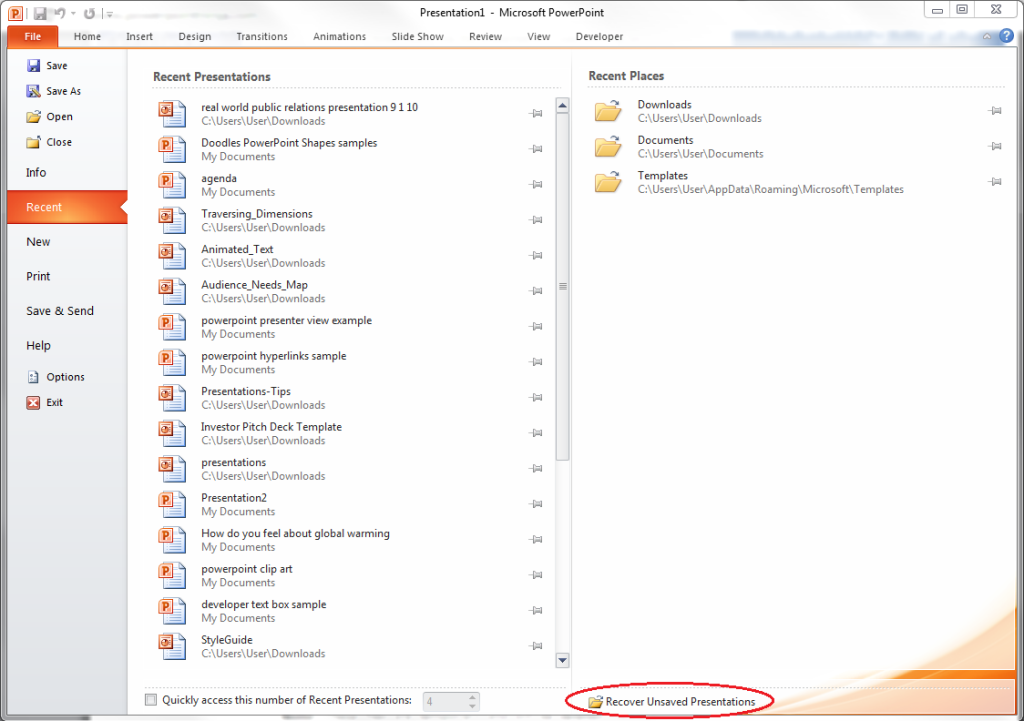
Everything in the Unsaved folder is a temporary file. Make sure you recover and save everything you need because you might lose it after a few days.

Method Two: AutoRecover

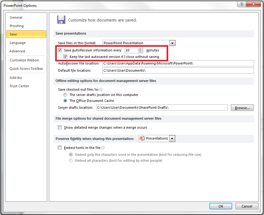
If you’ve been periodically saving your work but was interrupted before you could save specific changes, you can retrieve your PowerPoint file using the AutoRecover function. First, check if you have it enabled. Go to the File tab, click on Options and go to Save. Make sure your options are similar to those in this picture:
PowerPoint-Files-AutoRecover
If you don’t have AutoRecover enabled, there’s no other way to retrieve the changes you made to your PowerPoint file. You will have to redo your work from the last save. But if everything looks good, you can then follow these steps:
1.) Copy the file destination path in the same dialogue box.
PowerPoint-Files-AutoRecover-02
2.) Open Windows Explorer, paste the path on the address bar, and hit Enter.
PowerPoint-Files-AutoRecover-025
To avoid losing crucial information, ensure AutoRecover is enabled every time you create a PowerPoint deck.

Need a Presentation Designed?
Click Here To View Our Amazing Portfolio!

ConclusionSGBlog_SaveYourDeck_Supporting image_SG01_JE-01

Retrieving an unsaved PowerPoint file is a no-brainer as long as you know these basic recovery methods.
You can either open the “Recover Unsaved Presentations” found in the “Recent Places” or use the AutoRecover function to check where that unsaved document must be hiding.
Learn these tricks by heart so you don’t have to worry about getting your presentation back!

Twitter: Lessons from Social Media

If there is one social media platform that has changed the way we connect with the world around us, in only 140 characters or less, only one network comes to mind.

Twitter was founded all the way back in 2006, when social media started to take the tech world by storm. Like many young startups, Twitter’s popularity didn’t start growing until a few years later. It’s now one of the ten most visited sites on the Internet.

With over 500 million users and with over 400 million tweets sent daily, the platform has been noted as the “SMS” of the Internet. The application is simply designed to engage and connect users with hashtags and trending topics that spike during notable world events such as The Olympics
twitter follow me logo

Social media strategists now use Twitter to reinforce their client’s (or own brands) marketing efforts. They take advantage of the platform to boost their presence on the Internet. To successfully use Twitter there are a few rules and regulations one must follow. Some of these guidelines are also applicable in creating an effective PowerPoint presentation

If you pay attention, there are a few similarities between creating a well-rounded “tweet” and a successful presentation.

Step 1: Simplify Your Thoughts

A tweet can only be 140 characters or less. This means your information has to be condensed and minimized to fit this requirement. A great presentation is one that is simplified. It only has minimal bullets, text, images, and animation.

Overloading your audience with too much of these will distract them from understanding your content. Before you go ahead and add extreme fonts or a fancy template, think about how less is more and how this can positively affect your presentation.

Step 2: Get With What’s Trending

Twitter is known for staying on top of prominent world topics with phrases or words that are “trending” or being tweeted by many users. Try to apply this concept to your presentation ideas. Utilize culturally in tune twitter trendsgraphics, stories or videos within your presentation to better speak to your audience. Stay on top of the news and understand what’s going on in your audience’s culture. What do they know? What do they believe in? Knowing this ahead of time will allow you to connect with your audience at a higher level.

Step 3: Get Your Audience to Follow

Within the Twitter world, your “followers” are the equivalent to your friends on Facebook or connections on LinkedIn. You have to constantly engage and entertain your audience or followers if you want them to keep following. The same can be said for presentations.

You want to be constantly interacting with your audience the entire time. Ask them questions. Pause at the end of presentations to get feedback from them. You have to appeal to your audience over everything, if not you are basically speaking to an empty room.


References

“Keeping Your Audience in Mind : The 4 Essential Questions.” SlideGenius, Inc. December 11, 2013. Accessed January 23, 2014.
“Study Shows Simplicity Is Key When Creating a PowerPoint Presentation.” SlideGenius, Inc. July 24, 2013. Accessed January 23, 2014.
Twitter. Accessed January 23, 2014.

Oscar Speech Sounds A Lot Like…..

Cue the famed actresses in overly expensive ball gowns. Cue the undeniably sarcastic and quirky host. Cue the applauses. It’s awards season in Hollywood.

The most prestigious, of the film awards, is of course the much anticipated Oscars. Every year The Academy nominates a few fortunate actors and actresses who are praised for their works in major motion pictures. It is a special award that every actor dreams of receiving. Only a few, however, are lucky enough to actually walk on stage and accept the gold statue themselves. After the nerve-wracking tearing of the envelope the winners are then presented on stage to deliver a speech. This speech defines their Oscar moments even as it is only done in less than two minutes.

So what can we compare an Oscar speech to?


2cec8fb4-b84f-4918-94d1-1c27bb3e9fd3_fields

An Elevator Pitch

Short. Simple. Sweet. And most of all, straight to the point. An elevator pitch presents a product or service in as less time as possible – usually under two minutes.

An Oscar speech follows the similar concept. It delivered quickly, with the winner wrapping up his speech of gratitude and thanks in a very small amount of time. There are a few similar adjectives that we can use to compare a successful elevator pitch (which is usually paired with a PowerPoint presentation and a well rounded Oscar speech:

1. Short

An elevator pitch, just like an Oscar speech, should be between 30 seconds to two minutes. You should impose a strict time limit to your pitches. Drawing out your pitch will make your audience become disinterested in your points and, worse, stop paying attention.

As much as possible, get your points across swiftly and avoid using fillers. Condense your content into the simplest form possible within your pitch. Your goal is to allow audience to understand and learn.

movies-cuba-gooding-jr-oscar


2. Memorable

Like many elevator pitches that investors and or potential clients hear daily, there are dozens of Oscar speeches going on throughout the night of the Academy Awards. A good pitch is one that is unique and becomes memorable over the other various pitches, one that stands out.

If your idea gets lost in a blur with the rest, it wasn’t a very successful one. You always remember the most unique speech of the night when you watch The Academy Awards. The same can be said for the most unique and successful pitch.

 85th Annual Academy Awards - Show

3. Passionate

An effective acceptance speech is one that is delivered with passion and pride. It simply draws you in. You can apply the same principles to an elevator pitch.

While a well-rounded Oscar speech ends with a riveting and memorable closing line, your pitch should end with a passionate power statement. When delivering a pitch, you want to present yourself to your audience as being as credible as possible. You can earn your credibility by pitching with plenty of passion.

4a5222e0-6246-4c98-ad55-35d5da48bb87_hanks

References

Argetsinger, Amy. “Nine Oscar Speeches That Changed the World.” Washington Post. February 22, 2013. Accessed January 20, 2014.
Ums, Likes and You Knows: Avoiding Fillers in Your Presentation.” SlideGenius, Inc. August 21, 2013. Accessed January 20, 2014.

Olympians Can Teach Presenters a Thing or Two

Olympians are no ordinary athletes. They embody the qualities of an essential role model; an individual who represents their country and values in a positive and inspirational light. Not only are these characters unbelievably talented, but they are also a true description of a genuine champion.

With Sochi 2014 quickly approaching, Olympians from all corners of the globe will join together in Russia competing in various winter sports such as skiing, figure skating, snowboarding, and hockey. These athletes have devoted their months, and even years, to rigorous training and practice. Their hard work and dedication will soon pay off as the XXII Olympic Winter Games becomes their time to present.
sochi-2014-logo
Embracing the qualities that are associated with hardworking, well-respected Olympians will allow you to become a more effective presenter in the long run. Whether you’re speaking in front of a board of investors or pitching a sale to potential clients, perseverance and dedication will set you apart from the rest and allow your presentation to become effective and memorable.

There are a few questions to ask yourself before you step out on the ice or snow and present. These are the vital traits and questions Olympians from all backgrounds share in order to become gold medalists. Prior to your next PowerPoint presentation give yourself a few minutes to ask yourself these winning questions.

Have you trained adequately?

Olympians dedicate their entire lives in preparation for the big games. Long hours of training, dieting and exercise become their daily routine. A question to always ask yourself prior to your presentation is: How well prepared are you? Here are a few other guiding questions:

  • Will my audience be able to understand my main points?
  • Is this presentation marketable?
  • Does my pitch flow accordingly with my slides?

Do you have a strong will to win?

Olympians must have a passionate desire to go for the gold and win; take this mentality and apply it to your presentations. Though you may not necessarily, “win”, a gold medal you should have an aspiration to be the best, and be

Though you may not necessarily, “win”, a gold medal you should have an aspiration to be the best, and be your best. Your competition may not be visible at the time, but the audience will surely be comparing your presentation to other’s they’ve witnessed in the past.

Are you willing to accept the challenge?

Just as Olympic medalists overcome challenges during training and during the actual games, be prepared to accept any faults that may arise during your presentation. You might have a difficult question from an audience member or just a hard subject to tackle, in general, but going into the presentation with the mindset that things could, and may, go wrong will allow you to be better prepared.

You might have a difficult question from an audience member or just a hard subject to tackle, in general. But going into the presentation with the mindset that things could, and may, go wrong will allow you to be better prepared.

Are you Inspirational?

We’ve all be inspired by Olympic medalists such as, Gabby Douglas or Apolo Ohno, who’ve fearlessly decorated themselves with gold medals over the past years.

Learn from athletes like these, how can you inspire your audience? What makes your message different? What can you teach your audience? These concepts can push you in the right direction to be memorable, a concept that is crucial in presentation giving.


References

Sochi 2014.” Olympic.org. Accessed January 15, 2014.
Why Your Presentation Needs to Be These 3 Words.SlideGenius, Inc. January 5, 2014. Accessed January 15, 2014.

Overcoming a Public Speaking Disaster: A Lesson from Michael Bay

If you have been paying attention to recent pop culture news feeds lately, you may have heard of the phenomenon known as, “The Michael Bay Meltdown.”

During a Samsung CES press event that introduced their new 150-inch model television, the famed director was supposed to describe the product in detail. He started out great. When the teleprompter failed, however, he decided to just give up and casually walk off stage. If you haven’t had a chance to see the viral video, you can check it out here.


ioG2CaEgyEq8
The fear of speaking in front of many people is a fear that most of us share. Whether it’s in front of an audience of one or a few hundred, public speaking can be intensely nerve-wracking. It causes any normal human being to experience moments of sheer panic. The best ways to learn from your presentation mistakes are to actually make them and adhere to these changes later down the road.

Though Michael Bay blamed the teleprompter failing for his public speaking woes, being the presentation specialists that we are, there are various lessons to take away from his blunder that could have, and will happen, to any presenter at any time.

1. Don’t Memorize a Script

Memorizing a script isn’t always good when it comes to public speaking. Talking points are far different than following an actual script or prompt, and focusing on memorizing your verbiage will allow for more opportunities to slip up and freeze. Though you should always be prepared with a script, don’t focus on remembering your content word for word.

Try to focus on describing and elaborating your information with your slides. If you slip up or get lost, your slides are there to highlight your talking points and act as an outline — which is crafted in your storyboard. Improvisation is always a great alternative if you slip up!

The mistake that Michael Bay made was that he was so focused on doing a word for word delivery. Unfortunately, it only caused him to freeze up. If he had just improvised his speech, this would’ve helped him get past the situation.

2. Being Honest Will Help You in The Long Run

Everyone is bound to slip up and make mistakes, especially with public speaking. Apologizing to your audience and throwing in some laughter will show how honest and sincere you are – and this is key to being a credible presenter.

If you can’t remember what to say, or mess up your words, just laugh it off to ease the situation then apologize and move forward. Chances are your audience wouldn’t have even noticed! If you get frustrated, just take a deep breath and continue to speak. Just giving up and walking off stage like Michael Bay did shows a lack of maturity and preparation.

3. Own Up to Your Mistakes

Michael Bay made a monumental mistake by announcing to his audience that the teleprompter failed. Never let your audience become aware of your faults. This not only takes away your credibility but shows them that you are not responsible enough to fix the errors yourself.

If technical difficulties occur with the PowerPoint presentation, a public speaking professional will step up and engage with the audience until the problem is solved.

Conclusion

All in all, there is no way you can prevent a presentation or a public speaking disaster from happening. Things will go wrong, you’ll get nervous and forget your words sometimes. But giving up entirely is never the proper, or professional, solution.


Reference

Watch: Director Michael Bay’s CES Fail.” Bloomberg.com. Accessed January 13, 2014.

The Similarities Between Presentations and Advertisments : Super Bowl Edition

With Super Bowl XLVIII in the near future, this brings the excitement millions of Americans will come to share on February 2, 2014, as two national football teams will go head to head in one of the most highly televised programs of the year.

Apart from the notoriety of the game itself, between the AFC and NFC champions battling it out for the esteemed title, the Super Bowl is also known for creative, humorous advertisements that air during game breaks. We can expect to see some of the most well-known brands putting their best foot forward in their most ingenious and creative commercial installments of the year.

These infamous advertisements share various similarities to what can be described as successful and effective PowerPoint presentations. Compiling a presentation that speaks to your audiences and engages them is a similar concept that should be applied to distinguishing an innovative commercial that markets and intrigues viewers. Below are a few shared examples that both successful Super Bowl commercials and presentations have in common.

super bowl 48

Emotion Plays a Part

A good presentation is one that is memorable, and a memorable presentation is one that evokes emotion. Audience members are always captivated by content that is presented with emotion, which can be done by sharing a story or moving visuals. The same concept is applicable to an effective commercial as the brand’s focus is to connect with the audience on an emotional level. After all, the purpose of an advertisement is to sell. Appealing to the consumer’s emotion can make them feel connected to your product or message and in turn, generate sales.

Convey a Message

Every presentation should have a definitive message and this should be clearly repeated throughout your PowerPoint presentation. Having too many themes or conflicting ideas will leave your audience confused: you should attempt to actually teach them something. It’s important to stay on the same page with your audience throughout the entire presentation. The same can be said for a successful commercial, a good Super Bowl advertisement conveys a great message that not only covers what product or service it’s selling but the story behind it.

Become Memorable

Everyone’s favorite Super Bowl commercials are the ones they remember. Your PowerPoint presentation is a compilation of several different components, including graphics, statistics, bullets and talking points. As the presenter, it’s your job to carefully select these in order to project the purposes and themes you want your audience to remember overall. The most memorable Super Bowl commercial of all time was the Apple 1984 Introduction of the Mac Computer. You can watch the commercial here

What’s your favorite Super Bowl commercial? Comment below and tell us why!


References

Apple 1984 Super Bowl Commercial Introducing Macintosh ComputerYouTube. Accessed January 10, 2014.
Met Life StadiumAccessed January 10, 2014.

Maintain Audience Attention With This One Technique

Catching someone’s attention is one thing. Keeping them interested is another.

So here’s your challenge: What can you do to maintain audience attention? It’s almost an unmanageable task due to different factors. For one, every audience member analyzes and processes information differently. This makes appealing to all types of thinkers quite a daunting task.

Another issue is that people have this aversion to sales talks, even if you are simply selling them a particular idea, not a product. So above everything, it’s imperative that your audience learns something interesting about your message instead. There is one rule of thumb that can help you make sure your presentation is above all, understandable….

Put Yourself in Their Shoes


put_yourself_in_someone_shoes

When drafting up a presentation ask yourself this very simple question throughout the preparation of your PowerPoint. Will my points and train of thought be able to hold audience attention and keep them interested? Is this information useful to them? Is there too much content on this slide? Will they comprehend my message?

But placing yourself in the role of your audience will help guide you to think outside the box. Putting everything in their perspective, when you are outlining and creating your presentation, will not only help you cut down excess (and useless) information but also allow you to design a better PowerPoint.

Selfishness Hinders Audience Connections

While most of us subconsciously create our work in the mindset of thinking about us – think about them instead. Take this theory and apply this to your next presentation, you can practice it by going over your finished presentation and jot down notes at places you may think could use some editing and re-designing.

See if you are wholly interested throughout your PowerPoint presentation, and if your mind seems to wander at moments where information isn’t digestible or understandable. Take that into account because it is likely that your audience’s mind would wander at those exact same moments.

Conclusion

To maintain audience attention for a designated period of time does seem almost impossible. With breakthrough statistics categorizing the average adult attention span at a mere 5-12 minutes long, it makes sense for any professional presenter to panic. Sure, there are a few steps that you can take to enhance  your professional PowerPoint presentations. However, they don’t offer a real guarantee that you will be able to capture audience attention or make them comprehend your ideas completely.

Being able to communicate effectively is the single most important factor in presentation science, regardless of your topic or message, your audience needs to be on the same page as you.

References:

4 Types of Audience Members You Need to Present For.SlideGenius, Inc. November 13, 2013.
Vidyarthi, Neil. “Attention Spans Have Dropped from 12 Minutes to 5 Minutes — How Social Media Is Ruining Our Minds [Infographic].SocialTimes. December 14, 2011.

Why Your Presentation Needs to be These 3 Words

Regardless the topic of your presentation, regardless the audience in front of you, regardless time allotted to you, and regardless the goal you have in mind; every single one of your presentations should be about these three words: Understandable, Memorable & Emotional.

Shape your presentation to concurrently fit these three categories, and you will be able to make millions! Not really, but you will definitely have a very effective presentation, which will lead to more sales.

Here is a Forbes’ breakdown of these three categories and the significance of each one:

Understandable.

Without clear and understandable slides, your professional PowerPoint presentation is practically useless. Simplicity is key when it comes to design. In aims to make your content and CTA’s clear to your audience, aim to keep your deck to ten slides and at a very maximum of 4 points per slide.

Bullet points are probably the most widely used form of delivery, but they aren’t necessarily the best. “In 2001 the iPod was “1,000 songs in your pocket.” In 2008, the MacBook Air was “The world’s thinnest notebook.” Steve Jobs always described his products in one sentence.” Bullet points can be effective because they are simple and quick, which makes them easy to understand, but nothing beats delivering your point in a conversational, one-sentence structure. Saying your point as if you were telling it to your mom, friend, or a random stranger is a great way to think of your delivery during your presentation.

Another useful way of thinking of understandability is the “Twitter Test.” If you can express your point in 140 characters or less, you’ll make your point in its simplest form, which is always the best form.

Memorable.

Memory’s magic number is 3! “Neuroscientists generally agree that the human mind can only consume anywhere from three to seven points in short-term, or “working memory” (This is why the phone number is only seven digits. Long ago scientists discovered if you ask people to remember eight digits, they forget just about the entire sequence of numbers). Incorporate this concept of 3 in your presentations. This can be done in a handful of creative ways: describe concepts in three words, divide your whole presentation into three parts (and say that you’re doing that), give the “three next steps,” or use the idea however you see fit. Rule-3 packaging makes things easier to understand, which in turn is more memorable.

Emotional.

Not all people are logical, but I can assure you that everyone is emotional. An emotional story will be more likely to reel in sales than a scientific finding. Ethical, unethical, right or wrong, it seems hearts and guts prove to be better salesmen than brains! Emotion can be presented in a multitude of useful venues. These include, but are not limited to photographs, videos, songs, colors schemes, the way you dress, the way you talk, and even the lighting in the room you present in. Everything around us can sway the way we feel in some way; large and small.  Knowing your audience well enough to the point that you can identify what will make them cry, laugh, scream, or sing can be the single most useful tool at your disposal. Be emotional in the way you talk; if you want your audience to be excited, talk as if you were excited!

To sum up, when you’re designing your next corporate presentation, or investor pitch, or just any PowerPoint presentation, make sure you can describe the deck as understandable, memorable, and emotional, and you will find yourself accomplishing whatever the deck was created to accomplish.


Reference:

Gallo, Carmine. “The Three Basic Secrets of All Successful Presentations.” Forbes. February 22, 2013.

7 Apps Every Presenter Should Use


“With all the apps out there, it’s easy to get stuck with the same icons on your home screen — and never so much as click on the newer ones that would benefit your business most.” – Mashable

Each of these apps have the capability to make your presentations more effective, organize your time to complete those PowerPoint presentations more efficiently, or just make your life easier in general.

1.  Lift

Lift helps you achieve your goals, big or small. With your busy schedule, traveling, and running from conference to conference, it is important to stay organized, and keep the important goals you have in check. Lift will force you to keep consistently working on your important goals or tasks at whatever frequency you want.

2. CloudMagic

CloudMagic is a universal and indispensable search engine for all your data. CloudMagic lets you search across Gmail, Yahoo, Dropbox, Evernote, etc., through one simple search box. Very useful when putting together data for any investor pitch, corporate presentation, or sales pitch!

3. TripIt

Tripit is most useful for our “always traveling” presenters. TripIt gives you the ability to organize your travels just by forwarding your booking confirmations to an email address. This app will reduce your stress five times over and will allow you to relax and focus on your presentation instead of the flight.

4. Refresh

Refresh digs through social networks to provide users with a bio on anyone before meeting them; a great way to get some research on your audience prior to delivering your PowerPoint! Knowing the dirty “deets” on specific audiences will allow you to relate  to them, which will in turn keep them interested.

5. Audible

As a speaker, you should always be learning and reading books. It’s a great way to keep a steady stream of personal stories, quotes, or news that will come in handy to keep your data unique, interesting, and relevant. I’ve found Audible extremely helpful to listen to books while on the go.

6. LIA

With LIA you can access sales content in the field on a tablet and it works. When you only have 5 minutes with your prospect – trust LIA

7. Corkulous

Corkulous is an easy-to-use idea board only for iPads in which you can collect, organize, and share your ideas in a completely natural and organic way.

8. Sadun’s Whiteboard

This app lets you transform your IPad into a presentation screen and connect to any projection system using an Apple VGA connection or composite/component video-out cable and draw directly to an external screen using standard whiteboard markers and erasers. Really creative way to do live examples of anything you’re presenting on.

If you know any other useful apps for presenters or work related to presentations, feel free to comment them below to be added to this post!


References:

Gerber, Scott. “15 Underrated Apps Every Entrepreneur Should Use.” Mashable. October 26, 2013.

Tan, Kay. “30 Useful IPad Apps for Business & Presentation.Hongkiatcom.

A Lesson from A Christmas Story: How to Build Your Credibility

Effectively gaining your audience’s trust is imperative in any presentation setting.  Building that sense of reliability can be fairly tricky but there are a few lessons we can takeaway from one of the greatest holiday movies and a certain little boy named Ralphie.

images

If you aren’t familiar with Jean Shepard’s, A Christmas Story, it’s the classic story of a boy who will do anything to get what he wants for Christmas. In Ralphie’s case, he fantasizes about the, “official Red Ryder carbine-action 200-shot range model BB rifle with a compass in the stock “, the one and only thing he wants for Christmas. Throughout the entire film, Ralphie is set on a determined quest to convince his “Old Man”, mother, teacher and Santa himself that he absolutely needs this gift, even though he could potentially “shoot his eye out with that thing”.

So what can we learn about a hopeful little boy who desperately wants a gun for Christmas? It’s simple, Ralphie was able to build credibility with his parents because in the end he got what he wanted when they surprised him with his beloved BB gun. Though his parents were well aware of the possible danger of shooting his eye out, Ralphie constantly assured them that he “would be careful”-  enabling their trust.

Here are a few suggestions to help you establish that credibility and trust from your audience when giving a PowerPoint presentation:

Ensure Strong Verbal Delivery and Body Language

Speak loud and clear: the more understandable you are to your audience, the more they can trust what you’re saying. Use effective body language as well: stand tall and don’t fidget nervously to assure them that you’re cool, calm and confident.

Teach More, Sell Less

The purpose of your presentation is to teach your audience your content- selling them goes simultaneously with this. The more your audience learns, the more they remember.

Engage Constantly

Ask questions and listen to their ideas. Effective communication goes along way with trust building: your audience can believe your ideas when you believe in their concerns.

Share Beneficial Content

Skip the fluff, even if your content is simplified—another important PowerPoint tip. Only provide your audience with information that is useful and relatable. Don’t project a ton of text and statistics that they will soon forget, less is more!

Design, Write and Look Professional

This is a three step process. You want your PowerPoint to look neat, clean and presentable so skip the over abundance of animation and bordered backgrounds. Grammar and spell check multiple times before presenting, even ask for a second pair of eyes for extra edits. And most importantly, look presentable! It’s better to be overdressed than under dressed.

A-Christmas-Story-Red-Ryder

These four tips will help you build trustworthiness with any audience  base. Whether you are presenting to a conference room full of people, or even just one person, you are building a reputation for yourself within that time period. From start to finish your audience is meticulously judging your words, content and overall appearance of your professional presentation. Capture their attention in a good way and establish that trust from beginning to end.

Though Ralphie may not be a great example in this case, because in the end his parents ended up being right when he almost shot his eye out, he successfully built his own credibility by convincing his parents that they could trust him.  In your next professional presentation consider these tips in order to effectively gain your audience’s trust, I double dog dare you.

How to Be the Best : Lessons from Brands that Changed the World

Netflix. GoPro. The iPod. 

What do all of them have in common? These are all original products and concepts that uniquely redefined their industries. They revolutionized the way we watch movies, listened to music and recorded the world around us.
mod-mini-usb-cable-add-external-power-enclosed-gopro-hero3-camera.w654

It was pure originality that allowed these ideas to become the most popular name brand names of the era. Simplistic and innovative ideas combining together to create a one of the kind solution to certain problems. 10,000 songs in your pocket, a portable video camera, and a virtual Blockbuster.

So what can we learn from these very different products? Their ingenuity enabled them to become the most successful products and concepts in their markets and it is originality that allows you to create the most impactful PowerPoint presentation. There are a few concepts to utilize in your next presentation to create an innovative and unique PowerPoint.
ipodnanos

Branded Templates: Market your way through every slide. Include customized branding and logos throughout your presentation, which gives each slide it’s own unique flair.

Simplicity: This concept goes hand in hand with originality. Minimalize your key points and make sure your content is easily understandable and memorable.

Creative Graphics, Visuals, and Animation: The most creatively designed PowerPoints are the most memorable presentations. Utilize impactful images, sensible animation, and visuals that will excite your audience.

In essence, creating an original PowerPoint doesn’t mean to go out of the standard boundaries of presentation etiquette. You should always have an organized outline with a beginning, middle and end that keeps your story flowing. Being unique is utilizing creativity as a supplementary component of something that is already structured.
An original presentation is not only an impressive one, but one that also shows your creative marketing strategy. Think of ways to use innovation and apply this to your content throughout your presentation. Tell a story, throw in some humor and ask questions throughout your presentations to engage your audience. Do what it takes to be different.


Reference:

Putting Your Presentation before Your PowerPoint.SlideGenius. December 9, 2013.

Lessons from Social Media: Instagram

Whether it be taking picture of plane wings, an appetizing dinner or an artsy photo of your latte, Instagram has become one of the most prominent forms of social media to date. The application became so popular that it  was acquired by Facebook this past year in a hefty billion dollar deal. It may be the pure simplicity of photo sharing that draws so many users to the app, but there are certain steps one must partake in to get the perfect “Insta”. We’ve created a comparison between the steps of taking the perfect picture and creating the perfect powerpoint presentation. 

Step 1 : Picking the Perfect Angle 

tumblr_mas47arQRL1qhrzxto1_500

The first step of taking any Instagram is getting a unique angle, just like picking a perfect (and direct) angle for your audience when creating a presentation idea. Your ideas and thoughts presented (simply) within your powerpoint should be original and one of a kind, the better the ideas the more these will resonate with your audience.


Step 2: Picking the Perfect Filter

instagram-filter-options

No Instagram is complete without a perfect filter to give it a spruce of color and the same is said for sparking up your presentation. You can add character to any powerpoint slides with eye-opening graphics, videos and images, the more colorful and put together- the better!

Step 3: Picking the Appropriate Hashtag

Hashtag-620x350

After you’ve snapped your picture and added the perfect filer, tagging hashtags is necessary to make the Instagram complete.  The same step should be used in your final completion of your PowerPoints you should always review your finished slides to make sure all your ideas connect with each other and most importantly- make sense!

Avoiding a PowerPoint Penalty Flag

You can really use PowerPoint for just about anything…..

This past week’s story in the world of sports came from a man who submitted a PowerPoint presentation as his resume for an open coaching position for the University of North Dakota’s football team. Turns out he doesn’t quite have the standard credentials we were expecting to see. Christopher McComas, who currently works as an technician at Marshall University, made headlines this week as his application for the position went viral on the Internet. He listed out many his esteemed qualifications which included his many years of experience playing Madden and NCAA Football on his beloved Playstation.

The story of Christopher’s application became an Internet sensation. Between the lack of actual qualifications that are appropriate for a collegiate athletic position and his horribly put together powerpoint design, there are a few take aways we can learn from his errors.

 13385

Here are a few mistakes we noticed in Christopher’s presentation:

  • Formatting : Avoid using Comic Sans and boring templates, this shows a lack of effort and preparation.

  • Grammar/Spelling:  With bullet points people tend to think run on sentences are acceptable, but try to avoid this and utilize appropriate and professional language

  • Lack of Content: There is no significant or persuasive content within his presentations that supports his claim.

  • Organization:  There is no real structure – a presentation should have all three components: a title, a body and a takeaway.

northdakota13s-1-web

Though we wish Christopher the best of luck in his attempts to coach football at the University of North Dakota, one thing we can guarantee is that this PowerPoint is less than impressive and maybe next time he should just stick to the normal resume format for his next  job application.

Full Story: http://www.sbnation.com/lookit/2013/12/11/5202166/sb-nation-endorses-chris-mccomas-for-north-dakota-head-coach

The Top 5 Major PowerPoint Mistakes

Save yourself from a PowerPoint disaster with SlideGenius’s top five list of major PowerPoint presentation no’s of the year. Avoiding these common mistakes will have you going from PowerPoint amateur to professional in a matter of minutes – creating your most impressive presentation yet.

5. Paragraphs on Slides

Having giant paragraphs on your slide will guarantee you two things: a disinterested audience that won’t remember your content. We tell stories with words and images, having a ton of paragraphs up on your slides will distract your audience from listening to your points. Too much text  also provides you with more of an opportunity to read directly off of your slides, which of course is another major presentation no. You can avoid this by using bullet points as your primary text formatting- this allows you to broadcast important information without causing your audience to fall asleep.

4. Sound Effects per Animation

Sound effects cause too much chaos during any presentation and will divert your audience’s attention,  prevent this mistake by eliminating sound with your transitions. You can easily do this by making sure you’ve clicked “none” in the sound options in the animation box.

3 Using Elementary Fonts

While we all we’ll admit to using our longtime favorites Comic Sans or Garamond Script (yes they are pretty and cute) avoid using these types of fonts within a professional presentation. Stick with the most basic and easily legible fonts available so your audience can actually read your text without wondering if that letter is a g…or maybe a y?

2. Unusual Color Choices and Palettes

Skip choosing awkward color schemes that don’t match well and could possibly distract your audience by let’s say, blinding them. Avoid unusual color combinations such as red and green that are bright and disruptive. Keep your color scheme consistent throughout your entire presentation utilizing the same two or three colors. Also, avoid using those tempting patterned or textured powerpoint themes that will cause your font to be lost in the midst of an chaotic background.

1. Avoiding T.M.I.

T.M.I or Too Much Information is the ultimate general mistake when drafting up any PowerPoint presentation. Too much text, too many slides, and too much content will backfire on transcribing your ideas to your audience. Remember that the average adult thinking span is only five to seven minutes long, so keep all information simple and short -less is more! Tips to avoid this are having time limits and slide maximums (this should be around 15 slides) so you aren’t going overboard with your presentation.
Works Cited: http://presentationsoft.about.com/od/presentationmistakes/tp/080722_presentation_mistakes.htm

Keeping Your Audience in Mind : The 4 Essential Questions to Ask Yourself

“A good teacher, like a good entertainer who first must hold his audience’s attention, then he can teach his lesson” – John Henrik Clarke

If you ask any author what questions they ask themselves before drafting up their next bestseller, chances are they’ll tell you the first and most foremost step is targeting a specific audience. Presentations are all universally based around an audience because they are the reason why presenters, present. Before you start gathering content or building an outline for your next PowerPoint presentation, you should ask yourself these essential questions first.

Who Are They?

Your first step is knowing the basic knowledge and understanding of who your audience is. These include aspects such as their size, prior knowledge, and expectations. Are you presenting to a small or large group? What kind of production are they expecting? What kind of company culture do they share? Reaching out and personally connecting with them will make all the difference.

What Do They Know?

You don’t want to be going over concepts that the audience is already aware of. Understand what they have prior knowledge of and exclude sounding redundant in your presentation by not utilizing this information. This may require a substantial amount of research, but knowing this background information will put you a step ahead in the game.

What Interests Them?

Losing your audience’s interest is the ultimate presentation backfire, keep them entertained with personalized facts and ideas that are tailored to them exclusively. Do a substantial amount of research on their current projects and incorporate this knowledge within your powerpoint slides.

What Do You Want Them To Learn?

Your takeaway is the most essential feature of your entire presentation. The most vital question (before starting any presentation) is what do you want your audience to remember most? You are the teacher giving your audience a lesson- they should learn from you and your ideas. When crafting your presentation make sure to emphasize these themes or points regularly so your audience can remember the key points first.


Reference:

Sieber, Tina. “10 PowerPoint Tips for Preparing a Professional Presentation.Makeuseof.com. May 23, 2009.

Our Best PowerPoint Recommendations of 2013

The developing art of PowerPoint changes year by year; bringing forth new ideas that create all around better presentations. We’ve compiled our list of the most effective and beneficial tips from 2013.

Stay Consistent.

Consistency is key when it comes to your companies branding – the basic marketing should be universal throughout your entire presentation. This uniformity should include your companies logos, color, background, theme and graphic styling. The consistency will help reflect your company’s mission and philosophy by remaining constant on all platforms and this will create a recognizable brand to customers and audience members alike- which builds trust and loyalty.

Back to Basics.

You tell a story with your presentation slides,  so think of your PowerPoint as a high school essay that starts with an outline; organizing your introduction, your main points, counterpoints and conclusion. Your presentation should include all of these concepts and flow through accordingly.

Outline Smart.

Every substantial project starts somewhere and your powerpoint presentation should always start with a storyboard. This tool keeps your slides on point and helps you follow your persuasive argument throughout the entire presentation. A storyboard efficiently allows you to write all your points and ideas down prior to starting your powerpoint, which organizes your ideas effectively.

Images Speak Louder than Words.

A picture is worth a thousand words. The images that you place within your slides should be carefully chosen to fit your presentation. Another tip to consider is  to chose high quality images, look for HD or downloadable high-res images when searched on the Internet for your content, these will look much more polished on a large projector.

Adrian Dennis

Applying the Right Tools.

Utilizing effective outside tools can be used to enhance many components of your presentation slides. Touching back on a few we’ve covered in the past include beneficial support sites including, The PowerPoint FAQ that answers all your common day PowerPoint questions.

Putting Your Presentation Before Your PowerPoint

When drafting up any big presentation it’s easy to get caught up and forget about the vital questions that you should be asking yourself. With everything that is contributed to a PowerPoint presentation remember the key points you really want your audience to focus on.

A common misconception when giving any PowerPoint presentation is making your slides the focus, rather than your message- or actual verbiage. This is done by reading directly off your slides and reciting the text word for word. What most people don’t understand is that your PowerPoint is there as a supplementary piece that is used to solely enhance and elaborate your message.

4-presentation-lessons-from-steve-jobs-iphone-4-press-conference


While most of us have the urge to initially focus on getting all of our main points physically written onto a presentation- keep in mind that the PowerPoint slides are suppose to highlight takeaways and provide the content which is used accompany your story. The worst mistake you can make as a presenter is reading your slides word by word, which results in your audience completely losing interest and attention. Remember that, “communication is a transfer of emotion” and this becomes vital in getting your audience to understand your points and ideas.

Before you become caught up in dedicating your time to sprucing up your PowerPoint with tons of facts and fancy themed templates, understand that your speech is equally as important. Your story and words are just as significant as any statistic or graphics you have on your slides, so don’t forget to adequately prepare for your verbal content.

Your presentation is your message. It is the sole reason you even stand up in front of an audience and give PowerPoint in the first place. Be careful not to lose sight of the most significant details in any presentation preparation and make sure your message is portrayed in the most clear and effective way possible.

Works Cited: http://sethgodin.typepad.com/seths_blog/2007/01/really_bad_powe.html

Remapping the Self: A TEDx Talk with Erika Casriel

How does one define themselves? Why is it that we tend to think our judgements and ideas surpass those around us; and why do our emotions play a part in this? Psychology journalist Erika Casriel discusses new developments within the neuroscience field in a describing a new concept titled, “conciocenterism”, an idea she presented with TED, an organization that broadcasts “ideas worth sharing”.

SlideGenius developed her TEDx Presentation which you can watch here.

Some of Erika’s presentation ideas about this revolutionary notion of “conciocenterism” included concepts such as, instead of thinking of ourselves as the center of the universe we must challenge ourselves and see the more rational sides of our emotions and actions. Her theory challenges us to step outside ourselves and silence the illusion of the “little man inside our mind”. She provides a great analogy stating that instead of seeing ourselves as the lead actor in our life we should place ourselves within the audience position as well; therefore not letting irrational emotions and single minded judgments get the best of ourselves but to look at the bigger picture.

This idea of drifting away from egocentrism can also be tied back into giving a presentation, as you as the presenter must see both sides of the picture in order to connect with your audience by allowing them to see your inner thoughts as well.

References:

Casriel, Erika. “Remapping the Self: Neuroscience Gets Personal.” Lecture, Navesink, January 1, 2013

Why Your Presentation Needs to Be These 3 Words.SlideGenius. January 5, 2014.

What Breaking Bad Can Teach Us about Closing a Presentation *No Spoilers!*

Breaking Bad, AMC’s hit crime drama we’ve all come to know, love, and mournfully wave goodbye too, ended two weeks ago in a (without giving too much away) justified, epic climax after five seasons of watching Walter White (A.K.A. Heisenberg) turn from sheepish high school chemistry teacher to roaring meth kingpin.

For those of you who haven’t seen BrBa to its bitter-sweet end, I won’t go into details. What I will say of it is that I was thoroughly pleased with its conclusion, but not altogether satisfied, which is exactly what a great ending should be.

Ending our presentations requires the same careful planning. The show’s infamously meticulous Executive Producer Vince Gilligan put a great amount of thought and effort into the show’s final chapter, and that’s because he knows what his audience is going to remember.

There’s a famous saying in the sports world: “You’re only as good as your last game.” From this, we can take away that we’ll be remembered for our most recent victory and defeat. Our significance is who we are today. For a TV show–and for a presentation–the finale, or the closing, will be what is most remembered.

Even if the first 90 percent of your presentation is brilliant, but the last 10 percent is a total wash, guess what they’ll remember from the presentation? The horrific ending. Fair? maybe not, but definitely the reality.

So how to make sure your audience is left with the perfect ending? Here’s a few things Breaking Bad executed flawlessly that we can work into our presentations.

Leave Your Audience Wanting More

I previously stated that Breaking Bad’s ending was fantastic, yet not entirely satisfying. This is because, to me, the show ended at its peak, which I believe is precisely what Gillian planned. The series had a great story arc that resolved all issues, but we all still wanted the show to go on.

You don’t want your audience counting the minutes until you stop talking by the time you’re on the later half of your presentation. In fact, you should end the presentation saying everything you need to say, but your audience wants to keep listening. This will not only have them leaving with a favorable impression of you, but it will keep you and your presentation on their minds, ultimately leading to your information being better retained.

Don’t leave loose ends

There’s a big difference between a show ending at its peak and one that ends open-ended and often confusingly (I’m looking at you, Lost).

Just like this confusing promotional poster, Lost's conclusion left watchers scratching their heads.
Just like this confusing promotional poster, Lost’s conclusion left watchers scratching their heads.

Make sure everything in your presentation is adequately addressed and all questions answered. Many presentations leave their audience almost more confused that when the presentation started. A great way of ensuring your audience understood what you had to say is to leave time at the end for a Q&A session. At SlideGenius, we recommend to allot an equal amount of time for your Q&A session as for your presentation.

Hammer home your message

Just like Bogdan's eyebrows, our endings
Just like Bogdan’s eyebrows, our presentation’s message in our conclusion should be apparent and unavoidable.

Breaking Bad brought it all back out of the wood works for the finale. Characters we hadn’t seen in a couple seasons come back to life to be part of this modern-day western, and the episode even opens with Walter White back in his early meth-cooking days, where he still lies to his wife about having to work late at the car wash for its egotistical owner Bogdan. Don’t just end, recap. Remind them of your key points and overall message. Ending on your last point will likely reinforce the idea that the last point is the oly thing to take away, when it’s usually just one of many that you made.

What Professional Athletes Can Teach Us about Preparing for a Winning Presentation

There’s a saying in the sports world that 90 percent of performance is mental.

This isn’t to say that all the intense physical preparation, practice, and training for the big game won’t have a huge effect on an athlete’s performance, but none of that hard work will matter without being mentally prepared for the pressures of high-level competition.

Similarly, while it’s obviously vital to practice, obtain the best professional PowerPoint possible and plan all aspects of your presentation carefully, to avoid stress and pressure affecting you at the moment of your presentation. If you’re not mentally prepared then that presentation you worked so hard to perfect might never come to fruition. Look at some of today’s top athletes, like Peyton Manning and Lebron James, prepare themselves physically and mentally before any big game and have this down to an exact science.

Visualize Success

There was a study conducted by Dr. Judd Blaslotto at the University of Chicago in which the subjects were divided into three groups. At the beginning of the study, he tested each group on how many free throws they could make.

After this, he had the first group practice free throws every day for an hour, the second group just visualized making free throws successfully for an hour, and the third group didn’t do diddly squat.

After 30 days, the groups were retested. The third group didn’t improve. The first group improved by 24 percent and the second—the ones who did nothing but sit around all day thinking about shooting free throws—they improved by 23 percent.

young boy thinking
Success can look as easy as this. Simply imagining the success of your presentation can help ensure it.

Visualizing success is imperative to that success manifesting itself. If you are continually thinking about all the terrible things that could go wrong during a speech, this negative reinforcement may result in a poor performance. However, if you make it a point in your preparation to picture yourself giving a winning presentation, studies show that this will have a discernible positive impact.

Golfing and Grace Under Pressure

When pro female golfer Inbee Park won the U.S. Female Open earlier this summer, she credited her success to two things: her experience and her mental health coach.

This reiterates the two-part recipe for success in both sports and presenting to an audience. Preparation, practice, and experience are the foundation for success, but mental toughness is the final ingredient to a winning presentation.

Champion golfer Inbee Park employs a mental health coach to help keep her cool on the course.

Many golfers now use a mental coach to learn how to embrace anxiety before a tournament in order to use it to their advantage. The right amount of anxiety can heighten our awareness and sharpen our senses. The trick is to stay on top of your anxieties, controlling them rather than letting them control you.

While obviously this post can’t do what a mental coach can, some important lessons a mental coach often provides are:

Don’t carry mistakes from the previous hole through the rest of the round. When giving a presentation, don’t let past flubs haunt you. View each presentation as a unique opportunity to prove yourself.

Deep breaths can go a long way. It will lower your heart rate and allow you to think clearly and rationally about the situation.

Enjoy yourself. When you’re having fun, you won’t be weighed down by the pressure of the situation. Realize that people just want to enjoy your speech and have fun with it.

Maintain a Positive Outlook

Psychology today analyzed endurance sports such as marathon running and found that a key part of enduring these grueling races is mental outlook. While there isn’t as much crossover between presentation and endurance sports, there is a good lesson to learn about maintaining a positive attitude in the face of unexpected challenges, which is important when things don’t go as planned during our presentations.

“The key is how people respond to the stressful conditions,” writes psychologist Jim Taylor, Ph.D. “If you have two athletes of equal ability and one sees, for example, rain and wind as a threat that scares and intimidates them and the other as a challenge that they know they can overcome, the latter athlete will be more successful.”

This guy might be enjoying the rain a little too much, but he's certainly a good example of not letting misfortunes bog you down.
This guy might be enjoying the rain a little too much, but he’s certainly a good example of not letting misfortunes bog you down.

So if there’s a technology malfunction, an unruly crowd , or any of the unforeseeable flubs that tend to arise, remember to view them not as a death sentence to your presentation, but as another challenge to overcome and prove yourself with.

Check out our Webinar for ON24 :Teaching the Importance of Simplicity


ricksd_smaller

SlideGenius Founder and CEO Rick Enrico spoke last Thursday on the importance of simplicity in presentation design as a part of ON24’s very first installment of its Webinar Academy.

To view the webinar, titled, “Avoiding Information Overload: The Importance of Simplicity in Presentation Design,” do the quick, 1-minute registration here and view the entire webinar series created by ON24, a leading virtual communications company. Along with Rick’s, you’ll find several other Webinars that have a lot to teach about presenting in the digital age.

on24_logo

While most presentations designed by SildeGenius are given in person, the attention ON24 is giving to Webinars is indicative of a growing trend toward Internet-based presenting and how this is expanding our scope of how we can reach an audience. By viewing our webinar, you’ll see that all the key elements of an effective PowerPoint presentation are still there, but coupled with it is the ability to reach millions of people at the click of a button by creating your presentation online.

How to Think Like $5.99 and Not Like $6.00

Imagine you own a clothing store. Now you decide to begin a sale for that store. Let’s say a particular type of shorts usually costs $20 per short, but for the purposes of the sale you’re going to mark them down to $15 a piece.

There are two ways you could present that discount. The first would be as a percentage. Going from $20 to $15 would be 25% off. The second would be as an absolute number with $5 off. Which way is better?

Both discounts amount to the same final price. 25% off $20 and $5 off $20 both result in the customer paying $15 for the shorts. So both representations of the discount should have the same effect, right?

Wrong. Jonah Berger, author of Contagion, explains to us that the consumers find the 25% discount more attractive than the 5$ off. While the two discounts are the same economically, they don’t trigger the same psychological effect. One feels like a larger discount than the other.

Accordingly, the next time you’re reporting numerical information, pay attention to how you are presenting it. The way changes are represented can have a big impact on how they’re perceived.

Focus on the final number.

Like the story above, most people seemed to be more enticed by the offer when the discount number was larger. Rule of thumb would be whenever you are offering a discount under $100 display it as a percentage, and when the offer is greater than $100 display it as an absolute number. This will make sure you are always maximizing your psychological impact. Simpler is better. No one cares about a page of numbers and figures that look like the green screen display from the matrix. You need to simplify your results, and then simplify them again. Think of your raw data as a pile of freshly picked vegetables. People don’t want to eat them when they still have dirt and leave stems on them. People want a quick and painless way to stay healthy, so what do you do? You take those vegetables, clean them, cut them, put them in a blender and make a smoothie. Then you take that smoothie and turn it into a wheatgrass shot. Quick and to the point. So yes, your data should be reduced to the size of a wheatgrass shot! After all, the simpler your can represent your findings, the easier it will be for your audience to understand you, which will in turn make your call-to-action more successful.

Tell a story.

Everyone knows the best stories are the ones told with pictures, so use them. Portraying data graphically reveals patterns in the data that are hard to notice otherwise Visual depictions of data are almost universally understood without requiring knowledge of a language. It is also useful to alter your tone and speed as you approach the finding of any given graph. Much like when telling a story, the storyteller tends to get really excited toward the climax or “best part” of the story; it is not only useful but critical to draw attention to the most important features of the data.

I’ll leave you with Hans Rosling’s fascinating TED talk revolved around displaying data effectively, which you can watch here


References:

Berger, Jonah. “Fuzzy Math: What Makes Something Seem Like A Good Deal?linkedin. August 28, 2013.

Kakutani, Michiko. “Mapping Out the Path to Viral Fame.The New York Times. February 25, 2013.

Rosling, Hans. “The Best Stats You’ve Ever Seen.ted.com. February 2006.

Pushing Creative Boundaries for Unique Presentation Experiences

Today’s fast-paced and competitive world requires capturing and maintaining an audience’s attention during presentations—a challenge that is more challenging than ever.

Traditional slide-based presentations can feel stale and uninspiring, often failing to engage the audience fully. This is where pushing creative boundaries comes into play. By exploring new and innovative approaches to presentation design, we can create unique experiences that captivate and leave a lasting impact on the audience.

Need a Presentation Designed?
Click Here To View Our Amazing Portfolio

Let’s delve into the importance of pushing creative boundaries and explore strategies for crafting remarkable presentations.

Understanding Creative Boundaries

Creative boundaries refer to the self-imposed limitations that prevent us from thinking outside the box and exploring new possibilities.

In presentations, sticking to traditional formats and methods can limit our ability to deliver memorable experiences. By pushing these boundaries, we open ourselves up to fresh perspectives, enabling us to break free from the mundane and embark on a journey of innovation.

Embrace unconventional presentation formats—exploring alternative venues or incorporating interactive elements—to create an immersive experience that captivates the audience’s attention. Likewise, leveraging innovative technologies like virtual reality (VR) and augmented reality (AR) can transport the audience to new dimensions, providing an unforgettable presentation experience.

Thinking Outside the Box

To create a unique presentation experience, think outside the box. You can embrace unconventional presentation formats and utilize innovative technology to enhance engagement.

One way to achieve this is by exploring alternative venues. Rather than sticking to the traditional conference room, consider hosting your presentation in a unique setting that aligns with your topic. For example, presenting a nature-inspired project in a botanical garden can create a captivating atmosphere that enhances the overall experience.

Incorporating interactive elements is another effective way to push creative boundaries. Encourage audience participation through live polls, surveys, or interactive Q&A sessions. Involve the audience actively to foster engagement and create connection, making the presentation more memorable.

Creating Engaging Visuals

Visual storytelling is powerful for capturing and retaining an audience’s attention. To push creative boundaries in presentations, you should create visually captivating content.

Consider incorporating unique visual elements such as custom illustrations, animations, or infographics. They make the presentation visually appealing and help convey complex information easily understandable and engagingly.

Creative use of typography and color schemes can also elevate the visual impact of your presentation. Experiment with different fonts, sizes, and color combinations that align with your message and evoke the desired emotions in your audience.

Captivating the Audience

Connecting with the audience emotionally is key to leaving a lasting impression. Achieve this through storytelling techniques.

Integrate personal anecdotes and experiences that resonate with your audience. By sharing relatable stories, you establish a sense of authenticity and build a stronger connection with the listeners.

Additionally, engage the audience through interactive activities. Furthermore, incorporate moments where they can actively participate, such as brainstorming exercises or small group discussions.

These activities promote engagement and foster collaboration and a sense of shared experience among the participants.

Breaking Presentation Norms

It is crucial to challenge traditional slide-based presentations and explore alternative approaches to create unique presentation experiences.

Consider using unconventional presentation tools that offer a fresh perspective. Platforms like Prezi or Haiku Deck provide dynamic and non-linear presentation formats, allowing you to break free from the linear constraints of traditional slides.

Incorporate multimedia elements, like videos, audio clips, or live demonstrations, to enhance engagement and bring your ideas to life. These elements help create a multisensory experience, making the presentation more memorable and impactful.

Need a Presentation Designed?
Click Here To View Our Amazing Portfolio

Pushing creative boundaries is essential for creating unique presentation experiences that captivate and leave a lasting impact on the audience. Embrace experimentation, take risks, and don’t be afraid to push the boundaries of what is possible. The future of presentations lies in the hands of those who dare to innovate and create truly remarkable experiences.

Slide Composition: Designing Effective PowerPoint Presentation Layouts

PowerPoint presentations have become indispensable for communicating ideas in the boardroom, classroom, or conference hall. However, presenters struggle to captivate their audiences due to poorly designed slide layouts.

The art of slide composition plays a crucial role in conveying information effectively and engaging viewers.

Need a Presentation Designed?
Click Here To View Our Amazing Portfolio

Let’s explore key principles and techniques for designing impactful PowerPoint presentation layouts.

Understanding Slide Composition

Slide composition refers to the arrangement and organization of visual and textual elements on a slide. It involves strategically placing content to guide the audience’s attention and facilitate comprehension.

Mastering the art of slide composition enables presenters to convey their message, enhance visual appeal, and maximize audience engagement effectively.

Planning Your Presentation

Before diving into slide composition, you should clearly understand your presentation’s purpose and goals.

Identify the main message you want to convey and outline the key points. Consider your target audience and adapt the layout accordingly. Then, structure your content logically to ensure seamless transitions between slides.

Choosing the Right Layout

When selecting a slide layout, consider each slide’s purpose and content. 

PowerPoint offers various layout options, including title slides, content slides, and section headers. For instance, a title slide can create a strong first impression, while a content slide allows for detailed information. Ensure chosen layout emphasizes the most critical elements and supports the overall message.

Using Visual Elements

Visual elements—such as images, graphs, and charts—can enhance understanding and engage your audience.

Choose relevant visuals that align with your content and add value to your message. Incorporate icons, symbols, or infographics to present complex ideas visually appealingly. Maintain consistency and alignment of visual elements throughout your slides to create a polished and professional look.

Optimizing Text and Typography

Effective slide composition involves using concise and impactful text.

Avoid overcrowding your slides with excessive information, as it can overwhelm your audience and dilute your message. Opt for legible fonts and appropriate font sizes to ensure readability. Consider using contrast and color to highlight key points and create visual interest.

Remember, simplicity is key to effective slide composition.

Utilizing White Space

White space or negative space is the empty area between elements on a slide. It plays a crucial role in slide composition by providing visual breathing room and enhancing overall aesthetics.

By balancing content with ample white space, you create a clean and uncluttered look, allowing your audience to focus on the most crucial information.

Utilize white space strategically to emphasize key elements and improve visual impact.

Ensuring Accessibility and Compatibility

Designing slides that are accessible to all audiences is vital.

Consider color blindness and readability when choosing color schemes and fonts. Ensure that your slides are compatible across different devices and presentation platforms. Test your presentation on various devices and adjust the layout if necessary to ensure a seamless viewing experience for everyone.

Need a Presentation Designed?
Click Here To View Our Amazing Portfolio

Designing effective PowerPoint presentation layouts requires a thoughtful approach to slide composition. Implement these tips in your next presentation and witness the transformation in your communication effectiveness. Remember, well-designed slides can elevate your message and leave a lasting impression on your audience.

Best Practices for Using a Sales Enablement Deck

Sales enablement decks are powerful tools that help sales teams effectively communicate with prospects and drive conversions. They showcase your products or services and provide valuable information to potential customers.

Need a Presentation Designed?
Click Here To View Our Amazing Portfolio

In this blog, we will explore the best practices for using a sales enablement deck to maximize its impact and boost sales.

Understanding Your Audience

Before creating a sales content it is crucial to understand your target audience. Conduct market research to identify their pain points, preferences, and needs.

Gain a deep understanding of your audience to tailor your deck’s content and messaging to address their specific challenges and demonstrate how your solution can provide value.

Structuring the Sales Enablement Deck

A clear and logical structure is essential for a sales enablement deck.

Start with a compelling opening slide that grabs the audience’s attention and sets the tone for the rest of the presentation. Divide the content into sections that flow naturally, ensuring easy navigation and comprehension.

Use headings and subheadings to guide the audience through the deck and maintain a sense of coherence.

Content Creation and Design

When creating sales enablement content, define key messages and value propositions.

Highlight your product’s or service’s unique selling points of your products or services and emphasize how they can solve the customer’s problems. Incorporate storytelling techniques to engage the audience emotionally and make the content more memorable.

Additionally, utilize visuals, charts, and graphs to enhance comprehension. Visual representations can help convey complex information in a digestible format. Choose high-quality images that resonate with your audience and support your message effectively.

Consistency and Branding

Consistency is key when it comes to a sales enablement deck. Ensure that the design elements align with your company’s brand guidelines.

Use consistent language and tone throughout the presentation to create a cohesive experience. Incorporate your company’s logo, colors, and fonts to reinforce brand recognition and establish a professional image.

Keeping it Simple and Concise

To avoid overwhelming your audience, keep the content of your sales enablement deck simple and concise. Focus on the key points and benefits of your products or services.

Use bullet points and short sentences to enhance readability and make the information easily scannable. Avoid using jargon and technical terms that may confuse or alienate your audience.

Customization and Personalization

While creating a sales enablement deck, remember to consider the individuality of your prospects and clients.

Adapt the deck to their specific needs and preferences. Incorporate personalized data and examples that demonstrate how your solution can solve their unique challenges. Highlight relevant case studies and success stories that resonate with their industry or situation.

Practicing and Training

Creating a sales enablement deck is just the beginning; it’s equally important to train your sales team on how to use it effectively.

Conduct training sessions to familiarize your team with the content and ensure they can deliver it confidently. Encourage practice sessions to refine their presentation skills and provide feedback to improve their delivery. Continuous training and improvement will help your team make the most out of the sales enablement deck.

Leveraging Technology and Analytics

In today’s digital age, leveraging technology and analytics can significantly enhance the effectiveness of your sales enablement deck.

Explore sales enablement tools that can streamline the creation and distribution process, making it easier for your team to access and present the deck. Additionally, track metrics and analytics to measure the deck’s performance. Analyzing data-driven insights will help you identify areas for improvement and optimize your sales enablement strategy.

Need a Presentation Designed?
Click Here To View Our Amazing Portfolio

A well-crafted sales enablement deck can be a game-changer for your sales team. By following the strategies outlined here, you can maximize the impact of your sales enablement deck and achieve better sales results.

The Role of Conciseness in Slide Headers

In today’s fast-paced world, where attention spans are shrinking, concise communication has become increasingly vital. When it comes to presentations, slide headers play a crucial role in grabbing the audience’s attention and conveying key information.

Need a Presentation Designed?
Click Here To View Our Amazing Portfolio

In this blog, we will explore the significance of conciseness in slide headers and how it can make a substantial difference in the effectiveness of your presentations.

The Power of Effective Slide Headers

Slide headers act as the gateway to your presentation. They are the first thing your audience sees, and they have the power to captivate or lose their attention within seconds.

An effective slide header should be concise yet compelling, instantly conveying the main idea or purpose of the slide. It sets the tone for the entire presentation, creating anticipation and piquing the audience’s curiosity.

Think of a slide header as a headline for a news article. Just like a captivating headline grabs readers’ attention and entices them to read further, an engaging slide header can draw your audience’s focus and encourage them to delve deeper into your presentation. It should provide a clear and concise preview of the content that follows, creating a sense of intrigue and guiding the audience’s expectations.

The Challenges of Lengthy Slide Headers

While it is tempting to include as much information as possible in your slide headers, lengthy headers can have several drawbacks.

Firstly, they can overwhelm the audience, making it difficult to process the information quickly. With limited time and attention, they might miss the key message you’re trying to convey.

Additionally, wordy slide headers can lead to confusion and a loss of focus.

When the header is cluttered with unnecessary words and phrases, it becomes challenging for the audience to understand the main point you’re trying to make. This can result in a fragmented presentation where the message gets diluted, leading to a lack of clarity and impact.

The Benefits of Concise Slide Headers

On the other hand, concise slide headers offer numerous benefits. By distilling the essence of your message into a few words, you enhance clarity and comprehension. 

The audience can quickly grasp the main idea you’re presenting, allowing for a smoother flow of information and a more engaging presentation experience.

Concise slide headers also contribute to the visual appeal of your slides. With fewer words, there is more space for impactful visuals that complement the message. This creates a harmonious balance between text and visuals, making the slide more visually appealing and memorable.

Remember, a picture is worth a thousand words, and concise slide headers provide the perfect opportunity to let visuals do some of the talking.

Furthermore, brevity in slide headers can save valuable time during the presentation. Instead of spending precious minutes deciphering lengthy headers, you can swiftly move through your slides, maintaining a steady pace and ensuring that the audience remains engaged and attentive.

Need a Presentation Designed?
Click Here To View Our Amazing Portfolio

Concise headers are a crucial component of effective presentations. They have the power to captivate the audience, set the tone, and provide a clear roadmap for your presentation.

Harnessing Rhetoric Techniques in Presentations

Delivering a presentation that captivates the audience and effectively communicates your message requires more than just a well-structured PowerPoint. It demands the skillful use of rhetoric techniques, the art of persuasive communication.

Need a Presentation Designed?
Click Here To View Our Amazing Portfolio

In this blog, we will explore how harnessing rhetoric techniques can elevate your presentations and leave a lasting impact on your audience.

Understanding Rhetoric Techniques

Rhetoric, an ancient art, is the art of persuasive speaking and writing. It encompasses various techniques that enhance communication effectiveness.

Understand these techniques to engage, persuade, and inspire your audience. Techniques such as ethos, pathos, logos, rhetorical questions, and storytelling all play crucial roles in crafting compelling presentations.

Crafting an Engaging Introduction

The introduction sets the tone for your presentation and grabs your audience’s attention.

By utilizing rhetoric techniques, you can create a powerful opening that resonates with your listeners. Storytelling allows you to connect emotionally, making your presentation more relatable and memorable.

Employing attention-grabbing statements or surprising facts can also pique curiosity and intrigue your audience.

Structuring the Presentation

An organized and coherent structure is vital for conveying your message effectively. 

Using the rule of three, a rhetorical technique rooted in the power of threes, you can create a memorable and impactful presentation. Furthermore, employing signposts and transitions helps guide your audience smoothly through your presentation, ensuring they stay engaged and follow your main ideas effortlessly.

Effective Use of Visuals

Visual aids are a powerful tool to support and reinforce your message.

Select appropriate visuals, such as images, graphs, and infographics to enhance audience engagement and comprehension. Designing visually appealing slides with clear and concise information allows your audience to grasp complex ideas easily and keeps them focused on your presentation.

Mastering Verbal and Nonverbal Communication

Delivery is as important as the content itself.

Vocal variety, including tone, pace, and emphasis, adds depth and dynamism to your presentation, keeping your audience engaged. Nonverbal communication, including body language and gestures, can convey confidence, credibility, and enthusiasm, enhancing the impact of your message.

Maintaining eye contact establishes a connection with your audience, making them feel involved and valued.

Utilizing Persuasive Techniques

Persuasion is a fundamental aspect of effective communication.

Ethos, establishing credibility and trustworthiness; pathos, appealing to emotions; and logos, using logical reasoning, are the pillars of persuasion.

incorporate these techniques into your presentation to influence your audience’s attitudes, beliefs, and actions. Rhetorical questions, anecdotes, and evidence further strengthen your arguments and make them more persuasive.

Handling Questions and Objections

Addressing questions and objections gracefully is a crucial skill for presenters.

Prepare for potential queries and concerns beforehand to respond confidently and knowledgeably. Active listening and empathetic responses show respect for your audience’s viewpoints, and reframing objections can turn them into opportunities to convince and engage your listeners further.

Need a Presentation Designed?
Click Here To View Our Amazing Portfolio

Harnessing rhetoric techniques in presentations is an art form that can elevate your communication skills to new heights. Next time you step up to deliver a presentation, embrace the power of rhetoric and captivate your audience with your persuasive communication skills.

The Risks of Underestimating the Importance of PowerPoint Design

Many presenters focus on the content of their PowerPoint and delivery, neglecting the crucial role of visual design. Underestimating the importance of PowerPoint design can have significant risks and negative consequences.

Need a Presentation Designed?
Click Here To View Our Amazing Portfolio

In this blog post, we will explore the risks associated with poor PowerPoint design and the strategies for improving it.

The risks of poor PowerPoint design

There are several risks that presenters and their messages face when PowerPoint slides lack thoughtful design.

Loss of audience attention and engagement

Poor design can lead to a loss of audience attention and engagement.

We’ve all experienced the “death by PowerPoint” phenomenon, where slide after slide bombards us with text-heavy content and boring visuals. As a result, audiences disengage, struggle to retain information, and may even become bored or distracted. 

By underestimating design, presenters risk losing the opportunity to captivate their audience and effectively convey their message.

Negative perception of the presenter and the content

Poor PowerPoint design can negatively affect the audience’s perception of the presenter and the message.

Audiences form judgments about a presenter’s professionalism and credibility based on the quality of their slides. If the design is haphazard, cluttered, or visually unappealing, it can create a negative impression. This, in turn, can undermine the presenter’s credibility and hinder the audience’s receptiveness to the content being presented.

Underestimating design can, therefore, hinder effective communication and diminish the impact of the message.

Missed opportunities for persuasive communication

Poor PowerPoint design can result in missed opportunities for persuasive communication.

Visual storytelling is a powerful technique that helps presenters convey their message more effectively. Design choices, such as using appropriate imagery, charts, and graphs, can enhance the persuasive power of a presentation. Conversely, neglecting these elements can weaken the impact of the message and fail to engage the audience emotionally.

By underestimating design, presenters risk missing out on the chance to create a compelling and persuasive narrative.

Strategies for improving PowerPoint design

Improving PowerPoint design doesn’t have to be an overwhelming task. There are several strategies you can implement to enhance the visual appeal and effectiveness of your slides.

Investing in professional design services or templates

Graphic designers are skilled in creating visually engaging presentations and can work with you to develop a cohesive and visually appealing design. Alternatively, there are pre-designed templates available that can provide a professional and consistent look throughout your presentation.

By utilizing these resources, you can ensure that your slides look polished and visually appealing.

Learning basic design principles and tools

Another strategy is to learn basic design principles and tools yourself. Numerous available online resources can help you understand design fundamentals such as color theory, typography, and layout. Additionally, PowerPoint has features and tools for creating visually appealing slides. 

By investing time in learning and practicing these skills, you can elevate the quality of your presentations and make them more visually engaging.

Seeking feedback and iterating on design choices

Seek feedback and iterate on your design choices. Ask colleagues, mentors, or even your audience for input on your slides.

Constructive feedback can help you identify areas for improvement and make necessary adjustments. By continuously refining your design based on feedback, you can enhance the visual impact and effectiveness of your presentations.

Dull and poorly designed slides can result in a loss of audience attention and engagement, undermine the presenter’s credibility, and miss out on opportunities for persuasive communication—the importance of PowerPoint design cannot be overstated.

Need a Presentation Designed?
Click Here To View Our Amazing Portfolio

By applying the strategies outlined in this blog, you can build a well-designed PowerPoint that captivates your audience, enhances your message, and leaves a lasting impact.

Readability in PowerPoint: What Is It and Why it Matters?

PowerPoint presentations have become integral in communication in various fields. While we often focus on the content and design of our slides, one crucial aspect that is often overlooked is readability.

Readability refers to how easily text can be read and understood. It encompasses factors such as font choice, size, and color contrast.

Need a Presentation Designed?
Click Here To View Our Amazing Portfolio

In this blog, we will explore the concept of readability in PowerPoint and why it is essential for creating effective and engaging presentations.

Understanding Readability in PowerPoint

To grasp the importance of readability, let’s delve into its key components.

Definition of readability

Readability in PowerPoint refers to how easily your audience can read and comprehend the text on your slides. It is essential to strike a balance between visually appealing design and clear, legible text.

Elements such as font choice, size, and color contribute to the overall readability of your presentation.

Font Choice

The choice of font can significantly impact the readability of your slides. It is crucial to select fonts that are easy to read, even from a distance.

Avoid decorative or complex fonts that can hinder comprehension. Stick to sans-serif fonts like Arial or Calibri, which are highly readable.

Font Size

Font size plays a crucial role in ensuring readability—too small, and your audience may struggle to read the text; too large, and it may appear cluttered and unprofessional.

Maintain a font size that is legible from various viewing distances. For titles and headings, use larger font sizes, while body text can be slightly smaller but still easily readable.

Color Contrast

Color contrast is vital for enhancing readability, especially for individuals with visual impairments or color vision deficiencies.

Ensure a clear contrast between your text and background color. Avoid using combinations that make the text difficult to read, such as light gray text on a white background. Furthermore, opt for high-contrast color combinations, such as black text on a white background, to maximize readability.

The Importance of Readability in PowerPoint Presentations

Now that we understand what readability entails, let’s explore why it matters in PowerPoint presentations.

Engaging the Audience

Readability directly impacts audience engagement and comprehension.

If your text is hard to read or understand, your audience will likely lose interest and may miss key information. Clear, legible text helps capture and maintain the audience’s attention, enhancing their understanding of the content.

Accessibility Considerations

Designing accessible presentations is crucial to ensure inclusivity. Readability plays a significant role in accessibility.

Prioritize readability to make your presentations more accessible to individuals with visual impairments or color vision deficiencies. This consideration helps create an inclusive environment and ensures your message reaches a wider audience.

Professionalism and Credibility

Readability is closely linked to the overall professionalism and credibility of your presentation. A well-designed and readable slide deck demonstrates attention to detail and a commitment to delivering a clear message.

When your content is easily readable, it reflects positively on your expertise and enhances your credibility with the audience.

Best Practices for Improving Readability in PowerPoint

Let’s explore some best practices to enhance it in our PowerPoint presentations.

Simplify the Content

Avoid overwhelming your slides with excessive text.

Simplify your content by focusing on key messages and using concise language. Break down complex information into digestible chunks, using bullet points or subheadings to enhance clarity.

Use Visual Elements

Visual elements, such as images, charts, and graphs, can complement your text and make it more engaging. They help convey information visually, breaking the monotony of plain text and enhancing comprehension.

Choose visuals that support your message and ensure they are appropriately sized and positioned.

Consider Slide Layout

The layout of your slides can impact readability.

Organize content logically and coherently, ensuring proper spacing and alignment. Leave enough white space to avoid overcrowding and maintain a clean, uncluttered look.

Practice Consistency

Consistency is key to maintaining readability throughout your presentation.

Use consistent font choices, sizes, and color schemes across your slides. This consistency fosters a sense of cohesion and professionalism, making it easier for the audience to follow along.

Need a Presentation Designed?
Click Here To View Our Amazing Portfolio

By understanding the elements of readability and implementing best practices, we can create engaging and accessible slides that enhance audience comprehension and support our overall message. Strive for clear and legible content in our PowerPoint slides and unlock the full potential of our presentations.

Ways to Deliver Culturally Sensitive Presentations

Delivering culturally sensitive presentations is crucial in our diverse world. Cultural sensitivity allows us to communicate effectively, respect diverse perspectives, and create an inclusive environment.

Need a Presentation Designed?
Click Here To View Our Amazing Portfolio

In this blog, we will explore five key ways to deliver culturally sensitive presentations.

Understanding the audience

To deliver a culturally sensitive presentation, it is essential to understand your audience.

Conduct thorough research to learn about their cultural background, beliefs, and values. Recognize that cultures are not monolithic; within a culture, there can be significant diversity. Avoid making assumptions or generalizations based on stereotypes.

Instead, strive to understand and appreciate the individuality of each audience member.

Communication styles and language

Effective communication is the foundation of any presentation.

Use clear and concise language to convey your message, avoiding jargon or acronyms that may be unfamiliar to some. Adapt your communication style to the preferences of the audience.

For example, some cultures may value direct communication, while others may appreciate a more indirect approach. Pay attention to non-verbal communication cues, such as body language and gestures, as they vary across cultures.

Cultural references and examples

Incorporating relevant cultural references and examples can enhance the connection with your audience. These references can include traditions, holidays, or cultural figures that resonate with the audience’s background.

However, be cautious not to rely on stereotypes or offensive assumptions. Aim for inclusivity by incorporating examples that reflect diverse perspectives and experiences.

Sensitivity to cultural norms and values

Cultural norms and values shape how people perceive the world and interact with others.

To deliver a culturally sensitive presentation, respect religious beliefs and practices, ensuring you don’t unintentionally offend or exclude anyone.

Be mindful of gender roles and expectations, as they can differ significantly between cultures. Additionally, be aware of the importance of time and punctuality, as well as cultural taboos and sensitive topics. Sensitivity to these aspects will contribute to a more respectful and inclusive presentation.

Visual aids and multimedia

Visual aids and multimedia content can significantly enhance the impact of a presentation.

When selecting visuals, prioritize inclusivity and representation. Choose images that depict diverse individuals and avoid perpetuating stereotypes or biases. Similarly, when using multimedia content, ensure that the voices and perspectives showcased are varied and reflect the audience’s experiences.

By incorporating inclusive visuals and multimedia, you create an environment that fosters understanding and respect.

Need a Presentation Designed?
Click Here To View Our Amazing Portfolio

Delivering culturally sensitive presentations is a critical skill in today’s multicultural world. Thus, strive to continuously learn and grow in delivering culturally sensitive presentations, embracing cultural sensitivity as an essential aspect of our professional and personal lives.

Painting a Picture with Words: Using Vivid Language for Impactful Presentations

Have you ever listened to a speaker who could transport you to another world with their words? Their descriptions were so vivid that you could almost see the scenes they were painting, hear the sounds they were describing, and feel the emotions they were conveying. Such presentations leave a lasting impact on the audience and make the information truly memorable.

Need a Presentation Designed?
Click Here To View Our Amazing Portfolio

In this blog, let’s explore how vivid language creates impactful presentations.

Choosing the Right Words

One of the keys to creating a visual experience through words is selecting the correct vocabulary.

By carefully choosing descriptive adjectives and adverbs, you can bring your ideas to life and engage your audience’s imagination.

Instead of saying, “The building was tall,” you could say, “The towering skyscraper reached for the clouds, casting a shadow over the bustling city streets.” This simple change adds depth and visual imagery to your description.

Similes and metaphors are also powerful tools for vivid language. They create connections and comparisons that help the audience understand and visualize abstract concepts.

For example, you could say, “Her smile was as bright as the sun, spreading warmth and joy to everyone around her.” This comparison helps the audience envision a radiant and cheerful expression.

Moreover, incorporating sensory details can make your presentations more immersive. You can transport your audience into the scene you’re describing by appealing to the senses of sight, sound, taste, touch, and smell.

For instance, instead of saying, “The room was quiet,” you could say, “The room was so silent that you could hear a pin drop, creating an atmosphere of anticipation and intrigue.”

Creating Visual Imagery

Visual language is a powerful tool for painting a picture with words.

By carefully selecting your words, you can create vivid images in the minds of your audience. Imagine describing a serene beach scene: “The turquoise waves gently lapped against the golden shore, the soft sand caressing your toes. The palm trees swayed in the warm breeze, casting dancing shadows on the crystal-clear water.” Through this description, the audience can imagine themselves in this idyllic setting, feeling the sand between their toes and hearing the soothing sounds of nature.

To bring characters and actions to life, use descriptive language that paints a clear picture in the minds of your audience.

Instead of saying, “He was nervous,” you could say, “His hands trembled, sweat glistening on his forehead as he anxiously glanced around the room.” This vivid description helps the audience feel the character’s nervousness and relate to his emotional state.

Evoking Emotions through Language

To create impactful presentations, it is essential to engage the emotions of your audience.

Using powerful and evocative words can help you achieve this. For instance, instead of saying, “We must protect the environment,” you could say, “It is our moral duty to safeguard our planet, ensuring that future generations can enjoy the beauty and abundance of nature.”

Appealing to the audience’s sense of responsibility and their love for the natural world can inspire action and create a deeper connection.

Storytelling is another powerful way to evoke emotions. Weaving narratives that resonate with your audience can make your presentations more relatable and engaging. 

Sharing personal anecdotes or real-life stories helps create an emotional connection and makes the information more memorable. When telling a story, be descriptive and use language that brings the audience into the experience, allowing them to feel the emotions firsthand.

Need a Presentation Designed?
Click Here To View Our Amazing Portfolio

Using vivid language in presentations can make a significant difference in engaging your audience and creating impactful experiences. Therefore, the next time you prepare for a presentation, remember the power of vivid language and unleash its potential to make your message memorable.

Crafting a Compelling Ask Slide for an Investor Pitch Deck

When pitching your business to potential investors, one slide holds immense power—the ask slide.

Found within an investor pitch deck, the ask slide is where you make your funding request, and it can be the make-or-break moment in securing investment for your startup or business.

Need a Presentation Designed?
Click Here To View Our Amazing Portfolio

In this blog, we will explore the importance of a compelling ask slide and offer valuable tips on creating one that captures the attention and interest of investors.

The Role of the Ask Slide in an Investor Pitch Deck

The ask slide typically appears toward the end of the presentation and serves as a concise summary of your funding requirements. It is when you communicate what you need from potential investors, whether it’s a specific amount of funding or strategic partnerships.

You should carefully craft your ask slide to convey your funding needs, while also showcasing the potential ROI and the impact the funding will have on your business. It acts as a call to action, urging investors to seize the opportunity to be a part of your success.

Tips for Crafting a Compelling Ask Slide

Now that we understand the significance of the ask slide, let’s explore some tips to help you create a compelling one:

Start with a compelling headline or tagline

Begin your ask slide with a captivating headline or tagline that grabs the reader’s attention and immediately communicates the essence of your funding request.

A concise and impactful statement can leave a lasting impression.

Provide a concise overview of the funding request

Clearly state the amount of funding you seek and its purpose.

Be specific and transparent about how the funds will be utilized to drive growth and achieve key milestones.

Support the ask with relevant data and market analysis

Back up your funding request with compelling data and market analysis.

Highlight key market trends, growth opportunities, and the potential return on investment. Demonstrating a thorough understanding of your industry and market can instill confidence in potential investors.

Address the use of funds

Detail how the funds will be allocated and the impact it will have on your business. 

Break down the investment into categories, such as product development, marketing, hiring, and infrastructure. In doing so, you showcase a well-thought-out plan for utilizing the funds effectively.

Present a clear timeline for achieving milestones

Outline the timeline for achieving key milestones and show investors the path to success.

A well-defined roadmap demonstrates your ability to execute your business plan and instills confidence in your ability to deliver results.

Highlight potential investor involvement

Showcase the potential for investor involvement beyond financial support.

Highlight opportunities for board seats, advisory roles, or other ways investors can contribute their expertise and network. Demonstrates a commitment to building a mutually beneficial partnership.

Design and Visual Considerations

In addition to the content, the design and visuals of your ask slide play a crucial role in capturing the attention of investors. Here are some design considerations:

Use charts, graphs, and visuals

Present data in a visually appealing manner using charts, graphs, and visuals. These visual elements help to convey complex information quickly and enhance the overall readability of your slide.

Choose appropriate fonts, colors, and layout

Opt for clean and professional fonts that are easy to read.

Use colors that align with your brand and create visual harmony. Ensure a logical and well-organized layout that guides the reader’s eyes smoothly through the information.

Keep it visually balanced

Avoid cluttering the slide with excessive text or overcrowding visuals.

Maintain a balance between text and visuals to create a visually appealing and easy-to-digest ask slide.

Crafting the Ask Slide for Different Types of Investors

Lastly, it’s essential to tailor your ask slide to the preferences and interests of different types of investors.

Venture capitalists, angel investors, and strategic partners may have varying priorities and investment focuses.

Researching and understanding potential investors’ backgrounds and investments allow you to align your ask slide accordingly. Customizing your pitch to their specific needs increases the chances of resonating with them and piquing their interest.

Need a Presentation Designed?
Click Here To View Our Amazing Portfolio

A well-crafted ask slide can be the catalyst for securing the funding and partnerships necessary to drive your business forward. By following these tips, you can create an ask slide that effectively communicates your funding requirements, demonstrates your business’s potential, and captures the attention of potential investors.