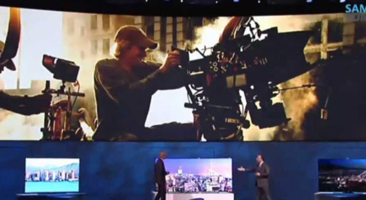
Once you’re onstage, the stars are you and your presentation. Of course, your training got you there in the first place: charisma, clear and loud voice, likable aura—public speaking skills polished over and over again until they’re perfect, almost like second nature, and suited to your needs—and appropriate for every crowd imaginable.
But what about your presentation? Is it tailored to your audience? There’s a risk you don’t want to take when, despite how good you are as a speaker, your presentation is not as appealing: you don’t get your message across as effectively as you want, vis-à-vis death by PowerPoint.
Since humans are visual creatures, our brains process imagistic information faster and more efficiently than text. This is a benchmark you should take advantage of when creating visually appealing and enticing slides, a tip awesome presentation designers always live by. Check this infographic for tips on how to charm your audiences, arrest their attention, and, most importantly, get your message across.
Visuals play an important role when arresting attention. In a world of eight-second attention spans and faster everything—connectivity, accessibility, and even loading times—people would rather spend more of their time on different, more valuable things.
Come to think of it, it’s a cyclical cause and effect: everything is faster, so people expect things to be even faster, ergo the short attention spans. Kind of a messed-up Pygmalion effect, only for things instead of persons.
With that happening, there’s now two steps to do: get their attention and retain it. Good, proper, and creative use of visuals can already do the first, and they can certainly take care of the second, especially when your topic goes from “something that makes them curious” to “something that genuinely piques their interest and makes them ask questions.”
There’s a beauty that certain senses can solely appreciate. Music to the ears. Caress on the skin. For the eyes, it’s appealing design. Beauty. Make something that both you and your audience will appreciate. In turn, they will appreciate you.
Resources:
Golden, Felicia. “The Power of Visual Content: Images vs. Text.” eyeQ. February 11, 2015. www.eyeqinsights.com/power-visual-content-images-vs-text
McSpadden, Kevin. “You Now Have a Shorter Attention Span than a Goldfish.” Time. May 14, 2015. www.time.com/3858309/attention-spans-goldfish


