
Ever stopped to take a longer look at an advertisement and recalled information even hours after seeing it?
If your answer is yes, then you just experienced effective graphic design.

Graphic design uses time-tested rules based on how human eyes perceive and interpret information.
According to University of Toronto’s Roger Martin, employing design thinking can also help businesses plan for effective and efficient communication by deciding what visual elements are necessary, what they look like, and where they should be placed.
However, there’s one visual element that continues to confuse a lot of beginning presenters: space.
What is White Space?
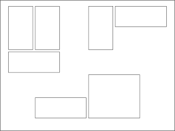
White space (also known as negative space) is the absence of any distinct object or shape in a layout. When printed materials still dominated information sharing, publishers made the most out of the available layout space because of high publishing costs. This is why newspapers, paperbacks, and most textbooks still look the way they do today—crammed with as much text and image that can fit.
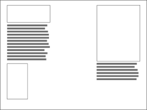
As most information is now transmitted and consumed digitally, designers no longer worry about wasting paper, allowing designers to use more white space. This shift in the use of space benefits your layout in many ways.
How White Space Affects the Viewer
White spaces impart a sense of cleanliness to a page. Restraining yourself from adding visible elements avoids cluttering your slides, confusing viewers, and burying important messages.
The absence of discernible objects also conveys openness. White space invites your audience to participate in the discussion and be more engaged as listeners.
How White Space Aids Your Design
-
Relaxes your audience’s eyes
The eyes’ muscles relax when there’s nothing to focus on. This regulates your audience’s mental stamina and safeguards their capacity to be attentive for longer.
-
Groups similar or related elements together
When there is a uniform amount of space among them, shapes are perceived as similar. This is a great way to organize multiple elements without adding objects such as bounding boxes to the slide.
-
highlights important elements
Shapes that are clearly separated by space are highlighted and further emphasized. You can use this for recapping, summarizing, or focusing.
-
Makes your design classier
This effect is tied to how white space was treated in print media’s heyday when publications tried to fit as much content as possible in available pages. Consequently, publications that wanted to exude a more exclusive feel were more charitable with space.
How Apple Mastered White Space
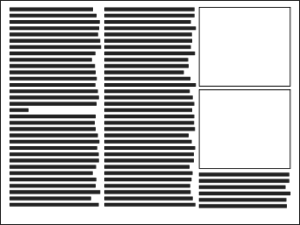
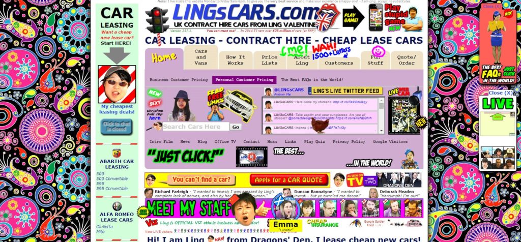
Flooding your space with content causes discomfort in viewers, as this actual website example demonstrates:
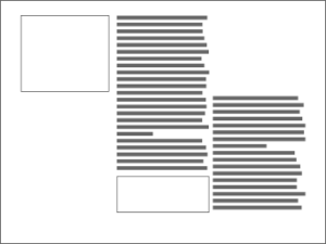
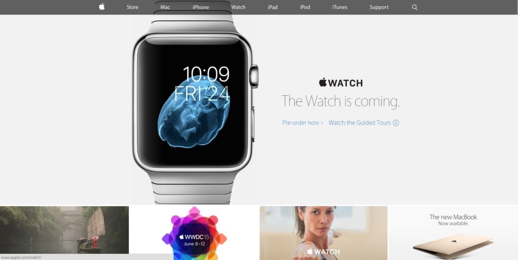
Conversely, Apple’s website uses white space to elevate their products’ perceived quality. Their website is a perfect example of simple design for both products and collateral:
—
Practice restraint. Don’t saturate your slides with images and text in the hopes that it’ll improve information sharing and memory retention. It won’t fill in the gaps between supporting data and great presentation design techniques.
Adding too many elements in one space makes text less legible and important images less visible. Effective designs leave viewers with enough space to breathe and translate your visuals into lasting and actionable knowledge.
Resist the temptation to fill your slides with frills. Fewer elements make more of a lasting impact.

Download free PowerPoint templates now.
Get professionally designed PowerPoint slides weekly.
Sign Up NowReferences:
Martin, Roger. “What Is Design Thinking Anyway?” Design Observer. September 28, 2009. Accessed May 14, 2015.
“Using White Space in PowerPoint Design-a Closer Look.” SlideGenius, Inc. December 4, 2014. Accessed May 14, 2015.


